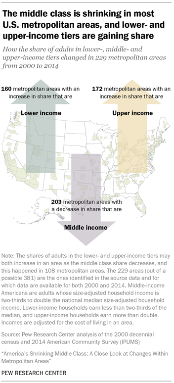
The American middle class is losing ground in metropolitan areas across the country, affecting communities from Boston to Seattle and from Dallas to Milwaukee. From 2000 to 2014 the share of adults living in middle-income households fell in 203 of the 229 U.S. metropolitan areas examined in a new Pew Research Center analysis of government data. The decrease in the middle-class share was often substantial, measuring 6 percentage points or more in 53 metropolitan areas, compared with a 4-point drop nationally.
The shrinking of the middle class at the national level, to the point where it may no longer be the economic majority in the U.S., was documented in an earlier analysis by the Pew Research Center. The changes at the metropolitan level, the subject of this in-depth look at the American middle class, demonstrate that the national trend is the result of widespread declines in localities all around the country.
This report encompasses 229 of the 381 “metropolitan statistical areas” as defined by the federal government. That is the maximum number of areas that could be identified in the Census Bureau data used for the analysis and for which data are available for both 2000 and 2014 (an accompanying text box provides more detail). 1 Together, these areas accounted for 76% of the nation’s population in 2014.
With relatively fewer Americans in the middle-income tier, the economic tiers above and below have grown in significance over time. The share of adults in upper-income households increased in 172 of the 229 metropolitan areas, even as the share of adults in lower-income households rose in 160 metropolitan areas from 2000 to 2014. The shifting economic fortunes of localities were not an either/or proposition: Some 108 metropolitan areas experienced growth in both the lower- and upper-income tiers.
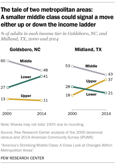
The possibility that a shrinking of the middle class may signal a movement into either the lower-income tier or the upper-income tier is exemplified by the experiences of Goldsboro, NC, and Midland, TX—one community buffeted by broader economic forces and the other buttressed by them.
In Goldsboro—an old railroad junction town and home to Seymour Johnson Air Force Base—the share of adults who are middle income fell from 60% in 2000 to 48% in 2014, or by 12 percentage points. This was one of the greatest decreases among the 229 metropolitan areas analyzed. It was also an unambiguous signal of economic loss as the share of adults in lower-income households in Goldsboro increased sharply, from 27% in 2000 to 41% in 2014.
But in Midland—an energy-based economy that benefited from the rise in oil prices from 2000 to 2014—the shrinking middle class was a sign of financial gains. The share of adults in middle-income households in Midland decreased from 53% in 2000 to 43% in 2014, the fourth-largest drop in the nation. But this was accompanied by rapid growth in the share of adults in upper-income households in Midland, which doubled from 18% in 2000 to 37% in 2014. 2
Among American adults overall, including those from outside the 229 areas examined in depth, the share living in middle-income households fell from 55% in 2000 to 51% in 2014. Reflecting the accumulation of changes at the metropolitan level, the nationwide share of adults in lower-income households increased from 28% to 29% and the share in upper-income households rose from 17% to 20% during the period. 3

Are you in the American middle class?
Find out with our income calculator.
Our new calculator lets you find out which group you are in – first compared with other adults in your metropolitan area and among American adults overall, and then compared with other adults in the U.S. similar to you in education, age, race or ethnicity, and marital status.
The widespread erosion of the middle class took place against the backdrop of a decrease in household incomes in most U.S. metropolitan areas. Nationwide, the median income of U.S. households in 2014 stood at 8% less than in 1999, a reminder that the economy has yet to fully recover from the effects of the Great Recession of 2007-09. The decline was pervasive, with median incomes falling in 190 of 229 metropolitan areas examined. Goldsboro ranked near the bottom with a loss of 26% in median income. Midland bucked the prevailing trend with the median income there rising 37% from 1999 to 2014, the greatest increase among the areas examined. 4
The decline of the middle class is a reflection of rising income inequality in the U.S. Generally speaking, middle-class households are more prevalent in metropolitan areas where there is less of a gap between the incomes of households near the top and the bottom ends of the income distribution. Moreover, from 2000 to 2014, the middle-class share decreased more in areas with a greater increase in income inequality.
These findings emerge from a new Pew Research Center analysis of the latest available 2014 American Community Survey (ACS) data from the U.S. Census Bureau in conjunction with the 2000 decennial census data. The focus of the study is on the relative size and economic well-being of the middle class in U.S. metropolitan statistical areas. These areas consist of an urban core and surrounding localities with social and economic ties to the core. A metropolitan area may cross state boundaries, such as the New York-Newark-Jersey City, NY-NJ-PA area (see the text box for more details).
A previous report from the Pew Research Center, released on Dec. 9, 2015, focused on national trends in the size and economic well-being of the American middle class from 1971 to 2015. That report demonstrated that the share of American adults in middle-income households shrank from 61% in 1971 to 50% in 2015. The national level estimates presented in the earlier report were derived from Current Population Survey (CPS) data. Thus, they differ slightly from the estimates in this report.
The current and future status of the American middle class continues to be a central issue in the 2016 presidential campaign. Moreover, new economic research suggests that a struggling middle class could be holding back the potential for future economic growth. 5 The national trend is clear—the middle class is losing ground as a share of the population, and its share of aggregate U.S. household income is also declining. 6 But, as the trends in Goldsboro and Midland demonstrate, similar changes in the size of the middle class could reflect very different economic circumstances and reactions at the local level.
U.S. metropolitan statistical areas
Metropolitan statistical areas represent the country’s urban centers. By definition, they consist of at least one urbanized area with a population of 50,000 or more people, plus neighboring areas that are socially and economically integrated with the core. The geographic building block for a metropolitan area is a county. But metropolitan areas may cross state boundaries, such as the Washington-Arlington-Alexandria, DC-VA-MD-WV area.
The federal government, via the Office of Management and Budget (OMB), identifies 381 metropolitan areas in the U.S. These 381 areas encompass 1,167 of the 3,143 counties in the U.S. About 85% of the U.S. population lives in metropolitan areas; the remainder lives either in smaller urban areas or in rural areas (see http://www.census.gov/population/metro/ and https://www.whitehouse.gov/sites/default/files/omb/bulletins/2013/b-13-01.pdf for more details).
Unfortunately, metropolitan areas are not specifically identified in the datasets the U.S. Census Bureau releases for public use. Instead, metropolitan areas must be reconstructed, or approximated, using another geographic identifier—the public-use microdata area (PUMA). By this method, the Integrated Public Use Microdata Series (IPUMS) version of the 2014 American Community Survey—the source data for this report—is able to identify a total of 260 metropolitan areas. These are not always precise replications of the areas defined by OMB because PUMAs occasionally straddle official metropolitan area boundaries (see the description of the variable MET2013 at https://usa.ipums.org/usa-action/variables/alphabetical?id=M).
Another limitation of the data is that the definitions for metropolitan areas are changed frequently. The latest OMB definitions were released in 2013 and differ from the metropolitan area delineations in 2000. As a result, the 260 areas identified in the 2014 American Community Survey could be matched to only 229 areas in the public-use version of the 2000 decennial census. These 229 areas, accounting for 76% of the U.S. population in 2014, comprise the sample of metropolitan areas for this report.
Who is middle income?
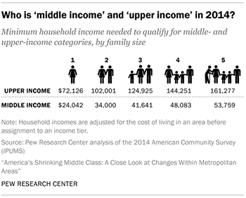
In this report, “middle-income” Americans are defined as adults whose annual household income is two-thirds to double the national median, after incomes have been adjusted for household size. 7 In 2014, the national middle-income range was about $42,000 to $125,000 annually for a household of three. Lower-income households have incomes less than 67% of the median and upper-income households have incomes that are more than double the median.
The income it takes to be middle income varies by household size, with smaller households requiring less to support the same lifestyle as larger households. Thus, a one-person household needed only $24,000 to $72,000 to be middle income in 2014. But a five-person household had to have an income ranging from $54,000 to $161,000 to be considered middle income.
Middle income or middle class?
The terms “middle income” and “middle class” are often used interchangeably. This is especially true among economists who typically define the middle class in terms of income or consumption. But being middle class can connote more than income, be it a college education, white-collar work, economic security, homeownership, or having certain social and political values. Class could also be a state of mind, that is, it could be a matter of self-identification (Pew Research Center, 2008, 2012). The interplay among these many factors is examined in studies by Hout (2007) and Savage et al. (2013), among others.
This report uses household income to group people. For that reason, the term “middle income” is used more often than not. However, “middle class” is also used at times for the sake of exposition.
The same middle-income standard is used to determine the economic status of households in all metropolitan areas after their incomes have been adjusted for the cost of living in the area. That means the incomes of households in relatively expensive areas, such as New York-Newark-Jersey City, NY-NJ-PA, are adjusted downward, and the incomes of households in relatively cheaper areas, such as McAllen-Edinburg-Mission, TX, are adjusted upward. Incomes are also adjusted for increases in the prices of goods and services over time when analyzing changes in the status of households from 2000 to 2014. 8
Metropolitan areas with the largest middle-, lower- and upper-income tiers in 2014
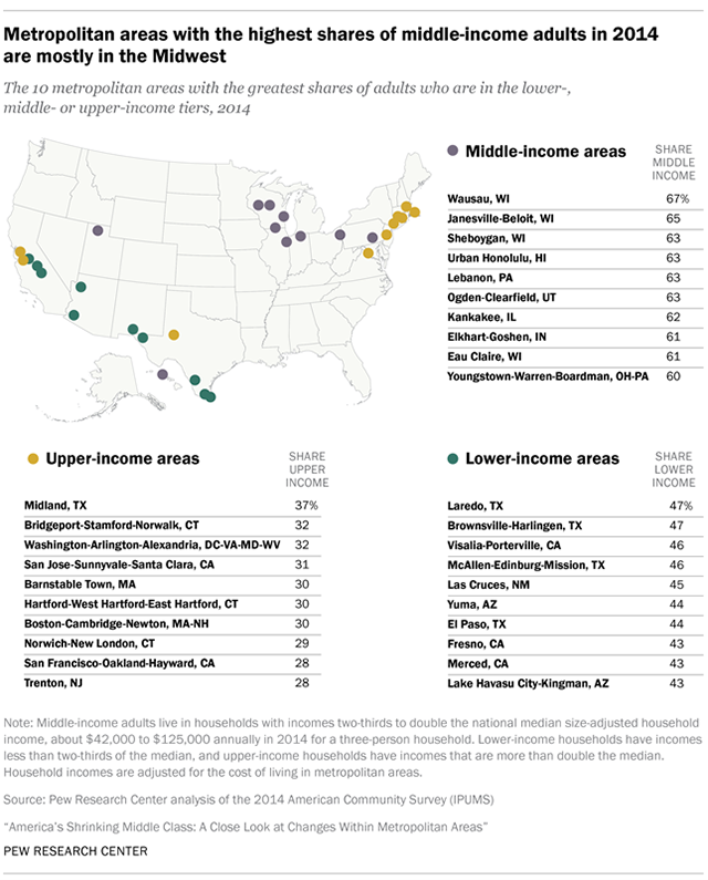
A distinct geographical pattern emerges with respect to which metropolitan areas had the highest shares of adults who were lower income, middle income or upper income in 2014. The 10 metropolitan areas with the greatest shares of middle-income adults are located mostly in the Midwest. Wausau, WI, where 67% of adults lived in middle-income households in 2014, had the distinction of leading the country on this basis, followed closely by Janesville-Beloit, WI (65%). Sheboygan, WI, and four other Midwest areas also placed among the top 10 middle-income areas.
Beyond a shared geography, the top 10 middle-income metropolitan areas are more rooted in manufacturing than the nation overall. Elkhart-Goshen, IN, for example, derived 56% of its gross domestic product (GDP) in 2014 from the manufacturing sector alone. Likewise, the manufacturing sector’s share was 40% in Sheboygan, WI, and more than 20% in Wausau, WI, Lebanon, PA, Ogden-Clearfield, UT, and Kankakee, IL. Overall, manufacturing accounted for only 12% of the nation’s GDP in 2014. 9
But the role of the manufacturing sector in sustaining the middle class in these Midwest localities is not clear-cut. While manufacturing jobs tend to pay more than average, the sector has been letting go of workers in recent decades. 10 Nationwide, employment in the manufacturing sector shrank 29% from 2000 to 2014. 11 The middle-class communities in the Midwest were not immune to this trend.
Among the Midwestern areas with some of the highest shares of adults who are middle income, the areas hardest hit by the loss in manufacturing jobs were Janesville-Beloit, WI, where manufacturing employment fell 49% from 2000 to 2014, and Youngstown-Warren-Boardman, OH-PA, where it fell 42%. Although at least 6-in-10 adults were middle class in these areas in 2014, both localities experienced losses in the shares of adults who were upper income and increases in the share who were lower income from 2000 to 2014. Thus, the economic status of the middle class in some of the Midwestern localities is not necessarily on firm ground.
The remaining top 10 middle-income metropolitan areas experienced more modest losses in manufacturing jobs and other sectors stepped in to pick up the slack in several areas. For example, from 2000 to 2014, Wausau, WI, lost 3,200 manufacturing jobs but overall private sector employment increased by nearly 1,ooo. Similarly, Eau Claire, WI, had a loss of 2,300 manufacturing jobs but an overall gain of 5,700 private sector jobs. Neither of these two areas experienced much of a change in the shares of adults who were lower income, and Eau Claire witnessed a rise in the share who were upper income. Thus, at least some of these industrial communities held on to their economic standing or saw it improve despite the decay in manufacturing.
Metropolitan areas with the largest upper-income populations are mostly in the Northeast or on the California coast. Midland, TX, the exception to this rule, leads the metropolitan ranking of upper-income areas. Some 37% of the adult population in Midland was upper income in 2014, thanks to a prospering oil economy. High-tech corridors, such as Boston-Cambridge-Newton, MA-NH, and San Jose-Sunnyvale-Santa Clara, CA, are on this list, along with financial and commercial centers, such as Hartford-West Hartford-East Hartford, CT. The adult populations in most of these upper-income areas are also more likely to have a college degree than in the nation overall.
The 10 metropolitan areas with the biggest lower-income tiers are toward the Southwest, several on the southern border. Two metropolitan areas in Texas, Laredo and Brownsville-Harlingen, lead the country in this respect—in both areas 47% of the adult population lived in lower-income households in 2014. Farming communities in central California, namely Visalia-Porterville, Fresno and Merced, are also in this group of lower-income areas. With the exception of Lake Havasu City-Kingman, AZ, Hispanics accounted for more than half of the population in each of these lower-income metropolitan areas in 2014, compared with 17% nationally.
Looking across the broader swath of metropolitan areas, the share of adults who are middle income ranged from a low of 42% in Monroe, LA, to a high of 67% in Wausau, WI, in 2014. But in the majority of metropolitan areas—118 of the 229 examined—the share of adults who were middle income fell within a relatively narrow range of 50% up to 55%. These metropolitan areas are dispersed across the country, not displaying a clear geographical pattern.
In about a quarter of the metropolitan areas in 2014, middle-class adults do not constitute a clear majority of the adult population. Notably, many of the nation’s largest metropolitan areas fall into this group, including Los Angeles-Long Beach-Anaheim, CA, where 47% of adults were middle income; San Francisco-Oakland-Hayward, CA (48%); New York-Newark-Jersey City, NY-NJ-PA (48%); Boston-Cambridge-Newton, MA-NH (49%); and Houston-The Woodlands-Sugar Land, TX (49%).
In some of these metropolitan areas, such as the Boston and San Francisco regions, the relatively small share of the middle-income tier reflects the fact that the upper-income tier is larger than average. But in the Los Angeles region, the middle class is relatively small because the share of adults who are lower income is greater than average.
Perhaps unsurprisingly, the relative size of the lower-income or upper-income tier in a metropolitan area is correlated with the median income of households overall in the area. In Laredo, TX, the area with the largest lower-income tier, the median household income was 35% less than the national median income in 2014. In Midland, TX, the metropolitan area with the largest upper-income tier, the median income was 45% greater than the national median. 12
The extent of income inequality in a metropolitan area also matters. Middle-income adults account for a larger share of the adult population in metropolitan areas where there is less of a difference between the incomes of the highest-earning and lowest-earning households. Wausau, WI, Janesville-Beloit, WI, and Sheboygan, WI, the three areas with the largest middle classes, are also among the metropolitan areas that had the lowest levels of income inequality in 2014.
Changes in the economic status of metropolitan areas from 2000 to 2014
As the middle of the income distribution hollowed around the country from 2000 to 2014, the movement was more up the economic ladder than down the ladder in some metropolitan areas (winners) while in other areas there was relatively more movement down the ladder (losers).
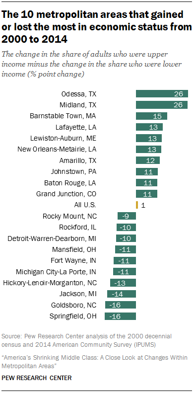
Nationally, the share of adults in the upper-income tier increased from 17% in 2000 to 20% in 2014, a gain of 2 percentage points. 13 Meanwhile, the share of adults in the lower-income tier increased from 28% to 29%, an increase of 1 percentage point. The difference—1 percentage point—is the net gain for American adults. By this measure, the net gain in economic status varied considerably across metropolitan areas. 14
The metropolitan areas that experienced the largest gain in economic status from 200o to 2014 are Odessa and Midland, neighboring communities in Texas with energy-based economies. The other major winners among metropolitan areas are varied in nature. New Orleans-Metairie, LA, and Baton Rouge, LA, are relatively prominent in shipping and petrochemicals, but Lafayette, LA, has more of a stake in information technology. Amarillo, TX, is principally a meat packing economy, while Barnstable Town, MA, is a leading tourist destination on Cape Cod.
The areas with the largest gains in economic status are not necessarily areas with high shares of upper-income households. Indeed, several are decidedly average, with the shares of lower-, middle- and upper-income populations closely resembling the national distribution in 2014. In Grand Junction, CO, for example, some 52% of the adult population was middle income in 2014, 28% was lower income and 20% was upper income. But Grand Junction got to the national norm by nearly doubling the share of its upper-income population from 2000 to 2014, making it one of the big winners.
Although other factors may also be at work, the 10 metropolitan areas with the greatest losses in economic status from 2000 to 2014 have one thing in common—a greater than average reliance on manufacturing. 15 Most of these areas, such as Springfield, OH, and Detroit-Warren-Dearborn, MI, are in the so-called Rust Belt. The areas not in the Rust Belt, such as Rocky Mount, NC, and Hickory-Lenoir-Morganton, NC, are also industrial communities.
These areas generally experienced a significant drop in manufacturing employment from 2000 to 2014, ranging from 23% in Fort Wayne, IN, to 51% in Hickory-Lenoir-Morganton, NC, compared with 29% nationally. The jobs lost in manufacturing were not entirely picked up elsewhere as overall private sector employment also fell from 2000 to 2014 in these 10 metropolitan areas, ranging from a decrease of 3% in Goldsboro, NC, to a decrease of 25% in Hickory-Lenoir-Morganton, NC. In contrast, private sector employment in the U.S. overall increased 5% from 2000 to 2014. 16
Across the 229 metropolitan areas analyzed, 119 were winners, moving up in economic status from 2000 to 2014, and 110 were losers. Changes in median household income are related to the likelihood that a metropolitan area proved to be a winner or a loser. Areas with higher growth in median household income from 1999 to 2014 were more likely to experience an increase in the share of adults who are upper income and a decrease in the share who are lower income. Trends in income inequality also made a difference. Areas with more of an increase in income inequality from 1999 to 2014 experienced larger losses in the middle-class share.
Households experience financial setbacks in most metropolitan areas
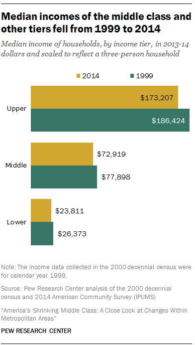
American households in all income tiers experienced a decline in their incomes from 1999 to 2014. Nationally, the median income of middle-income households decreased from $77,898 in 1999 to $72,919 in 2014, a loss of 6%. The median incomes of lower-income and upper-income households fell by 10% and 7%, respectively, over this period.
The decline in household incomes at the national level reflected nearly universal losses across U.S. metropolitan areas. Middle-income households lost ground financially in 222 of 229 metropolitan areas from 1999 to 2014. Meanwhile, the median income of lower-income households slipped in 221 metropolitan areas and the median for upper-income households fell in 215 areas.
The trends in income point to economic pressures on the middle class, including in areas where it still holds a large share of the population. In Sheboygan, WI, where 63% of adults are middle class, the median income of the middle class fell by 17%, from $80,281 in 1999 to $66,719 in 2014. Also, middle-income households in areas such as Janesville-Beloit and Eau Claire in Wisconsin and Elkhart-Goshen in Indiana experienced at least a 10% decrease in median incomes. Thus, while these communities are still largely middle class, the financial security of middle-class households in them has deteriorated since 1999.
Looking across metropolitan areas in 2014, there is considerable variation in the median income of households. For households overall, the median income ranged from $39,752 in McAllen-Edinburg-Mission, TX, to $90,743 in Midland, TX. Also, the incomes of households within each income tier varied across metropolitan areas. Among middle-class households, the median income ranged from $64,549 in Hanford-Corcoran, CA, to $81,283 in Racine, WI, a gap of 26%. 17
Road map to the report
This report divides households in U.S. metropolitan areas into three income tiers—lower income, middle income and upper income—depending on how their incomes compare with the national median household income. Household incomes within each metropolitan area are first adjusted for the cost of living in the area relative to the national average cost of living. Incomes are also adjusted for household size and scaled to reflect a household size of three.
In drawing comparisons over time, households that were in the lower-, middle- or upper-income tier in 2014 are compared with households in those tiers in 2000. The analysis does not follow the same households over time, and some households that were middle income in 2000 may have moved to a different tier in 2014. The demographic composition of each income tier may also have changed over the period.
The first chapter of the report describes how the U.S. adult population was distributed across the three income tiers in 2000 to 2014. It also describes the impact of adjusting incomes in metropolitan areas for the local cost of living.
The report then focuses on the size and economic well-being of lower-, middle- and upper-income tiers in U.S. metropolitan areas in 2014, and on how the metropolitan areas compare in these respects. The final chapter analyzes changes in the relative size and well-being of the income tiers from 2000 to 2014 at the metropolitan level.
Appendix B contains tables with estimates of the shares of the adult populations in lower-, middle- and upper-income tiers in 229 metropolitan areas and changes in those shares from 2000 to 2014. Maps in Appendix B depict these changes pictorially. Additional data on all metropolitan areas, such as median incomes, cost of living and other economic and demographic indicators, are available online for download.
Terminology and Methodology
“Middle-income” households are defined as those with an income that is two-thirds to double that
of the U.S. median household income, after incomes have been adjusted for household size. For a
three-person household, the middle-income range was about $42,000 to $125,000 annually in
2014 (in 2013-14 dollars). Lower-income households have incomes lower than two-thirds of the
median, and upper-income households have incomes that are more than double the median.
Incomes are also adjusted for household size and scaled to reflect a household size of three. Also,
household incomes within each metropolitan area are adjusted for the cost of living in the area
relative to the national average cost of living.
The 2000 decennial census collected income data for 1999, the preceding calendar year. Thus, the
assignment of adults to an income tier in 2000 is based on their household income in 1999.
The analysis encompasses 229 of 381 metropolitan areas in the U.S., as defined by the Office of
Management and Budget (OMB). The 229 metropolitan areas included in this report are the
maximum number of areas that could be identified in the Census Bureau data used for the analysis
and for which data are available for both 2000 and 2014. These 229 areas accounted for 76% of
the U.S. population in 2014. A metropolitan area consists of at least one urbanized area with a
population of 50,000 or more people, plus neighboring areas that are socially and economically
integrated with the core.
National estimates presented in the report encompass the U.S. adult population, including people
outside of the sample of 229 metropolitan areas.
Differences between numbers or percentages are computed before the underlying estimates are
rounded.
