
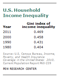
Over the past 30 years income has become less equally distributed among the nation’s households. One widely used measure of inequality, the Gini index, ranges between 0 and 1, with 0 denoting complete equality (every household has the same income) and 1 complete inequality (one household receives the entire national income and all others receive nothing). The U.S. Census Bureau reports that income inequality based on the Gini index has increased by about 16% in the past three decades, from 0.404 in 1980 to 0.469 in 2011.
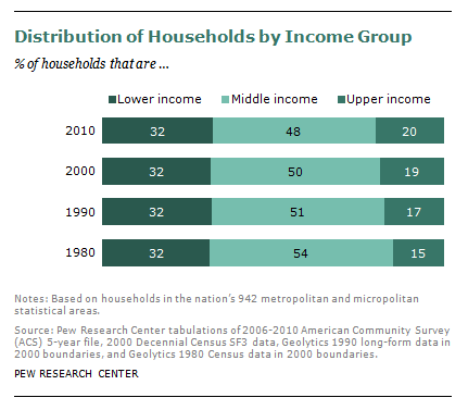
Consistent with this increase, there has been shrinkage over time in the share of households in the U.S. that have an annual income that falls within 67% to 200% of the national median, which are the boundaries used in this report to define middle-income households. In 1980, 54% of the nation’s households fell within this statistically defined middle; by 2010, just 48% did. The decline in the share of middle-income households is largely accounted for by an increase in the share of upper-income households. The share of households in the upper end of the income distribution rose from 15% in 1980 to 20% in 2010.
With fewer households now in the middle income group, it’s not surprising that there are now also more census tracts in which at least half of the households are either upper income or lower income. In 2010, 24% of all census tracts fell into one category or the other—with 18% in the majority lower-income category and 6% in the majority upper-income category. Back in 1980, 15% of all census tracts fell into one category or the other—with 12% majority lower and 3% majority upper.
To be sure, even with these increases over time in the shares of tracts that have a high concentration of households at one end of the income scale or the other, the vast majority of tracts in the country—76%—do not fit this profile. Most of America’s neighborhoods are still mostly middle income or mixed income—just not as many as before.


