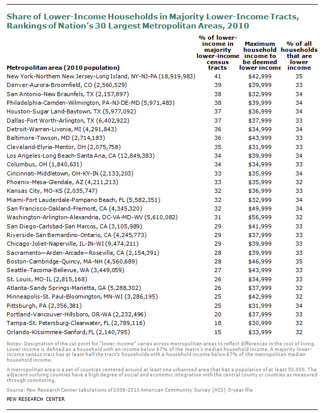
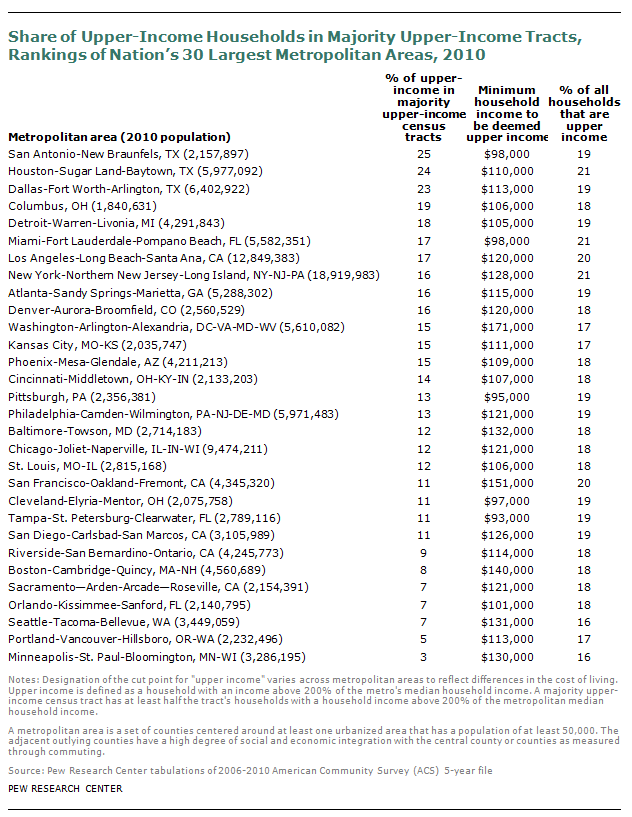
The Pew Research Center analysis of the nation’s 30 largest metropolitan areas finds wide variation in the extent of residential segregation by income.8
New York, Denver, San Antonio and Philadelphia lead the 30 largest metros in the share of lower-income households residing in majority lower-income tracts. As of 2010, 41% of lower-income households in New York lived in a majority lower-income tract. In Denver, 39% of lower-income households were in such tracts. In San Antonio and Philadelphia, 38% of lower-income households resided in majority lower-income tracts. By contrast, less than 20% of lower-income households were in majority lower-income tracts in Orlando and Tampa.
When it comes to high concentrations of upper-income households in upper-income neighborhoods, San Antonio, Houston and Dallas lead the nation’s top 30 metropolitan areas. In 2010, a quarter of upper-income households in San Antonio were located in majority upper-income tracts, followed closely by Houston (24%) and Dallas (23%). By contrast, 7% or fewer upper-income households were in majority upper-income tracts in Sacramento, Orlando, Seattle, Portland and Minneapolis.
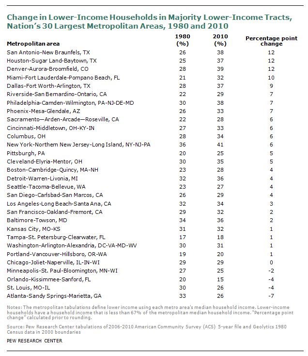
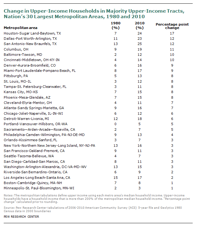
This Pew Research analysis also finds considerable variation among the nation’s 30 largest metros in the increase from 1980 to 2010 in the share of households residing in majority lower- or upper-income tracts.
San Antonio, Houston and Denver had the largest increases in the share of lower-income households residing in majority lower-income tracts among the 30 largest metros (12 percentage points). For example, in 1980 in San Antonio, 26% of lower-income households resided in majority lower-income tracts, but by 2010 that figure had risen to 38%. Overall, 25 of the nation’s 30 largest metropolitan areas experienced at least some increase during the past 30 years, while four had a decrease and one had no change. Atlanta, St. Louis and Orlando experienced the greatest decreases during this period.
As for the share of the upper income residing among the upper income, the direction of change was even more pervasive than the change for lower-income concentration. All of the nation’s 30 largest metropolitan areas experienced at least some increase during the past 30 years in the share of upper-income living among the upper income. Houston experienced the largest increase (in percentage point terms). In 1980 in Houston, 7% of upper-income households resided in majority upper-income tracts. By 2010, 24% of Houston’s upper-income lived in such tracts. In other metros, the increases were much more modest. For example, in 1980 in the Portland metropolitan area there were no majority upper-income census tracts. By 2010, 5% of Portland’s upper-income households resided in majority upper-income census tracts.