The American Trends Panel survey methodology
Overview
The American Trends Panel (ATP), created by Pew Research Center, is a nationally representative panel of randomly selected U.S. adults. Panelists participate via self-administered web surveys. Panelists who do not have internet access at home are provided with a tablet and wireless internet connection. Interviews are conducted in both English and Spanish. The panel is being managed by Ipsos.
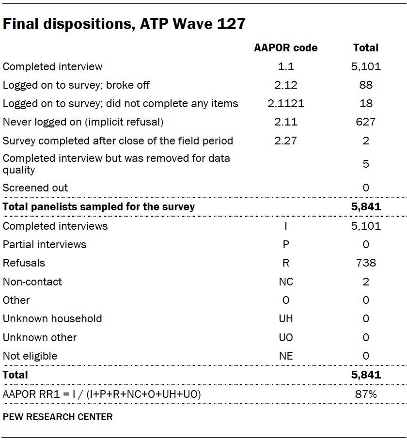
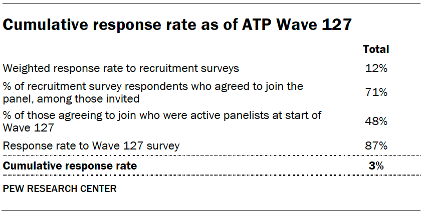
Data in this report is drawn from ATP Wave 127, conducted from May 15 to May 21, 2023, and includes an oversample of Hispanic men, non-Hispanic Black men and non-Hispanic Asian adults in order to provide more precise estimates of the opinions and experiences of these smaller demographic subgroups. These oversampled groups are weighted back to reflect their correct proportions in the population. A total of 5,101 panelists responded out of 5,841 who were sampled, for a response rate of 87%. The cumulative response rate accounting for nonresponse to the recruitment surveys and attrition is 3%. The break-off rate among panelists who logged on to the survey and completed at least one item is 2%. The margin of sampling error for the full sample of 5,101 respondents is plus or minus 1.7 percentage points.
Panel recruitment
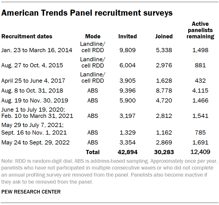
The ATP was created in 2014, with the first cohort of panelists invited to join the panel at the end of a large, national, landline and cellphone random-digit-dial survey that was conducted in both English and Spanish. Two additional recruitments were conducted using the same method in 2015 and 2017, respectively. Across these three surveys, a total of 19,718 adults were invited to join the ATP, of whom 9,942 (50%) agreed to participate.
In August 2018, the ATP switched from telephone to address-based recruitment. Invitations were sent to a stratified, random sample of households selected from the U.S. Postal Service’s Delivery Sequence File. Sampled households receive mailings asking a randomly selected adult to complete a survey online. A question at the end of the survey asks if the respondent is willing to join the ATP. In 2020 and 2021 another stage was added to the recruitment. Households that did not respond to the online survey were sent a paper version of the questionnaire, $5 and a postage-paid return envelope. A subset of the adults who returned the paper version of the survey were invited to join the ATP. This subset of adults received a follow-up mailing with a $10 pre-incentive and invitation to join the ATP.
Across the five address-based recruitments, a total of 23,176 adults were invited to join the ATP, of whom 20,341 agreed to join the panel and completed an initial profile survey. In each household, one adult was selected and asked to go online to complete a survey, at the end of which they were invited to join the panel. Of the 30,283 individuals who have ever joined the ATP, 12,409 remained active panelists and continued to receive survey invitations at the time this survey was conducted.
The U.S. Postal Service’s Delivery Sequence File has been estimated to cover as much as 98% of the population, although some studies suggest that the coverage could be in the low 90% range.6 The American Trends Panel never uses breakout routers or chains that direct respondents to additional surveys.
Sample design
The overall target population for this survey was non-institutionalized persons ages 18 and older living in the U.S., including Alaska and Hawaii. It featured a stratified random sample from the ATP in which Hispanic men, non-Hispanic Black men and non-Hispanic Asian adults were selected with certainty. The remaining panelists were sampled at rates designed to ensure that the share of respondents in each stratum is proportional to its share of the U.S. adult population to the greatest extent possible. Respondent weights are adjusted to account for differential probabilities of selection as described in the Weighting section below.
Questionnaire development and testing
The questionnaire was developed by Pew Research Center in consultation with Ipsos. The web program was rigorously tested on both PC and mobile devices by the Ipsos project management team and Pew Research Center researchers. The Ipsos project management team also populated test data that was analyzed in SPSS to ensure the logic and randomizations were working as intended before launching the survey.
Incentives
All respondents were offered a post-paid incentive for their participation. Respondents could choose to receive the post-paid incentive in the form of a check or a gift code to Amazon.com or could choose to decline the incentive. Incentive amounts ranged from $5 to $20 depending on whether the respondent belongs to a part of the population that is harder or easier to reach. Differential incentive amounts were designed to increase panel survey participation among groups that traditionally have low survey response propensities.
Data collection protocol
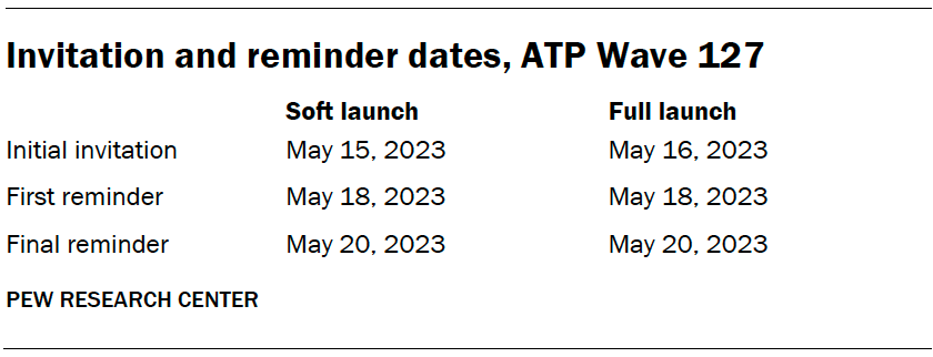
The data collection field period for this survey was May 15-21, 2023. Postcard notifications were mailed to all ATP panelists with a known residential address on May 15.
Invitations were sent out in two separate launches: soft launch and full launch. Sixty panelists were included in the soft launch, which began with an initial invitation sent on May 15. The ATP panelists chosen for the initial soft launch were known responders who had completed previous ATP surveys within one day of receiving their invitation. All remaining English- and Spanish-speaking sampled panelists were included in the full launch and were sent an invitation on May 16.
All panelists with an email address received an email invitation and up to two email reminders if they did not respond to the survey. All ATP panelists who consented to SMS messages received an SMS invitation and up to two SMS reminders.
Data quality checks
To ensure high-quality data, the Center’s researchers performed data quality checks to identify any respondents showing clear patterns of satisficing. This includes checking for very high rates of leaving questions blank, as well as always selecting the first or last answer presented. As a result of this checking, five ATP respondents were removed from the survey dataset prior to weighting and analysis.
Weighting
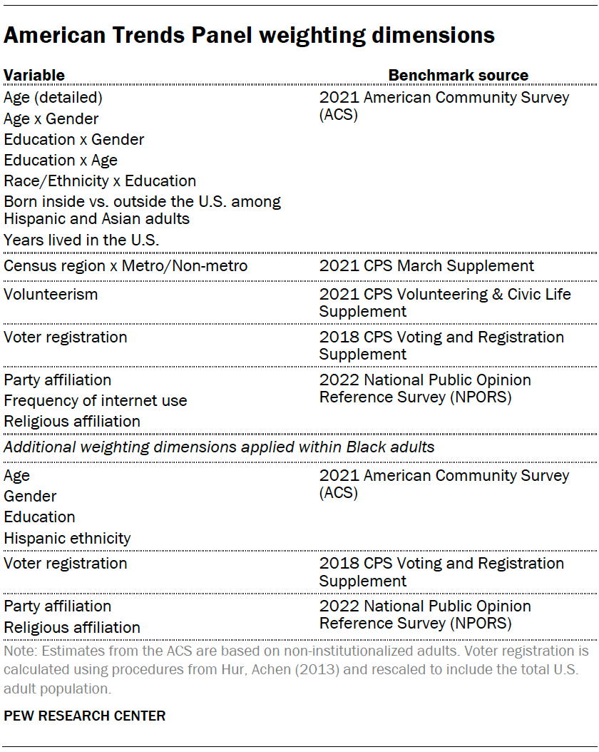
The ATP data is weighted in a multistep process that accounts for multiple stages of sampling and nonresponse that occur at different points in the survey process. First, each panelist begins with a base weight that reflects their probability of selection for their initial recruitment survey. These weights are then rescaled and adjusted to account for changes in the design of ATP recruitment surveys from year to year. Finally, the weights are calibrated to align with the population benchmarks in the accompanying table to correct for nonresponse to recruitment surveys and panel attrition. If only a subsample of panelists was invited to participate in the wave, this weight is adjusted to account for any differential probabilities of selection.
Among the panelists who completed the survey, this weight is then calibrated again to align with the population benchmarks identified in the accompanying table and trimmed at the 1st and 99th percentiles to reduce the loss in precision stemming from variance in the weights. Sampling errors and tests of statistical significance take into account the effect of weighting.
The following table shows the unweighted sample sizes and the error attributable to sampling that would be expected at the 95% level of confidence for different groups in the survey.
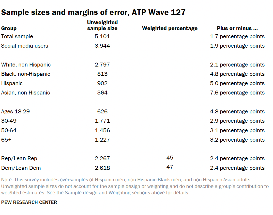
Sample sizes and sampling errors for other subgroups are available upon request. In addition to sampling error, one should bear in mind that question wording and practical difficulties in conducting surveys can introduce error or bias into the findings of opinion polls.
A note about the Asian adult sample
This survey includes a total sample size of 364 Asian adults. The sample primarily includes English-speaking Asian adults and, therefore, may not be representative of the overall Asian adult population. Despite this limitation, it is important to report the views of Asian adults on the topics in this study. As always, Asian adults’ responses are incorporated into the general population figures throughout this report. Because of the relatively small sample size and a reduction in precision due to weighting, we are not able to analyze Asian adults by demographic categories, such as gender, age or education.
Dispositions and response rates
Twitter data methodology
This report contains three different analyses of Twitter hashtags: an analysis of the volume of tweets over time mentioning #BlackLivesMatter; a content analysis of the major topics mentioned in #BlackLivesMatter tweets using natural language processing and machine learning methods; and hashtag clustering of a specific subset of hashtags to identify other major themes mentioned in #BlackLivesMatter tweets. Each is discussed in greater detail below.
Data Collection
To study the conversation around the Black Lives Matter movement on Twitter over the last 10 years (2013-2023), researchers compiled a collection of over 44 million publicly available tweets tagged with #BlackLivesMatter.
This data collection effort is based in part on previous research conducted by Giorgi et al. (2022), who used the Twitter Streaming API endpoint to continuously monitor and collect tweets tagged with #BlackLivesMatter, #BlueLivesMatter or #AllLivesMatter between 2013 and 2021. The final published data collection from that project contains the unique identifiers (but not the full tweet objects) of nearly 64 million tweets. Real-time data collection is ideal for social media analysis, so where possible, Center researchers used the tweet identifiers from this collection. Center researchers compiled all these tweet identifiers collected in real time and used the Twitter GET statuses/lookup API endpoint to retrieve the full tweet objects for all tweet identifiers that were still publicly accessible on Twitter during the data collection period of March 1-May 12, 2023.
Center researchers compiled all these tweet identifiers collected in real time and used the Twitter GET statuses/lookup API endpoint to retrieve the full tweet objects for all tweet identifiers that were still publicly accessible on Twitter during the data collection period of March 1-May 12, 2023.
For analysis, these retrieved tweets were then filtered down to just those tagged with #BlackLivesMatter or containing “blacklivesmatter” in the tweet text field.
To fill in gaps in this collection and extend the original data collection to the present, Center researchers used the Twitter Full Archive Search API endpoint to collect the missing data retrospectively, similarly querying on the keywords “#BlackLivesMatter” and “blacklivesmatter.”
The result of these combined efforts is a collection of the full tweet objects for over 44 million #BlackLivesMatter tweets, including full texts, engagement metrics, media information, user information and more. This collection spans the decade between the beginning of 2013 and the end of March 2023, and represents the full set of tweets containing the #BlackLivesMatter hashtag that could be retrieved through the Twitter API during the data collection period of March 1-May 12, 2023.
Measurement
Researchers used several methods to identify characteristics of interest in the tweets used for analysis, including:
- Whether the tweet states a favorable, neutral, or opposing position toward the Black Lives Matter movement;
- Language that distinguishes tweets with a favorable stance toward the Black Lives Matter movement from those with an opposing stance;
- Whether or not the tweet references policing or police violence, or mentions by name a Black person killed by police;
- Hashtags that commonly co-occur with #BlackLivesMatter, as well as with one another.
Identifying stance in #BlackLivesMatter tweets
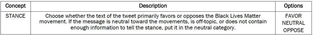
To identify whether tweets stated a favorable, neutral, or opposing stance toward the Black Lives Matter movement, researchers trained a custom transformer-based machine learning classifier.
First, researchers selected a random representative sample of 1,000 #BlackLivesMatter tweets to serve as a validation set, and hand-coded each tweet into one of the three categories: whether the tweet states a (i) favorable, (ii) neutral or (iii) opposing position toward the Black Lives Matter movement.
Coders used the following codebook to perform this task:
Tweets were labeled by three coders independently, who achieved moderate levels of inter-annotator agreement with each other (pairwise percent agreement between 79% and 82%; pairwise Cohen’s Kappa score between 0.58 and 0.63; and Krippendorff Alpha score of 0.68).
Examining these agreement metrics further, researchers found that most disagreements between coders were a result of ambiguity between the favorable and neutral categories or the opposing and neutral categories. Very few disagreements existed where one coder categorized a tweet as favorable and another coder categorized it as opposing. Excluding neutral labels from the calculation resulted in extremely high levels of inter-annotator agreement (pairwise percent agreement above 97%; pairwise Cohen’s Kappa score above 0.87; and Krippendorff Alpha score of 0.88).
To account for the inherent ambiguity of the neutral category, all 1,000 tweets in the sample were coded by all three coders, and where any disagreement occurred, the ultimate label was decided using a Dawid-Skene aggregation model. Researchers used this set of 1,000 hand-coded tweets with stance labels to validate the performance of the machine learning classifier explained below.
We then fine-tuned a task-specific machine learning classifier to replicate this labeling scheme across the rest of the collected data. This task was performed iteratively:
- First, researchers used OpenAI’s gpt-3.5-turbo-0301 API endpoint to produce stance labels for a random sample of 20,000 tweets.
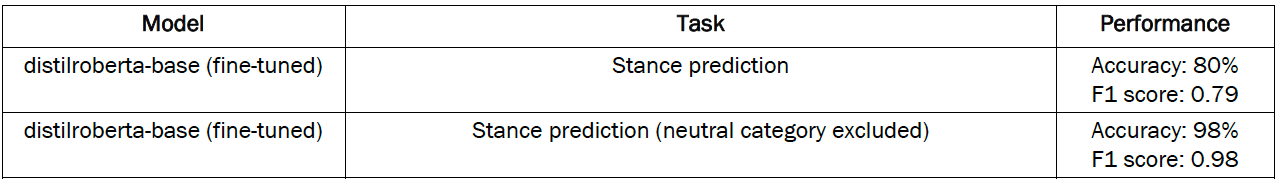
- Then, researchers fine-tuned a DistilRoBERTa-base transformer model on this set of 20,000 labeled tweets.
The fine-tuned DistilRoBERTa stance classifier achieved human-level performance when validated against the hand-coded set of 1,000 tweets.
Finally, all tweets in the collection were assigned stance labels by this classifier.
Identifying “distinctive” language in supportive and opposing #BlackLivesMatter tweets
Researchers identified distinctive terms appearing in tweets that state a favorable or opposing position toward the Black Lives Matter movement using pointwise mutual information (PMI). This method compares the probability of a word appearing in a tweet that is supportive (or opposing) of the Black Lives Matter movement, to the probability of the word appearing in a tweet and a tweet having a supportive (or opposing) stance independently.
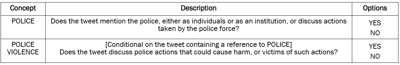
Identifying references to policing, police violence and victim names
To identify references to policing, police violence and victim names, researchers used machine learning classifiers paired with keyword lookups. The machine learning component of this task used a transfer learning approach: Here, models initially trained on natural language inference (NLI) are adapted to classification on unseen texts and categories (an approach known as zero-shot classification).7 We used bart-large-mnli, a large transformer-based language model as our classifier for this task.
Similar to the stance classifier, this police classifier was validated against a random representative sample of 1,000 tweets from the #BlackLivesMatter tweets dataset, independently hand-coded by three human annotators.
Coders used the following codebook to perform this task:
Coders achieved high levels of inter-annotator agreement on these tasks. For general references to the police:
- Pairwise percent agreement above 88%
- Pairwise Cohen’s Kappa score between 0.7 and 0.82
- Krippendorff Alpha score of 0.75
For more specific references to police violence:
- Pairwise percent agreement above 90%
- Pairwise Cohen’s Kappa score between 0.7 and 0.83
- Krippendorff Alpha score of 0.75
All 1,000 tweets in the validation sample were coded by all three coders, and where any disagreement occurred, the ultimate label was decided using a Dawid-Skene aggregation model.
To identify tweets where Black victims of police killings were mentioned by name, researchers created a dictionary using two databases of police killings: the Washington Post’s “Fatal Force” database, which logs fatal shootings by U.S. police officers in the line of duty, and Campaign Zero’s “Mapping Police Violence” database, which takes a broader definition, and records any incident where civilians are killed by law enforcement officers (off duty or on duty) by any application of lethal force.
These databases were combined and filtered to the names of victims who were Black. Researchers then used regular expressions to check for matches to any victim names in the text or hashtags of a tweet.
The predictions of the bart-large-mnli classifiers on whether tweets contained references to either the police generally, or police violence specifically, were then combined with the victim names dictionary matches. Tested against the hand-coded set of 1,000 tweets, this ensemble achieved an accuracy level of 94% and an F1 score of 0.94.

Identifying co-occurring hashtags
More than half of #BlackLivesMatter tweets include other hashtags, and these hashtags bring different issues to Twitter users’ attention. To explore these themes, we first identified the 100 most frequently used hashtags other than #BlackLivesMatter in each year from 2013 to 2023. We then measured how often each pair of other hashtags is used together, using Jaccard similarity across the 10-year timespan. Then, we used network analysis and community detection methods to group hashtags that commonly appear together in tweets in our dataset. We used Clauset et al. (2004)’s fast greedy modularity optimization algorithm to find the community structure.
This method resulted in 47 unique clusters, and researchers from the Center assigned one of 10 informative themes to these clusters: Black Lives Matter protests; General support for Black Lives Matter; Black culture and history; Opposition to Trump (the Resistance); Democratic politicians; Celebrities; Other movements and causes; Opposition to Biden (the Red Wave); General opposition to Black Lives Matter; and Miscellaneous. For example, a tweet cluster including #BlackCommunity and #BlackExcellence hashtags is categorized under the Black culture and history category, and another cluster with the hashtag #BTS is grouped under the celebrity category.
Estimating tweet deletion rates
Data on social media platforms – including Twitter – can be fairly impermanent. Users can delete their tweets, make their account private or deactivate it, or be suspended by the platform itself. When any one of these things happen, tweets that were previously publicly available become inaccessible, and researchers can no longer retrieve them through Twitter’s API. Therefore, analyses of Twitter data such as this one typically represent a snapshot of what the platform looked like at the time of data collection. In this case, since our data collection was based in part on #BlackLivesMatter tweets monitored and collected in real time, we had a unique opportunity to not just present a snapshot of what Twitter activity around #BlackLivesMatter looked like during the data collection period of March 1-May 12, 2023, but to also estimate the share of tweets that used to be available but no longer are (for one reason or another). To estimate these tweet attrition rates, we started with the total count of tweet identifiers in Giorgi et al.’s original dataset for each month between January 2013 and December 2021. We then compared each count with the count of tweets returned by the Twitter API for that month when we attempted to retrieve all those tweets by tweet identifier in March 2023. These monthly differences were then used to calculate overall, monthly and period-specific attrition rates.
© Pew Research Center, 2023