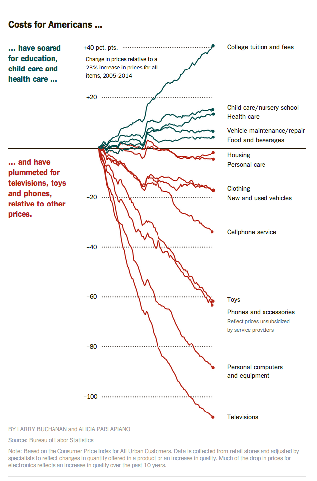
In 21st-century America, it’s entirely possible for poor people to have much of the same material comforts — cars, TVs, computers, smartphones — as more affluent people, yet be trapped in low-paying jobs with little prospect of improvement.
That’s the takeaway from this eye-opening chart, produced by The New York Times. As it and the accompanying story make clear, prices for a wide range of manufactured goods have plummeted in recent years, making yesterday’s luxuries widely affordable despite stagnating wages for most workers. (Though the chart only covers 2005-2014, the larger trend extends back to at least the 1980s.) As the Times put it, “the differences in what poor and middle-class families consume on a day-to-day basis are much smaller than the differences in what they earn.”
The differences, though, show up in services — particularly the sort of services (education, health care, child care) that enable people to find and keep better-paying jobs and, over time, move themselves and their families up the socioeconomic ladder.
“Without a doubt, the poor are far better off than they were at the dawn of the War on Poverty,” James Ziliak, director of the University of Kentucky’s Center for Poverty Research, said in the Times story. But relative to middle- and upper-income Americans, he added, “they have also drifted further away.”