
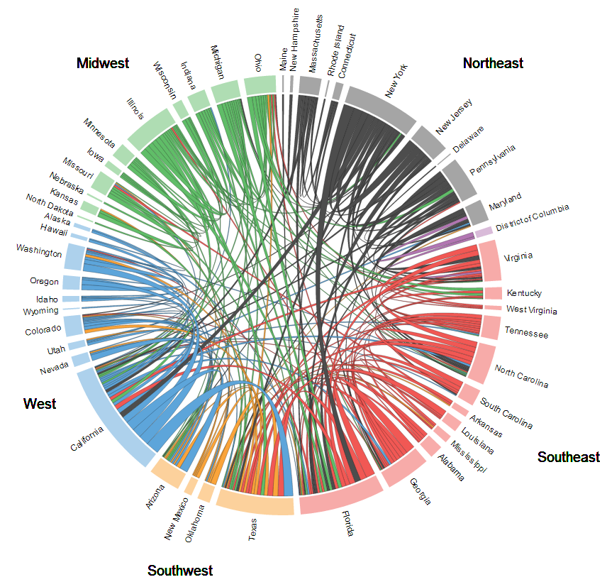
How can you display the moving patterns of 7.1 million Americans without a map? Chris Walker, an independent data journalist and visualization blogger, came up with this compelling interactive graphic (even if it looks like a piece of spin-art at first).
Walker built his graphic using 2012 state-to-state migration estimates from the Census Bureau’s American Community Survey. If you go to the interactive version on his blog and hover over each state’s colored segment along the rim of the circle, you’ll see its overall in-migration and out-migration numbers and isolate its migration links with other states; states that gained or lost a lot of people, such as Florida or California, look like exploding fireworks. (Walker only charted links with at least 10,000 people moving between states. As he explains on his blog, “I had to set a cut-off for drawing a link between two states, because otherwise the whole graphic would look like a tangled hairball”).
The thickness of the lines reflects how many people moved between any two states. Hover over a single line to get the specific traffic figures: For instance, an estimated 53,009 New Yorkers moved to Florida last year, while only 27,392 Floridians moved to New York.
Despite their restless, rootless image, most Americans stay put in any given year, and those who move usually don’t go far. Last year, according to the ACS, 85% of Americans lived in the same place they did a year earlier; 12.2%, or 37.7 million, moved within the same state. Along with the 7.1 million (2.3%) who moved to a different state, 1.8 million (0.6%) moved overseas (including to Puerto Rico or other U.S. island territories).
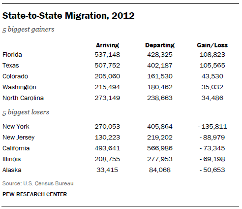
The only thing Walker’s chart left us wishing for was a summary of which states gained and lost the most migrants. So using the same ACS dataset he did, we compiled these tables. Florida and Texas were by far the biggest gainers, each drawing more than 100,000 people more from other states than they lost to other states. New York was the biggest loser, with nearly 136,000 more people leaving the Empire State for some other state than moving there.
(Thanks to Wired magazine’s MapLab blog for leading us to Walker’s creation.)
