
By Scott Keeter, Nick Hatley, Courtney Kennedy and Arnold Lau
A new study from Pew Research Center suggests that, after decades of consistent decline, U.S. telephone survey response rates have plateaued over the past four years. And contrary to the current narrative that polls are under siege, the data show that the bias introduced into survey data by current levels of participation is limited in scope. This report is the fourth in a series of Center studies tracking the impact of such changes in survey response (see previous studies in 1997, 2003 and 2012.) Among the key findings:
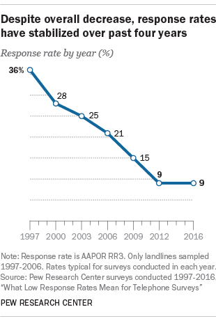
After decades of decline, the response rates for telephone polls like those conducted for Pew Research Center have stabilized in recent years to around 9%1,2 While the stabilization is good news for the industry, such low response rates do signal the potential for bias to creep into surveys if the people who consistently participate in polls are different than those who do not. That said, the current study and prior research suggest that response rate is an unreliable indicator of bias.
Telephone poll estimates for party affiliation, political ideology and religious affiliation continue to track well with estimates from high response rate surveys conducted in-person, like the General Social Survey. This provides strong evidence that decisions to participate in telephone surveys are not strongly related to political, social or religious attitudes. So even at low response rates, telephone surveys that include interviews via landlines and cellphones, and that are adjusted to match the demographic profile of the U.S., can produce accurate estimates for political attitudes.
Analysis of telephone survey respondents versus nonrespondents on variables from a national voter file suggests that survey participation is not strongly linked to partisanship. Affiliation with a particular political party does not appear to affect the likelihood that a person will participate in telephone polls, though those who participate in polls tend to vote more often than people who are less likely to take surveys.
There is no sign of an increase in nonresponse bias since 2012. On 13 demographic, lifestyle, and health questions that were compared with benchmarks from high response rate federal surveys, estimates from phone polls are just as accurate, on average, in 2016 as they were in 2012. The average (absolute) difference between the Center telephone estimates and the benchmark survey estimates was 2.7 percentage points in 2016, compared with 2.8 points in 2012.
On a range of demographic variables, differences between RDD telephone samples and the profile of all U.S. adults are relatively small with the important exception of educational attainment. In recent years, increasing the share of interviewing done with cellphones has improved representation of young adults and Hispanics. Like many survey organizations, the Center uses weighting to correct imbalances on major demographic variables (education, gender, race/ethnicity, region, age and more).
Telephone polls greatly overstate civic engagement, probably because of nonresponse bias.3As has been established in previous work, the people who answer surveys are likely to be the same people that are involved in their community’s public life – they are joiners. Fortunately for pollsters, civic engagement is not strongly correlated with political attitudes or most other measures researchers attempt to study with surveys.
Telephone polls also overstate political engagement, but to a lesser extent. Both the benchmarking and the voter database analysis show that politically engaged adults are overrepresented in surveys. The magnitude of bias on political engagement tends to be in the single digits (e.g., telephone polls overstate the share of adults who are registered to vote by about 7 percentage points) whereas the magnitude of bias on civic measures is in the double digits (e.g., phone polls overstate the share of adults who participated in a sports or recreation organization in last year by about 16 points).
The finding that a low response rate leads to substantial bias on some topics (e.g., volunteering) but not others (e.g., partisanship or religious affiliation) underscores the importance of having high response rate in-person surveys, which make such knowledge possible. Without surveys like the Current Population Survey, American Community Survey, the American National Election Survey and the General Social Survey, it is significantly harder if not impossible for researchers to determine where biases exist or do not exist in low response rate public opinion polls.
At first glance, the above results might seem to fly in the face of perceptions that polls failed in the 2016 presidential election. Indeed, there were some large errors in critical Upper Midwest states and those polls fed expectations that Hillary Clinton would win the presidency. But such a synopsis overlooks the fact that national polls were actually quite accurate. Collectively, they indicated that Clinton had about a 3 percentage point lead nationally, and they were basically correct, as she ultimately won the popular vote by 2 points. Furthermore, according to a new report, there are clear reasons why national polls as a group fared better than state polls. For instance, national polls were much more likely than state polls to adjust for respondent education level in their weighting, which proved critically important in the 2016 election. In sum, while polling errors did contribute to the false expectation that Hillary Clinton would win the presidency, polling writ large was not broken in 2016, and researchers have identified factors that help explain why some polls performed better than others.
The current study uses two types of data to assess the representativeness of Pew Research Center phone surveys. Most of the results are based on a comparison of survey estimates to widely accepted benchmarks from government-conducted or government-funded surveys that have far less nonresponse than standard telephone surveys. Altogether, a total of 29 benchmark measures were compared with identical (or nearly identical) questions asked on telephone surveys conducted by Pew Research Center.
A second source of data is a national database of adults that includes information about voter registration, turnout and partisanship on the vast majority of U.S. households. This particular dataset4 is one of a class of commercial products known as voter files that are widely used by campaigns and others to contact voters and leverage the fact that states are required to keep lists with the names, contact information and turnout history of residents who are eligible to vote. These voter file data were matched with the telephone sample used in a 2016 Pew Research Center survey to provide information on a group that otherwise prove difficult to examine: those who choose not to respond to the phone survey. This was accomplished by taking the 40,182 working telephone numbers called for a Pew Research Center survey and using those numbers to match people’s voting information, as many people have their phone number listed on their registration record. In this way, the survey’s respondents and nonrespondents were compared on several political measures to see if and where they differ.
A final point worth emphasizing is that live interviewer phone polls now represent a minority share of all polling conducted in the U.S. Online polls and automated (Interactive Voice Response) polls, or combinations of the two, are collectively more common than live interviewer phone polls and tend to have significantly lower response rates. This means that the findings presented in this report speak to only one part of the overall polling landscape, though it is an important part. Polls with methodologies similar to those of Pew Research Center continue to be conducted by major newspapers, broadcast networks, cable news organizations, universities and Gallup.
What is nonresponse bias?
The term bias can conjure up the thought of prejudice against certain kinds of people or a conscious effort to be unfair. Surveys can be biased in this sense if, for example, the questions are designed to favor one side of an issue. But when survey researchers and statisticians use the term, they mean something more general. In this case, bias is error that occurs when something about the way a survey is designed or conducted leads to results that are systematically different from what is true in the population. This is in contrast with what’s commonly called “sampling error” — the kind of error that occurs by chance because surveys try to interview a random sample of the population. The term bias, as used in this study, does not favor a particular group or point of view or result from conscious effort on the part of the researcher.
This report focuses on nonresponse bias in particular, which occurs when the kinds of people who are contacted and who agree to participate in a survey are systematically different from those who can’t be contacted or who refuse to participate. For example, younger people may be harder to reach for an interview. This would mean that those who are interviewed will tend to be older than the population as a whole. In turn, for questions that are strongly related to age, the results will overrepresent the attitudes and behaviors of older people if an effort is not made to correct the bias.
Concern about nonresponse bias has grown as nonresponse rates have grown. But it is important to note that survey researchers have been concerned about this issue for as long as modern survey research has existed. And methods of correcting for nonresponse bias are well understood and widely used. In particular, nearly all high quality surveys (including Pew Research Center’s) use some form of statistical weighting to ensure that their samples conform to the population with respect to geography, age, education, gender, race and other characteristics. However, nonresponse bias can still occur if respondents and nonrespondents differ on some dimension that is not accounted for in weighting. This report is an effort to measure and document the nature and extent of nonresponse bias in RDD telephone surveys of the sort conducted by Pew Research Center.
Low response rate phone polls still conform closely to high response rate in-person surveys on measures of political and religious identification
Some concepts are so fundamental to understanding public opinion they are measured in survey after survey. These concepts include political party affiliation, political ideology and religious affiliation. Several high response rate in-person surveys,5 as well as many low response rate polls, routinely ask these questions so researchers can study how they relate to policy attitudes and other outcomes. The availability of benchmarks from in-person surveys provides an opportunity to evaluate whether or not phone polls are still accurate in this era of single-digit response rates.

If the narrative that polls are broken is correct, one place it is likely to manifest is in trend-lines for these fundamental concepts. Specifically, two trend lines (one line for the benchmark high response rate survey and one line for the telephone poll) which used to be similar back in the 1990s or early 2000s, for example, perhaps would have been expected to diverge by 2016, as single-digit polls are no longer capable of producing unbiased estimates. This scenario is not borne out in the data.
This study compared Pew Research Center and General Social Survey (GSS) trends. Because of differences in question wording and mode of interview, these comparisons are not always precise. In addition, GSS estimates come from individual surveys with a modest sample size. Center estimates represent all of the interviewing conducted for the year, which for common questions involved combining multiple polls and taking the yearly average. This was done to minimize the role of sampling error.
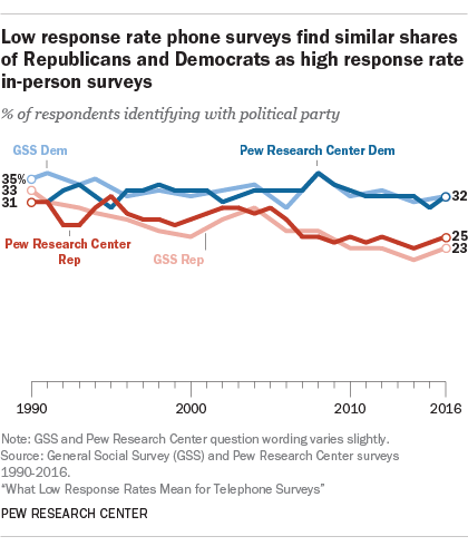
Across the quarter century span for which comparisons are available, the GSS and Center phone polls produced very similar estimates of the share of American adults identifying with the Democratic or Republican parties. Both sets of surveys measure party affiliation with a simple question asking respondents whether they are Democrat, Republican or independent.6 The average difference in point estimates across the high and lower response rate surveys is 1.4 points for Democratic identification and 1.6 points for Republican identification.
The relationship between the shares identifying with each party is also similar across the high and lower response conditions. Nearly every year of the comparison has more Democrats than Republicans in both surveys (though the difference between the parties is not always statistically significant), and the Democratic advantage has risen and fallen in the two surveys in parallel fashion. Both surveys found the public more evenly divided between the parties in the early 2000s than in the period since 2008. In 2016 – the most recent year for which a comparison is available – the GSS finds Democrats outnumbering Republicans by about 9 percentage points, while Pew Research Center finds Democrats ahead by 7 percentage points. On the whole, this analysis suggests that – despite low response rates – telephone surveys are able to produce accurate readings of the partisan composition of the American public. A different approach to this issue (presented later in the report) compares telephone respondents to nonrespondents using voter file data and reaches the same conclusion.
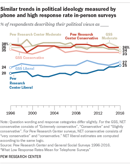
Beyond partisan affiliation, the portrait of Americans’ ideological orientation is also very similar in the GSS and in Pew Research Center surveys. Pew Research Center’s question offers respondents five categories ranging from “very liberal” to “very conservative,” while the GSS shows respondents a fully labeled seven point scale ranging from “extremely liberal” to “extremely conservative.” In both questions, “moderate” is the middle option.
Despite the differences in how the categories are presented to respondents, there is a reasonably close correspondence between the Center’s surveys and the GSS with respect to the relative shares choosing “moderate” or the conservative or liberal options. Both surveys consistently find more self-identified conservatives than liberals, and both show a gradual uptick over time in the share identifying as liberal. The number describing themselves as moderate is similar in the two sets of surveys (e.g., 34% in Pew Research Center’s 2016 surveys vs. 36% in the GSS that year). Conservatives outnumbered liberals in Pew Research Center surveys in 2016 by a margin of 36% to 25%, while they did so by a margin of 33% to 27% in the GSS.
Like politics, religion is a subject of great interest to many people. But for a variety of reasons, the government collects almost no information about the religious affiliation, attitudes and behavior of the public. In fact, in 1976 Congress prohibited the U.S. Census Bureau from asking about religion in its mandatory surveys such as the decennial census.7 However, the GSS has measured religion since its inception.
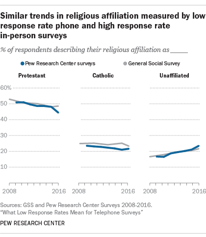
Despite using different questions, Pew Research Center surveys and the GSS produce similar findings both in respect to the levels and trends in key religious activities and beliefs. Perhaps most fundamental is what scholars of religion often call “belonging,” or religious affiliation. Pew Research Center surveys track religious affiliation on a nearly monthly basis using a relatively straightforward set of questions that first offers respondents a choice among 12 categories such as Protestant, Catholic, Jewish, atheist and then follows up with more detailed questions. The GSS question series on religious affiliation is similar, though it offers fewer options with its initial question (Protestant, Catholic, Jewish, some other religion or no religion).
The portrait of religious affiliation painted by the two surveys is highly similar, both with respect to the shares of the public associating with major religious traditions and with the trends over time. Both find the percentage of adults who are unaffiliated with a religion (either as atheist, agnostic, or no religion) growing rapidly in the past decade and constituting more than one-fifth of the public in 2016 (23% in Pew Research Center surveys, 22% in the GSS). Similarly, both find affiliation with Protestantism in fairly steady decline over the time period examined.
Both surveys show a slight decline in the Catholic share of the population in the past decade or so. Pew Research Center surveys in 2016 found Catholic affiliation at about 21%, while the Catholic share in the GSS is about 23%, a difference that is not statistically significant.
Caveats about benchmarks
Assessing bias in surveys requires an objective standard to which survey findings can be compared. Election polling has such a standard, at least for measures of voting intention: the outcome of the election. But most benchmarks are taken from other surveys. The benchmarks used here are drawn from government-funded surveys that are conducted at considerable expense and with great attention to survey quality. But they are surveys nevertheless and subject to some of the same problems facing the low response rate telephone surveys examined here.
The surveys used as benchmarks in this report have high response rates – on the order to 60% or more. Accordingly, the risk of nonresponse bias is generally thought to be lower for these surveys, though it still exists. Also relevant is the fact that all surveys, no matter the response rate, are subject to measurement error. Questions asked on government-funded surveys are carefully developed and tested, but they are not immune to some of the factors that create problems of reliability and validity in all surveys. The context in which a question is asked – the questions that come before it – often affects responses to it. Similarly, all survey items may be subject to some degree of response bias, most notably “social desirability bias.” Especially when an interviewer is present, respondents may sometimes modify their responses to present themselves in a more favorable light (e.g., by overstating their frequency of voting). All of these factors can affect the comparability of seemingly identical measures asked on different surveys. Assessing the quality of data is an inexact process at best. It is therefore important to bear in mind that benchmarking provides measures of estimated bias and is highly dependent on the particular set of measures included.
Telephone surveys somewhat overrepresent politically engaged adults, but the bias has been fairly stable over time
Previous research indicates that surveys tend to get a disproportionate response from those who are active participants in electoral life. One key question is whether that bias has grown larger as response rates have settled into the single digits. To address this, the study leveraged a long trend from the Current Population Survey (CPS), which has an 87% response rate.
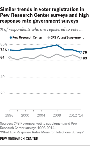
Both the CPS and Center phone surveys regularly measure the proportion of U.S. adults who are registered to vote.8
The data show a basically stable trend in over-estimating voter registration in telephone surveys from 1996 to 2014 (the last year for which the government data is available). Specifically, the observed overestimation is similar in 2014 – a year in which the phone surveys had a nine percent response rate – and 1996 when there was a 37% response rate. This is evidence that falling response rates are not resulting in dramatically different survey respondents when it comes to voter registration levels.
The CPS also provides benchmarks for two other measures of political engagement: frequency of voting in local elections and contacting a government official in the past year. Unlike voter registration (a staple of political surveys), Pew Research Center asks these questions only on rare occasion, which means that there is no analogous trend line to consider. To support this study, the Center did, however, administer the questions about local voting and contacting an official in a 2016 national telephone survey.
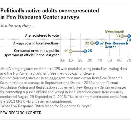
A comparison of the Center data to the most recent CPS data show the telephone survey samples to be more engaged than those in the government surveys, though the size of this bias varied from roughly 5 to 15 percentage points. When it comes to regularity of voting, the CPS indicates that 32% of adults vote in all or almost all such elections. The telephone survey estimate is 37%, an overstatement of about 5 percentage points.
A larger bias appears on the question about contacting elected officials. The CPS found that 10% of adults had contacted or visited a public official at any level of government to express their opinion. In contrast, the telephone survey estimate is that 25% have done so.
The most up-to-date comparison on voter registration status is from 2014 (the most recent election year with data available from the CPS). The benchmark indicates that 63% of eligible adults were registered to vote, while the comparable Pew Research Center estimate for three surveys conducted around the election was 70%, an overstatement of about 7 points.
Large biases persist on civic and social engagement measures
The results are substantially less positive with respect to measures of civic and social engagement. As was documented in the Center’s 2012 report on survey nonresponse, the new study suggests that telephone surveys continue to over-represent people who say they have volunteered, worked to solve a neighborhood problem, belonged to a community, recreational or civic association and people who say they trust or regularly talk with neighbors.
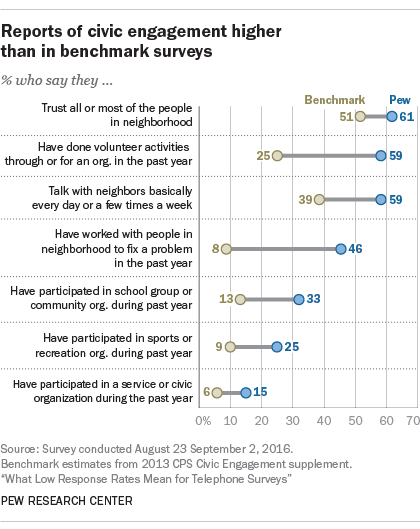
The biases range from a whopping high of 38 percentage points on working with neighbors (8% in the Current Population Survey vs. 46% in the telephone survey) to a low of 9 percentage points on participating in a civic or service association (6% in the CPS vs. 15% in the telephone survey).
The source of these large biases is reasonably well understood based on research published by Abraham, Helms and Presser in 20099 (and more recently by Amaya and Presser10 that examined reported rates of volunteering and other civic behaviors in the CPS (the same survey used as the benchmark in the present analysis). By comparing the survey respondents who subsequently completed an additional special survey with those who did not, the authors showed that the overall rate of volunteering was sensitive to survey nonresponse. In their conclusion, they observe that participating in surveys is a prosocial behavior related to other kinds of behaviors such as volunteering. They write that “our findings suggest that there is an important element of altruism in the decision about whether to respond to a survey request.”
While the implications for accurate measurement of prosocial behaviors in low response rate surveys are troubling, our 2012 analysis of this issue found that such behaviors – volunteering in particular – were not highly correlated with most other survey topics of interest. A similar analysis conducted with 2016 data found that the overrepresentation of civically engaged adults in phone surveys, if anything, increases support for both the Republican Party and Donald Trump. Among non-Hispanic whites, the share identifying as Republican or leaning to the Republican Party was 55% among those volunteering in the past year, as compared to 45% identifying as Republican or leaning Republican among non-volunteers. In theory, weighting down volunteers to bring the phone survey data in line with the CPS target would reduce the civic engagement bias, but would not necessarily make other survey estimates more accurate. In 2016, such an adjustment would have likely exacerbated the extent to which some telephone surveys overstated support for Hillary Clinton. That said, this finding that overrepresentation of volunteers favor Republicans is, at present, based just on one survey. Additional testing in other surveys would help to determine how robust this pattern is.
Telephone estimates generally show little bias from nonresponse on lifestyle, health and demographic questions
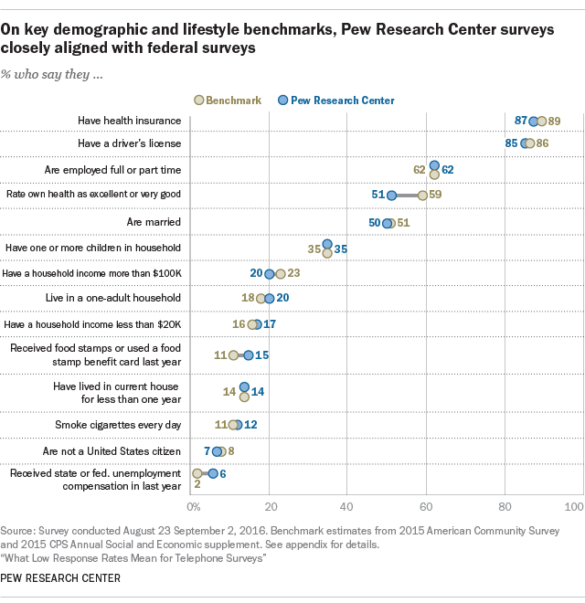
Across 14 measures of demographic and personal characteristics (temporarily holding aside variables used for weighting Pew Research Center surveys, which are discussed in a later section), the average difference between the government estimate and the Center’s survey estimate was 3 percentage points, and varied between 0 and 8 points. The largest difference was seen on a measure asking respondents about their health status. The government estimate of the share of people who rate their health as excellent or very good is 59%, while the telephone survey found 51% doing so.
The other 13 personal and demographic items were quite close to the benchmarks. The Center’s telephone survey overstated the share who received food stamps in the previous year by 4 percentage points and the share who received unemployment compensation also by 4 percentage points.
The remaining demographic and personal measures miss the benchmarks by 3 percentage points or less. These include measures of family income, employment status, household size, citizenship, health insurance, length of residence at current address, marital and parenthood status, smoking, place of birth among Hispanics and having a driver’s license. In other words, on all these measures, the relatively lower response telephone survey provided a measure of the phenomenon nearly identical to that of the high response rate government survey used as a benchmark.
The accuracy of telephone survey data on lifestyle, health and demographics is at least as high as four years ago, especially for estimates based on young adults
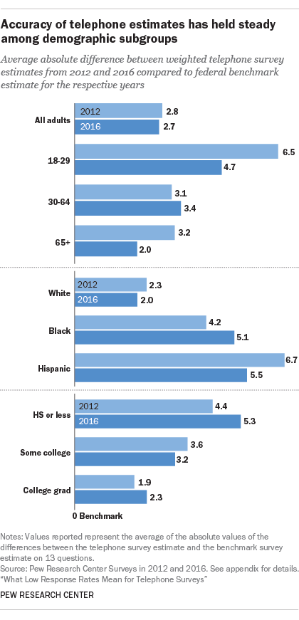
Researchers are, of course, interested in the extent to which nonresponse bias is getting worse over time. Comparing current levels to those measured roughly four years ago, we find that, on average, the accuracy of telephone survey data is at least as high as it was in 2012. On 13 demographic, lifestyle and health questions11that have high response rate benchmark survey data, the average (absolute) difference between the Center telephone estimates and the benchmark survey estimates was 2.7 percentage points in 2016, compared with 2.8 points in 2012.
In general, accuracy as measured by these benchmarks was lower among certain demographic groups such as young adults and minorities. But there is no indication that the biases within groups got worse over time. Most major subgroups – defined by age, gender, race or education – saw the accuracy of their estimates from phone surveys either stay level or slightly improve. For example, across the 13 lifestyle, health and demographic questions with high response rate comparisons, the average difference between the Hispanic adult estimate from Pew Research Center phone surveys and the same Hispanic estimate from the benchmark survey was 5.5 percentage points in 2016 as compared with 6.7 in 2012. The average change in accuracy from 2012 to 2016 was similar for non-Hispanic white. For blacks, however, their phone survey estimates differed from benchmark survey estimates by an average of 5.1 percentage points in 2016 versus 4.2 points in 2012.
Of the groups analyzed, young adults (ages 18 to 29) was the subgroup that saw the accuracy of its phone survey estimates improve the most. In Pew Research Center surveys conducted in 2012, the absolute average difference from the benchmarks reviewed was 6.5 percentage points. In surveys in 2016, the difference from benchmarks on the same set of questions was 4.7 percentage points. This change suggests a small improvement in the quality of the data collected among adults ages 18 to 29 in low response rate phone surveys in 2016 compared with 2012.
Educational attainment is another key demographic grouping we are often interested in. For adults with a high school education or less, their phone survey estimates differed from benchmark survey estimates by an average of 5.3 percentage points in 2016 versus 4.4 points in 2012. The change from 2012 to 2016 in the average difference from benchmarks was less dramatic for adults with higher levels of formal education.
Trends in the composition of survey samples over time
While random-digit-dial survey samples – designed to randomly select respondents and thus create a representative cross-section of a population — start out as generally well balanced, certain patterns of demographic bias quickly creep in once the calling process begins. These are well known by now, which is why Pew Research Center and many other pollsters adjust for demographic imbalances in weighting. The question is whether they are getting worse over time. For the most part, this analysis suggests the answer is no.

Because they are more willing to talk to pollsters, better educated individuals are overrepresented in most telephone surveys, while some racial minorities – especially those for whom English is not their native language – are often underrepresented. The youngest adults are harder for surveys to contact and interview, and city-dwellers (for a variety of reasons having to do with lifestyle and demography) are also more elusive.
To combat these biases, surveys have long relied on statistical weighting as a corrective for known issues around the key set of demographic variables encompassing things like race and ethnicity, age, gender and educational status. Samples are compared with government benchmarks on these core demographic variables and the data are adjusted so that the samples conform to the population. A more complete discussion of weighting can be found here. Surveys with lower response rates may be more subject to these types of biases. But these biases are also a function of aspects of the survey design, such as the inclusion of cellphones in the sample (which helps in reaching a younger, more ethnically diverse segment of the population) or how respondents are selected within households that are reached.
To the extent that declining response rates may be creating more nonresponse bias in surveys, the weighting applied to fix the biases must become more aggressive. This comes with a cost, since weighting also results in some loss of precision in the sample and to smaller effective sample sizes. To assess how the biases in core demographic characteristics are changing over time, the unweighted demographic composition of Pew Research Center samples was compared with government benchmarks on four key variables across a quarter century.
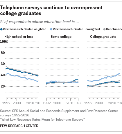
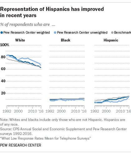
The adjacent graphics illustrate these trends. Each graph plots three lines for each category of one of the variables of interest. For example, the left panel of the first graph shows the share of the sample that is age 18 to 29. The light blue line is the unweighted share of Pew Research Center samples year by year from 1992 to 2016. The gray line is the benchmark for this age group, computed from U.S. Census surveys. The dark blue line is the Pew Research Center trend after weighting has been applied. It should closely match the benchmark line). As the graph illustrates, surveys during the middle years of the last decade underrepresented young adults in this age group, a phenomenon driven by the rapid adoption of cellphones. After Pew Research Center began adding cellphones to its telephone samples in 2007, the shortfall in young adults began to lessen and accuracy on this variable has continued to improve.
As the graphics demonstrate, the magnitude of the observed biases for most variables has varied over this time period. But in general, the biases are not significantly greater than in the past. And samples for age, race and ethnicity have improved in quality in recent years as telephone samples have included more cellphones and incorporated other design changes, such as the routine inclusion of Spanish language interviewing.
Properly representing the population with respect to educational attainment remains perhaps the greatest challenge for low response rate surveys. Pew Research Center surveys, and those like them, have consistently overrepresented college graduates and underrepresented those with a high school education or less over the period examined here. The magnitude of this imbalance has crept upward in the past few years, going from an average of 8 to 10 points during the 1990s and 2000s to 12 to 15 points since 2012. At the same time, the shortfall in non-college individuals has been relatively consistent, averaging about 10 points since the 1990s. As discussed above, weighting helps to correct these imbalances. Still, it would behoove survey researchers to find ways to close this education gap at the data collection stage rather than relying on weighting to fix it.
Phone survey respondents and nonrespondents have similar political profiles based on voter file data; respondents vote more often
In the world of surveys, nonresponse bias becomes a problem when the roughly 90% of people that don’t participate in any given poll are meaningfully different than the 10% who do. One way to find out if this is happening is to learn more about the people who don’t answer. Unfortunately, that is a difficult task, since for any given survey the so-called “nonresponders” have not provided any information to pollsters. However, a developing data resource – large, commercially available national databases of adults, their voter registration status and their voting histories – provides a window into many of these survey nonresponders.
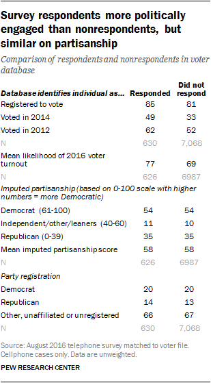
To leverage this, cellphone telephone numbers that were sampled for the survey – numbers for both people responding to the survey and those not responding – were matched to a large national database, called a voter file, that contains information about voter registration, turnout, party registration and estimated partisanship among most U.S. adults. Out of all 31,412 cellphone numbers, 7,698 were a unique match against the voter file. Of these, 630 were respondents and 7,068 were nonrespondents, comprising 22% and 19% of all respondents and nonrespondents respectively.
The upshot: among these uniquely matched cases, a comparison of respondents and nonrespondents survey finds the respondents more politically engaged than nonrespondents but nearly identical in terms of partisan loyalties, a result very similar to that seen in a comparable analysis in 2012.
Respondents were slightly more likely than nonrespondents to be registered to vote (85% among respondents vs. 81% among nonrespondents) and to have voted in the 2012 elections (62% vs. 52%). The overstatement in 2014 turnout – voting in the off-year elections that do not include a presidential contest – is considerably larger (49% among survey respondents vs. 33% among those who didn’t respond). The voter file also includes a measure of the likelihood of voting in 2016,where a score of 0 is very unlikely to vote and 100 is very likely. The mean score for survey respondents was 77, while for nonrespondents it was 69.
By comparison, there is no evidence of partisan bias in the sample. Those who participated in the poll look quite similar to those who did not with respect to partisan affiliation. The voter file includes an imputed partisanship score that varies from 0 (most Republican) to 100 (most Democratic). The mean partisan score for both respondents and nonrespondents is 58. Similarly, the voter file record of party registration shows no bias as well: registered Democrats were 20% of respondents and 20% of nonrespondents; the comparable figures for registered Republicans were 14% and 13%.
Although restricted to only those cellphone numbers that were uniquely matched to the voter file, this analysis – using a very different approach – points to the same conclusion as the GSS trend analysis at the top of the report: despite low response rates, well-designed and carefully weighted telephone surveys still produce accurate information about the political profile of the American public.
As noted earlier in the overview of data sources for this study, the voter file analysis relies upon cases drawn from the larger August 2016 telephone survey (of which the benchmarking analysis was based on a subset of cases) to compare respondents and nonrespondents on measures of political engagement and partisanship. Party registration is taken from state voter records in states that permit registration by party. Partisan affiliation is imputed using a methodology that takes into account party registration (in states where this is available), past participation in partisan primaries and other information about party leanings available from surveys or political campaigns. Voter registration and turnout in specific elections is taken from official records in each state. Turnout propensity is imputed using a methodology that takes into account previous voting history and other variables.
Altogether, 70% of the telephone numbers in the landline frame known or believed to be associated with adults living in residential households matched to at least one voter file record, as did 33% of the sampled cellphone numbers. For many numbers in both samples, matches were made to multiple records in the database. Multiple individuals in a household might be associated with the same phone number, or the phone number might have been assigned to different people over time. Landline numbers had far more multiple matches than cellphone numbers. Inspection of the records indicated that many of these multiple matches were to related individuals in the same household. A decision was made to exclude the landline cases from the analysis entirely (and to exclude the multiple matches in the cellphone frame) because of concerns that including the multiple matches would actually bias the analysis toward finding no differences between the respondents and nonrespondents by introducing more randomness into the respondent data. Thus the analysis was restricted to the cellphone numbers that matched a single record in the voter file. Altogether this was 25% of all cellphone numbers called for the study.
It is important to note that the substantive findings reported here would not be substantially different had the landline cases been included or the analysis not been restricted to cases with a singled matched record.


