
The coronavirus outbreak has taken the lives of nearly 100,000 Americans. Yet since the start of the outbreak, the death toll has been concentrated in a just a few places – mostly large metropolitan areas, especially the New York City area.
The places hit hardest by the coronavirus outbreak – which have relatively large shares of ethnic and racial minorities and residents living in densely populated urban and suburban areas – are almost all represented by congressional Democrats.
A new Pew Research Center analysis of data on official reports of COVID-19 deaths, collected by the Johns Hopkins University Center for Systems Science and Engineering, finds that, as of last week, nearly a quarter of all the deaths in the United States attributed to the coronavirus have been in just 12 congressional districts – all located in New York City and represented by Democrats in Congress. Of the more than 92,000 Americans who had died of COVID-19 as of May 20 (the date that the data in this analysis was collected), nearly 75,000 were in Democratic congressional districts.
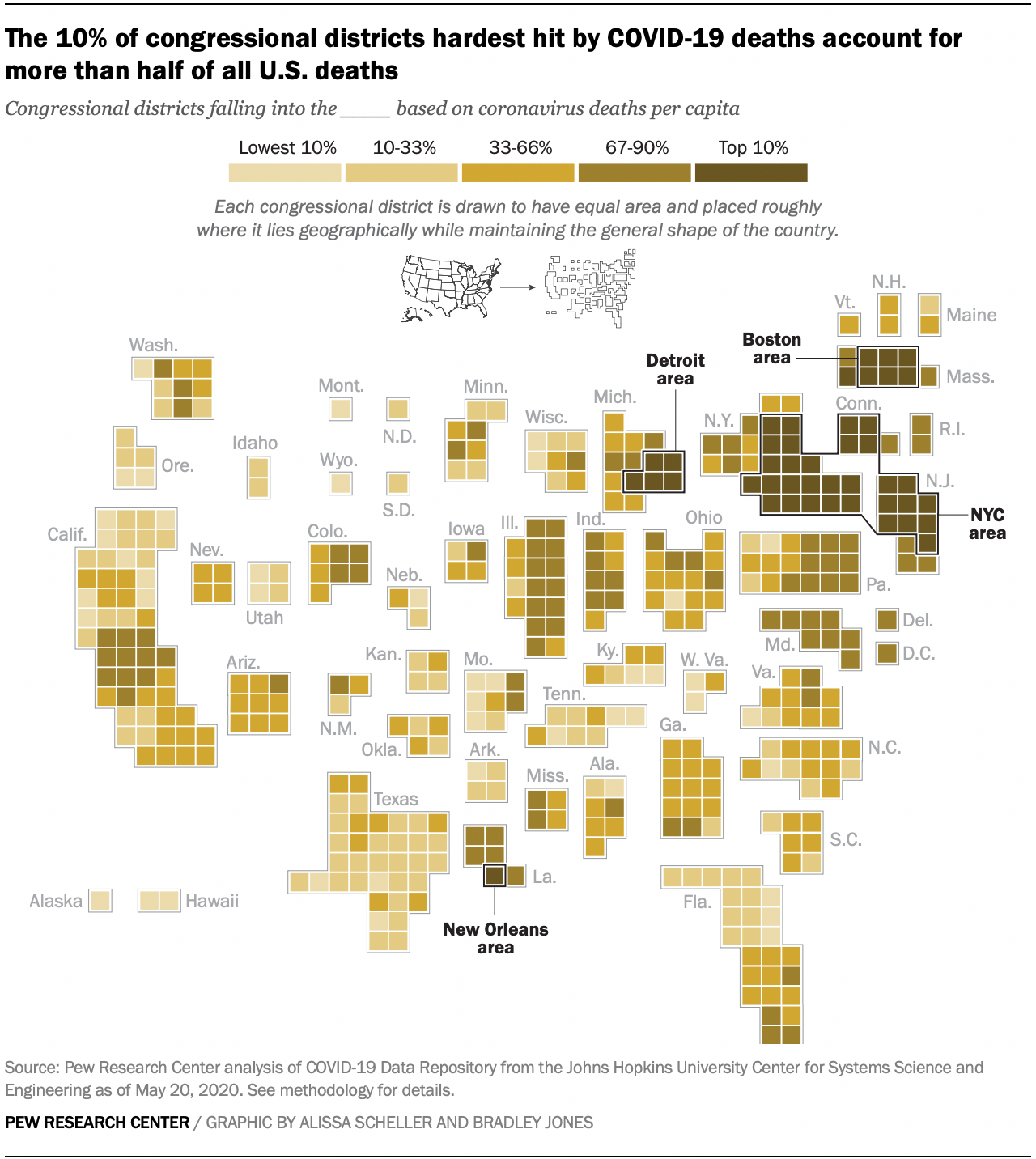
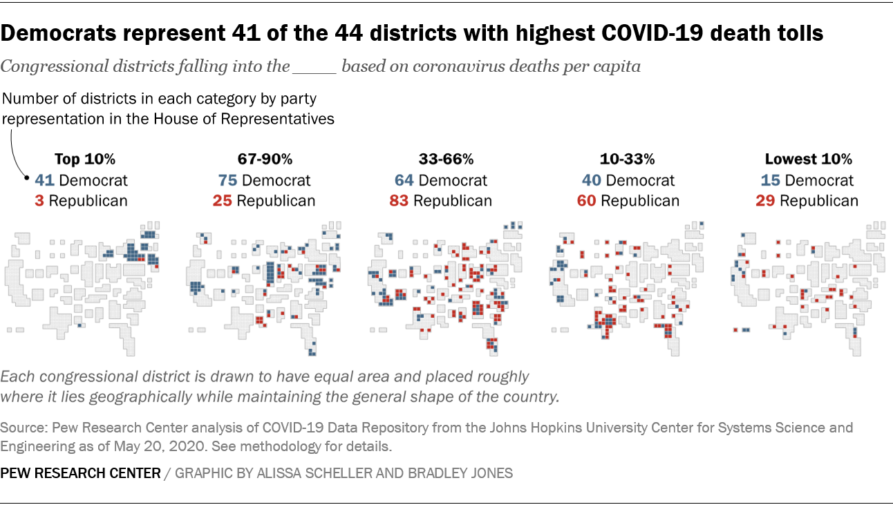
Of the 44 hardest-hit congressional districts – the top 10% in terms of deaths – 41 are represented by Democrats, while three are represented by Republicans. These include the New York-area districts, as well as those in the Boston, Detroit and New Orleans metropolitan areas. The average death toll in each of these hardest-hit districts was 1,122 as of May 20.
The next 100 hardest-hit districts, which represent the remainder of the top third of districts, with an average of 270 deaths, also are disproportionately represented by Democrats: 75 are represented by Democrats, 25 by Republicans.
About two-thirds (68%) of the 44 least affected districts – the bottom 10%, with an average 13 deaths in each district – are represented by Republicans in Congress.
While the current death rates remain highest in districts controlled by Democrats, the trend in coronavirus fatalities over time has been decreasing in Democratic districts steadily since mid-April. In contrast, Republican-controlled districts have not seen the same declines in the trend over time.
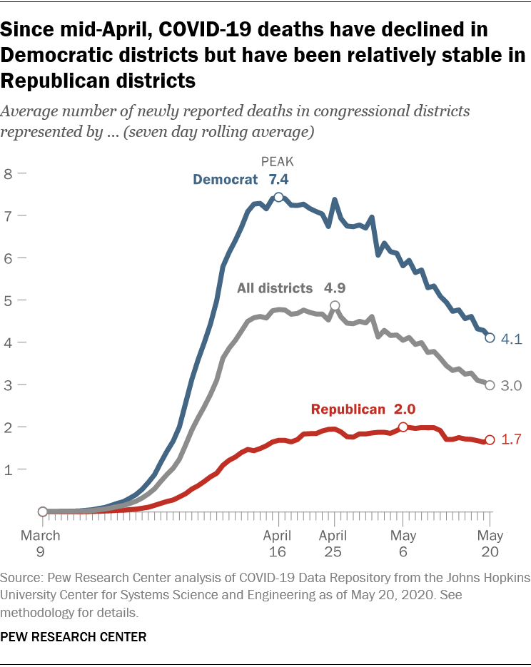
In mid-April, the average number of new deaths across all congressional districts in the country peaked at about five new deaths per day. That figure has declined by about 40% overall to roughly three new deaths per day as of last week.
The decline of deaths in Democratic districts has outpaced the national average, decreasing from an average of more than seven new deaths per day in mid-April to about four new deaths per day in the second half of May.
During this same period, the number of new deaths in districts controlled by Republicans has remained relatively steady (an average of just under two deaths per day in GOP districts).
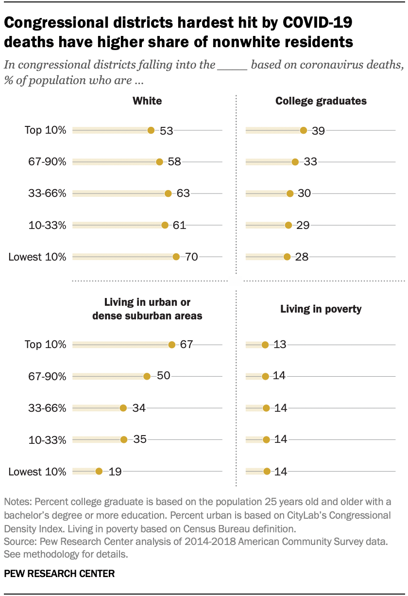
Compared with districts that have seen lower coronavirus death rates, congressional districts hardest hit by COVID-19 deaths generally have higher shares of residents living in urban or densely populated suburban areas, greater shares who are a race or ethnicity other than white, and more residents with a college degree.
Two-thirds of residents of the hardest-hit districts live in urban or dense suburban areas, compared with just 19% of those living in the least hard-hit districts.
Nearly half (47%) of the population of districts that have been hardest hit by the coronavirus do not identify as white (while 53% of residents of these districts are white). By comparison, in the 44 districts that have the lowest coronavirus death rate, seven-in-ten residents are white.
Harder-hit districts also tend to be places where residents have higher levels of formal education: 39% of those living in the districts with the highest death rate have a four-year college degree or more, compared with 28% of those living in the districts with the lowest death rate.
However, there are no differences across districts in terms of poverty rates. About equal shares of those living in both the most and least hard-hit places are under the poverty level as defined by the Census Bureau (13% of those in the districts with the highest death rate, 14% of those in districts with the lowest death rate).
Note: Here is the methodology used for the report.
