
The graphics team at Pew Research Center creates hundreds of charts, maps and other data visualizations every year. We depend on these visuals to communicate our research findings clearly and concisely. At the same time, we try to make our findings visually appealing to readers.
So what makes for a successful graphic? Generally speaking, it must have a clear takeaway, engage readers and display layers of information beyond the immediate point that first catches the eye. Graphics also must be digestible for readers on a small screen, especially as smartphones and internet adoption have become so widespread.
Above all, graphics should tell a story about our research, whether it’s about changing demographics or Americans’ shifting political values. As 2019 ends, here are some of our favorite graphics of the year, with some notes about what went into crafting them.
Small multiples to drive home a point
We frequently use “small multiples,” which are a method of displaying the same chart type in a gridded layout to communicate multiple data series in a compact area. There are several reasons this is an effective approach, including ease of labeling and the ability to include many data points without overwhelming the reader by putting everything in the same chart.
A graphic showing concerns over climate change used this technique to great effect earlier this year. It would have been difficult, if not impossible, to clearly label each of the 10 lines in this graphic if they were all on the same chart. The lines would have overlapped and the chart’s main takeaway – that people in each of the 10 surveyed countries shown have become more concerned about the threat of climate change since 2013 – may have been lost.
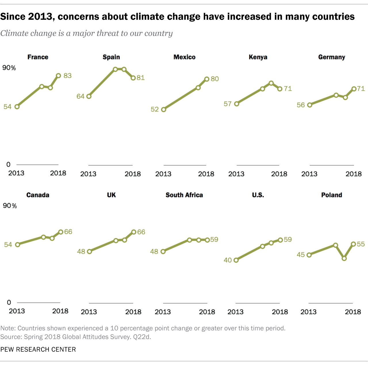
The small multiple approach doesn’t work for every dataset, but when it does, it can be particularly effective at showing trends for different groups or countries without making a reader wade through difficult-to-decipher labels. Here, the fact that the trend lines are all moving in the same direction adds to the graphic’s impact.
Federal workers in red and blue congressional districts
A year ago, the federal government was in the midst of its longest-ever partial shutdown. With hundreds of thousands of federal workers furloughed, we wondered whether there was any difference in the average number of federal employees in House districts held by Republicans versus those held by Democrats. We found that federal workers are represented fairly evenly by each party. To show that, we used a cartogram of congressional districts, showing the overall distribution of federal workers and breaking them out by the party of their elected representative.
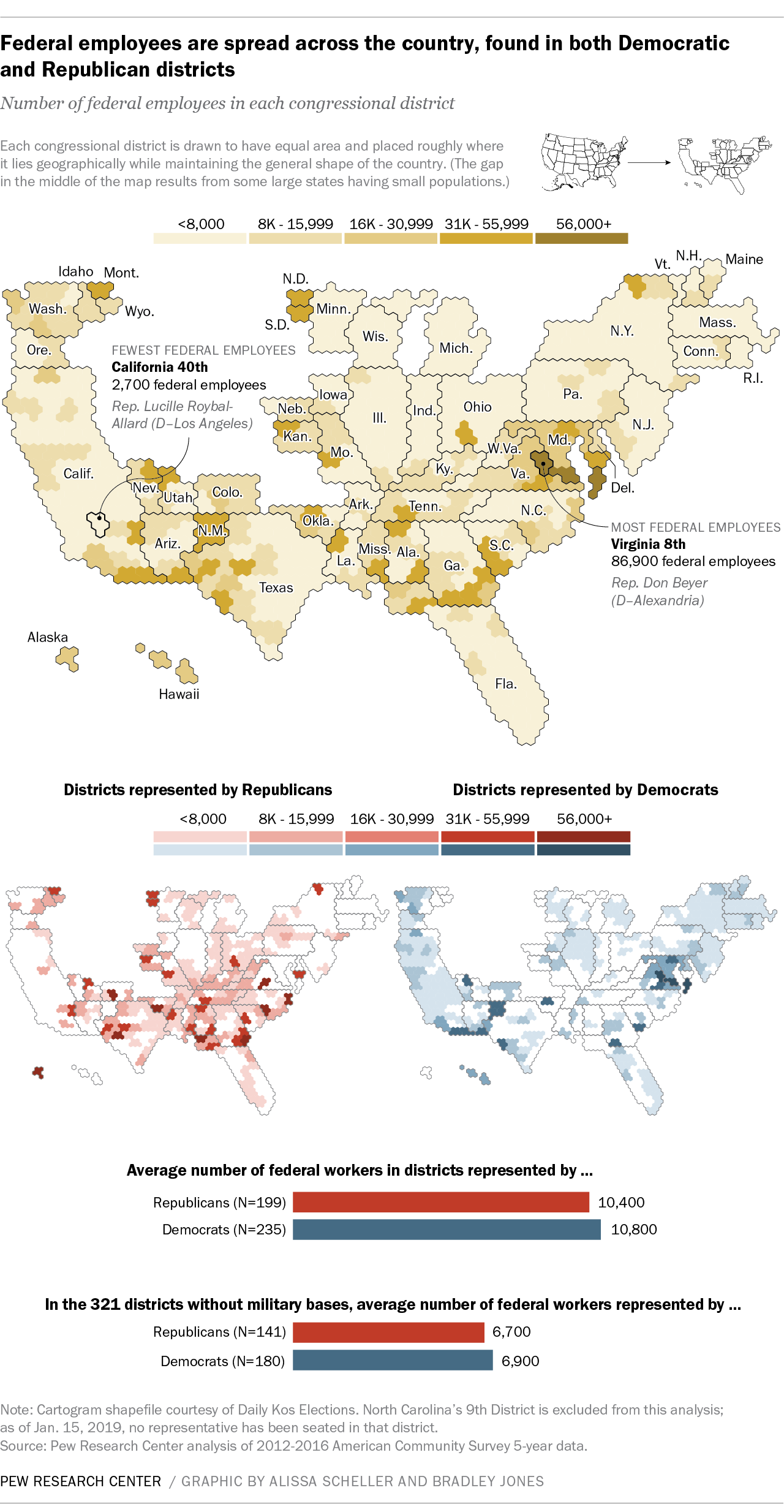
Since this visualization type might be new to readers, we included a small key at the top, showing how a typical map of the United States translates to a cartogram. In the cartogram itself, each congressional district is represented by an equally sized area, rather than its actual geographic area. This prevents the visual overrepresentation of districts that cover a lot of area but have a small population, as well as the inverse. In a geographically accurate map, the 8th congressional district in Virginia – which covers a small land area in and around Alexandria but is home to the most federal employees of any House district – would all but disappear. By using a cartogram and sizing all congressional districts equally, we can easily see that the Alexandria district stands out in its number of federal workers.
An area chart with a twist
Political identity is a key element of many of our findings related to U.S. politics, and partisanship is the predominant divide seen in the public’s views on political issues. But not everyone in the U.S. identifies with one of the two main political parties. In fact, self-identified independents make up about 38% of U.S. adults, counting independents who “lean” toward one party or the other.
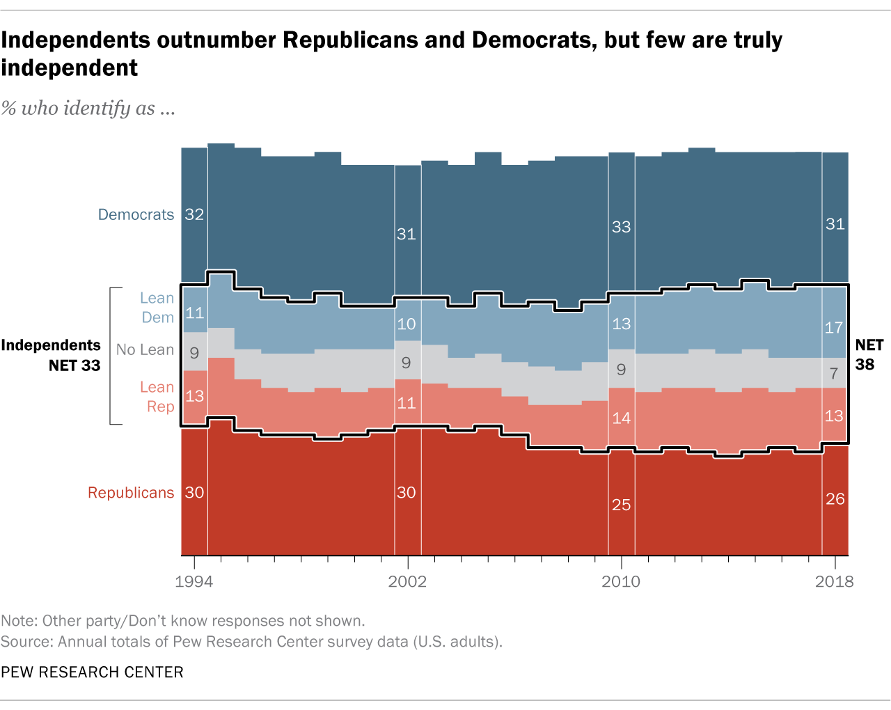
For a report on politically independent Americans, we wanted to visualize two things: how large a share of the population considers itself independent and how few within that group are “true” independents – that is, adults who don’t lean toward either party.
To do this, we built a fairly standard area chart with slices to represent Republicans, Democrats and those who think of themselves as neither. Since the report was focused on independents, we highlighted that 38% slice with a thick black outline. Combined with the saturated colors of party identifiers, this had the effect of making the center section of the chart “pop.” It’s the first thing you notice when you look at the graphic. Then, within that central portion of the chart, we broke out “leaners” and those who decline to lean toward a party.
The chart’s takeaway is that those who call themselves independent are a large group, but the truly independent – the thin, gray slice of Americans in the middle of the chart – are a small group whose share of the population hasn’t changed much over time.
Animated, annotated connected scatterplots
One of the Center’s signature reports each year measures restrictions and social hostilities toward religion around the world. For the 10th edition of this report, designers and researchers wanted a strong visual narrative to walk readers through 10 years of data. The result was this interactive.

In addition to an animated custom cartogram and small multiples, the interactive uses connected scatterplots. A connected scatterplot isn’t a new idea: A designer might use this format to show change over time on both axes, rather than just one (as a line chart would). However, connected scatterplots come with challenges. It’s not a common type of visual, so readers may not be familiar with how to read it. And there’s a risk of misinterpretation because readers usually expect to read a time series from left to right. To mitigate these concerns, we used animation.
First, when the initial scatterplot appears, only one data point is shown, alongside an explanation of what it represents. As the reader scrolls down, another annotation appears, describing the data and how to read the chart. When the full scatterplot appears on the screen, the line connecting each point animates, highlighting each new year as it appears on the chart, in sequence. We repeat this technique for several countries throughout the interactive, reinforcing how to read the chart. Using animation allows us to show all the data – but not all at once, so as not to be overwhelming.
How a computer might ‘see’ someone as male or female
Pew Research Center is increasingly using computational social science techniques to study the world, which means we also increasingly need visual explanations of these complex approaches. For a recent project using large-scale online image analysis, we wanted to explain in an engaging way how machine vision works, while also demonstrating its pitfalls and limitations. To do so, we developed an interactive feature that lets users try to trip up an algorithm that classifies photos as depicting a man or a woman.

This visualization presented several challenges. One was that machine learning is a complicated concept, making it critical for designers and researchers to use simple visuals and textual explanations. Another was that the images typically used to create such algorithms might not be suitable for publication, in part because photos might be too grainy or low-quality. To address this issue, we decided to take visually consistent, high-quality photos of our own staff.
The resulting interactive uses a simple visual interface – a grid of colored squares placed over each photo – to show how covering a small portion of a photo can cause an algorithm to change its initial classification of an image from man to woman or vice versa. As with the connected scatterplots, we used animation and interactivity to create a clear sequence that readers could walk through at their own pace. The interactive revealed that the algorithm’s classifications were often dependent on seemingly arbitrary inputs.
