Every year, designers at Pew Research Center create hundreds of charts, maps and other data visualizations. We also help make a range of other digital products, from “scrollytelling” features to quizzes based on our research and large interactive databases.
All of these products are aimed at communicating our research findings clearly and concisely. Our graphics must have clear takeaways and engage readers. They also must be easily viewed on small screens, especially as smartphones have become so widespread.
Ultimately, our graphics should tell a story about our research, whether it’s about changing media habits or shifting social norms. Below, we’ll highlight a few of our favorite visuals from 2025 and walk through how we made them and what makes them successful.
Related: Striking findings from 2025
Showing shifts over time with alluvial diagrams
Alluvial diagrams are named after the alluvial “fans” that naturally form in sediment from streams of water. Sometimes called Sankey diagrams, they’re a unique way of showing changes over time. They allow us to show changes in the composition of various categories of data between two points in time.
In the two examples below, bars and columns represent the categories in each year, while the flows between them show changes in the composition of those categories. We could easily show this data as a simple bar or column chart, but alluvial diagrams allow us to show not only that shifts happened, but also how they happened.
The first graphic shows how the American electorate shifted between 2020 and 2024, leading to President Donald Trump’s return to the White House:

This chart uses a paneled version of an alluvial diagram to highlight different voter flows between 2020 and 2024. In both the static and interactive versions of the visualization, we walk readers through the decisions that three categories of Americans – 2020 Trump voters, 2020 Biden voters and 2020 nonvoters – made in 2024. With this type of diagram, we can show how relatively small changes drove a larger electoral shift.
Alluvial diagrams are particularly useful for survey data that comes from the Center’s American Trends Panel (ATP), a group of U.S. adults who agree to take our polls regularly. With a survey panel like the ATP, we’re able to poll the same people regularly, and alluvial diagrams allow us to show how their attitudes and experiences have – or have not – changed over time.
We also used an alluvial diagram – albeit in a slightly different way – to visualize how Israeli Jewish adults have switched their affiliation within Judaism since childhood. The diagram below shows how Israeli people were raised and how they currently identify:
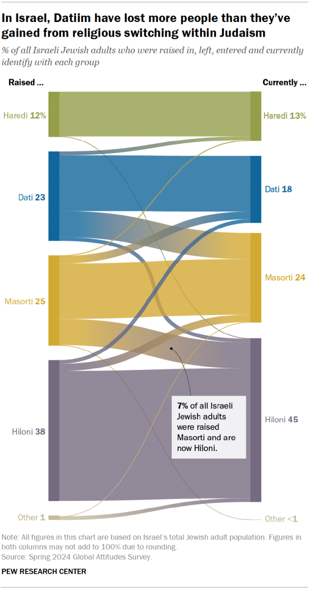
At the Center, we don’t use alluvial diagrams often. But when called for, they can be a powerful way of breaking down changes in various categories over time. We’ve also used them to show shifts in U.S. public opinion about China, acquittal and conviction rates in federal trials, and how the number of women’s colleges in the United States has declined over time.
Adding context and making differences stand out
Sometimes we want to add another layer of data to a standard type of chart, such as a bar or column chart.
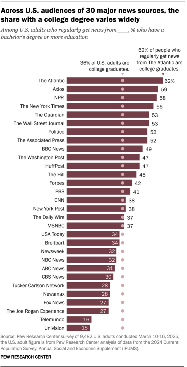
In a few graphics this year, we included text annotations, dots or lines to give charts an extra layer of information. For example, the chart below shows how the U.S. audiences of major news outlets differ by education level. To provide important context, we added dots for each bar to show the educational attainment of the U.S. adult population overall. This lets readers see how an outlet’s readership compares with the larger population:
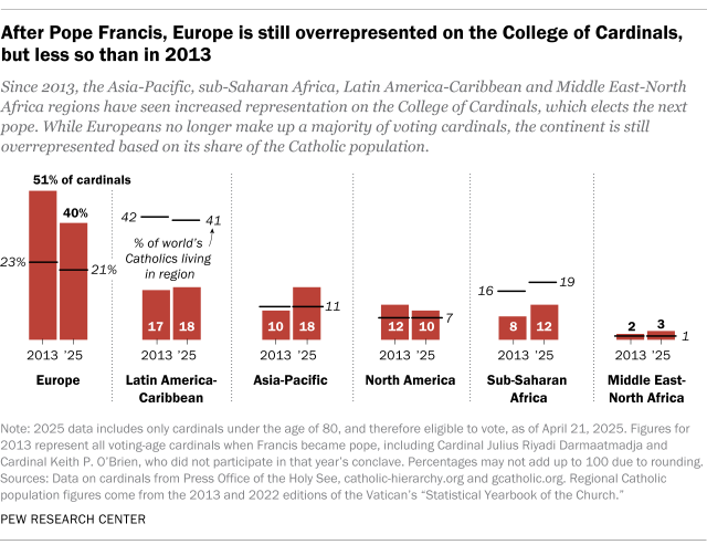
Similarly, the chart below shows the share of Catholic cardinals who come from each world region, along with annotations highlighting the share of the world’s Catholics who live in that region. The chart allows readers to see which regions are under- or overrepresented in the College of Cardinals:
We used another type of visual – known as a bullet chart – to show that Christians are the majority in 60% of the world’s countries, despite accounting for just 29% of the world’s population. This type of visualization is good for making comparisons and can convey a lot of information in a compact space:
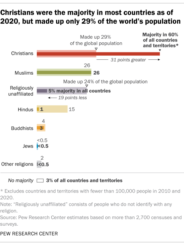
In the above chart, we’re communicating several things, including the share of countries and territories where a particular religious group makes up the majority; each religious group’s share of the total global population; and the gap between those two numbers. It’s a lot to pack into a small space, but the bullet chart format, along with text annotations, makes it possible for readers to quickly see and understand these comparisons.
Using nature-inspired visuals: Rose plots and beeswarms
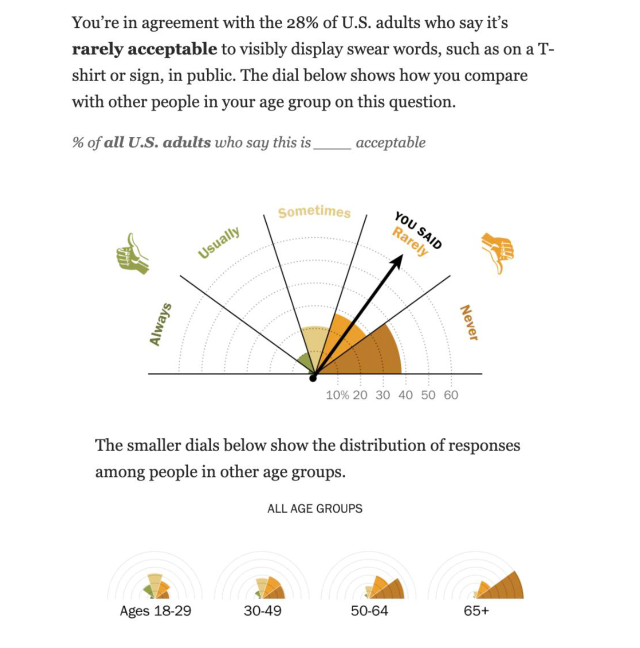
Two less common – but impactful – chart types are rose plots and beeswarms. When used with the correct data, these visualizations can effectively show direction and magnitude (in the case of a rose plot) and distributions within a dataset (in the case of beeswarms).
Rose plots
Traditionally, rose diagrams (or polar area diagrams) are similar to pie charts. But their slices are at equal angles, with the length of each slice representing the underlying data. These charts were first popularized by Florence Nightingale, who used them to visualize mortality rates in the British Army during the Crimean War.
This year, we used a version of a rose plot in an interactive feature about public behaviors in the U.S. In the snippet below, you can see how someone navigating through the interactive answered a particular question, shown in the form of an arrow. The colored slices (or rose petals) represent the share of Americans who selected each answer option, allowing users to compare their own answers with those of the overall population. And the smaller rose plots at the bottom show how Americans’ responses to this question differ by age group:
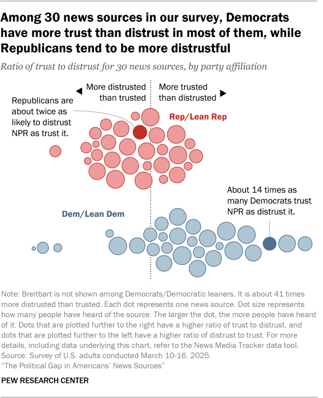
Beeswarms
Beeswarm plots take their name from, well, swarms of bees. They’re a kind of scatterplot that displays individual data points with no overlap, constructed by showing points side-by-side along one axis. This creates a “swarm” effect (if you think of each data point as a bee), allowing viewers to see the density of the data at particular points along the axis.
We used this approach in a graphic showing Americans’ trust and distrust in various news sources. As shown below, each dot in the graphic represents a news source, while the size of the dot shows how many people have heard of the news source. The dots are placed along a trust/distrust axis, where dots that are plotted farther to the right have a higher ratio of trust to distrust – and vice versa. Responses are also grouped by party affiliation, showing that Democrats and those who lean Democratic trust more news sources, while the opposite is true of Republicans and Republican leaners:
We published many more graphics this year apart from the ones discussed in this post. Here are some other visualizations worth checking out:
