
Have more Canadians migrated to the United States or have more Americans moved north to Canada? Where are most of New Zealand’s migrants from? And what up with the 2,000 or so Argentines who’ve relocated to Bangladesh?
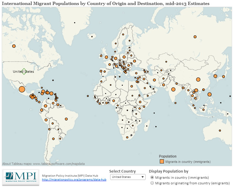
The Migration Policy Institute, a Washington, D.C.-based nonprofit research group, has used United Nations migration estimates to produce this fascinating, and somewhat addictive, interactive map. Choose from the “Select Country” pull-down menu below the map, and it will show you (to the nearest thousand) how many immigrants to and emigrants from that country there were as of last year, along with those migrants’ countries of origin or destinations.
We learn, for instance, that Russia and Ukraine are each other’s leading sources of migrants, with more than 2.9 million Ukrainians now living in Russia and nearly 3.5 million Russians living in Ukraine. Saudi Arabia and the United States are the top destination countries for Syrian migrants (139,000 and 76,000, respectively). The U.S. draws immigrants from nearly every country in the world, from Mexico (nearly 13 million) to Mauritius (3,000).
