SPOILER ALERT: If you haven’t yet taken our Science Knowledge Quiz, please do so before reading this any further because we give away one of the answers.
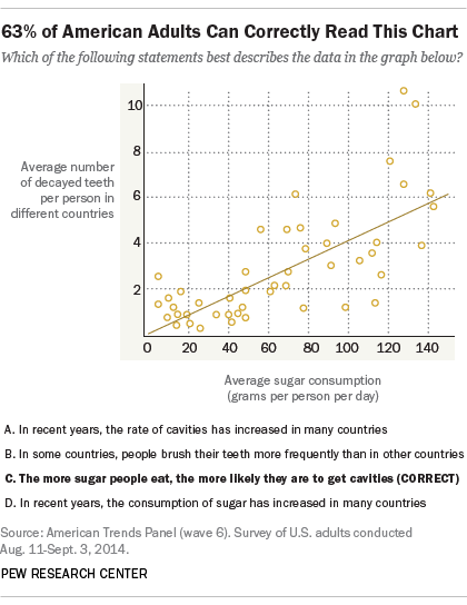
In a recent survey of what Americans know about science, we asked people to interpret the chart you see here and tell us what it showed. Six-in-ten (63%) identify the best interpretation of this chart as “the more sugar people eat, the more likely they are to get cavities.”
This kind of chart — known as a scatterplot — is very familiar to people who are used to working with numbers, such as economists, scientists, researchers and data journalists. It is a good way to show a relationship between two variables.
Perhaps unsurprisingly, the people we surveyed who were most likely to interpret our scatterplot example correctly were the college educated. About eight-in-ten (79%) of those with a college degree and 84% of those with a postgraduate degree chose the right answer out of four options. In contrast, only half of those with a high school education or less drew the correct conclusion. The education gap on the scatterplot question was second only to the question we asked about what property determines the loudness of sound.
So, just why is the scatterplot hard to read for folks with less education? I asked Alberto Cairo, who holds the Knight Chair in Visual Journalism at the University of Miami and is author of “The Functional Art.” (He has another book, “The Truthful Art,” coming out next year.)
“We forget that we don’t just understand graphics automatically,” Cairo said. “The bar chart, the line chart, we are taught how to read those in school. We’re taught how to understand graphics.” And in most cases, including for Cairo himself, students aren’t exposed to the scatterplot in grade school. It’s mainly students who take a course in economics, statistics or some other scientific field who are exposed to the relationship analysis the scatterplot illustrates.
Among data journalists, Cairo says, there’s a common thought these days that graphics should be instantly understood. But he disagrees. “That is completely false,” he said. “Visualizations should be read. They are like a piece of text. The first time I saw a scatterplot many many years ago I was flabbergasted. I thought, what is this? I spent five minutes with it.”
But once you read one, you know how to read another. It’s a matter of exposure, he says. The fact that about six-in-ten adults in our survey were able to read a scatterplot, therefore, was good news, he said, because it’s surprisingly higher than what he would have thought.
“Graphics have grammar. They have vocabulary,” he said. “The results mean we are expanding our education. We’re expanding our vocabulary.”
The scatterplot chart has become more popular in recent years, moving out from just academic textbooks and papers to more common usage in newspapers and online media. Among graphic designers, it’s a more sophisticated chart — a step above the typical bar, line or pie chart.
But it does take a little more time to read. First, it is not a simple comparison of just two elements as you would find in a bar chart, or numbers over time as in a line graph. The scatterplot plots two variables in relationship to each other.
One important point to understand is that the scatterplot shows correlation, not causality, said Pew Research Center’s art director, Diana Yoo. The chart we used was adapted from a sample test of the OECD’s Programme for International Student Assessment given to 15-year-olds in more than 70 countries. While sometimes people see a causal relationship, the chart only shows an association between average sugar consumption and average number of decayed teeth.
Often, a scatterplot includes a line, known as the “line of best fit,” that helps to summarize the underlying relationship between two variables. The slope of this line can help illustrate whether an increase or decrease in one variable is associated with an increase or decrease in the second. In our example, the tooth decay scatterplot shows a positive relationship. (A negative one would slope down from left to right.) You can see the strength of the relationship between two variables by how closely the data points are clustered around the line of best fit: the more data points on or near the line of best fit, the stronger the overall correlation.
At Pew Research Center, we’ve published lots of data in scatterplot charts, and we’ve found them especially useful when we have a large number of data points to show, such as the share of eligible Hispanic voters in each Congressional district, or countries, such as wealth relative to food affordability, or even to paint a picture of who’s having a “good”day.
It’s safe to say that most data journalists are scatterplot fans. But what’s next? Cairo says the nation’s graphics vocabulary can expand even further. Echoing New York Times journalist Amanda Cox, he said the next hot graphic is the histogram. What’s that? View one of ours and tell us if you can read that, too.