It was five years ago this month when the financial crisis, which had been steadily worsening for months, reached critical mass and exploded with a force that, for a while, threatened to take down the entire global economy. But a lot has happened since then, and who can remember all the details? Was it Bear Stearns or Lehman Brothers that collapsed first? Wasn’t TARP enacted under President Obama? And what did TARP stand for anyway?
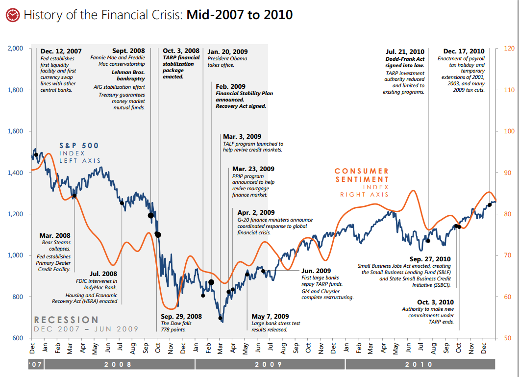
The Treasury Department has distilled the complex series of corporate and governmental actions and responses, from late 2007 through 2010, in this nifty chart. It’s part of a PowerPoint deck Treasury created to show how much progress has been made in the past five years. (For a thorough examination of the crisis and its causes, check out the Financial Crisis Inquiry Commission’s 2011 report.)
But “progress,” like beauty, is in the eye of the beholder, and while Treasury’s slideshow packs a lot of information into a fairly small space, it rather understandably tends to put the government’s actions in the best light. For a useful annotation and corrective, check out this post by Washington Post financial reporter Neil Irwin.
And even though the Great Recession officially ended in June 2009, given the recovery’s slow pace and uneven impacts it should come as no surprise that, as the Pew Research Center reported Thursday, nearly two-thirds (63%) of Americans say the nation’s economic system is no more secure today than it was before the crash.
