The Federal Reserve Act gives the nation’s central bank two main tasks: maximize employment and maintain long-term price stability. While both are worthy goals, economists have known for a while that achieving both low inflation and maximum employment simultaneously is, at best, difficult (the relationship is a lot more complicated than the simple tradeoff often cited in the media).
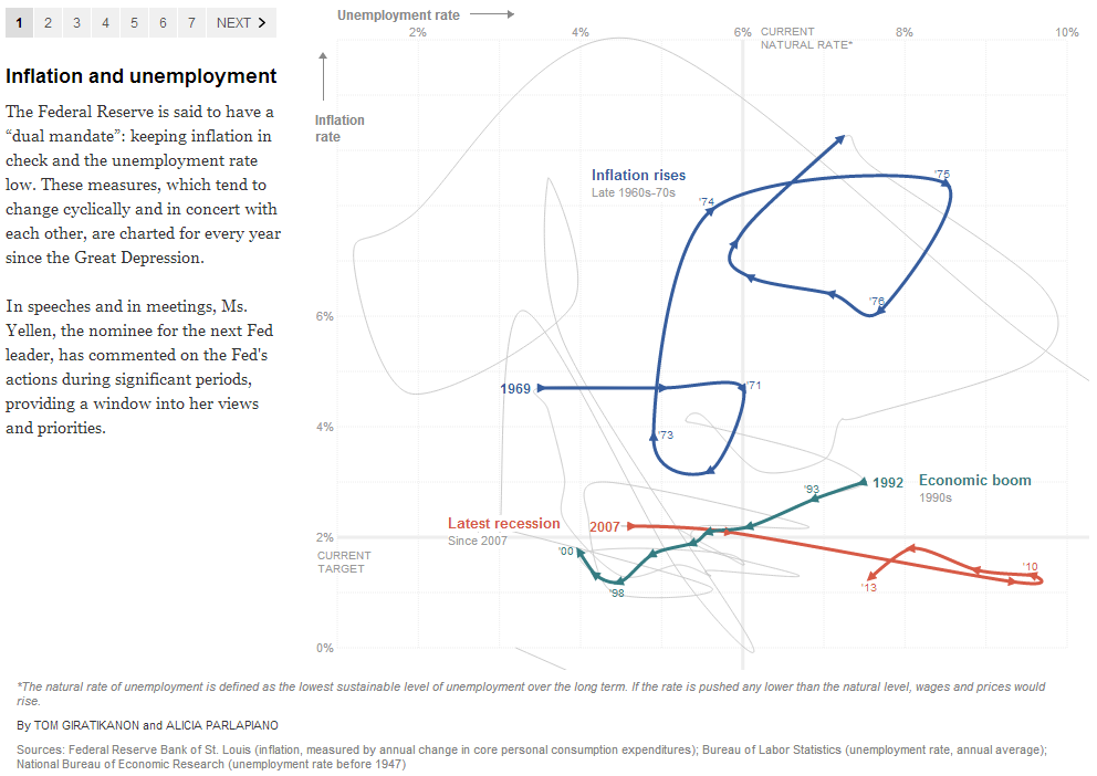
The complex interplay between the Fed’s dual mandates is well captured in the spaghetti-bowl swirls of this New York Times chart, which covers more than eight decades of U.S. economic history. The twisting line traces average annual unemployment and core inflation (the Fed’s preferred measure, which excludes volatile food and energy categories) for each year since the onset of the Great Depression.
During the stagflation of the 1970s, unemployment and inflation both rose sharply; inflation remained high even after unemployment began to fall. During the 1990s boom, inflation and unemployment both fell, which few economists at the time thought possible. And in the ongoing recovery from the Great Recession, inflation has remained at exceptionally low levels while unemployment has slowly fallen.
The Times chart includes comments that President Obama’s Fed chairman nominee, Janet Yellen, has made in speeches and meetings on the Fed’s past actions. Should Yellen be confirmed, she’ll face the same challenge that has bedeviled Bernanke: How to use the tools of monetary policy to get the U.S. economy out of low gear without also setting off uncontrolled inflation.

