
This weeks’ massive release of 2012 Medicare billing and payment data stimulated a rush of creativity among data visualizers. But the sheer size of the data dump — covering $77 billion paid in 2012 to 880,000 doctors and other health care providers — posed challenges in deciding what to chart and how to display it, from high-level overviews to detailed interactive maps to graphics focusing on the biggest recipients of Medicare reimbursements.
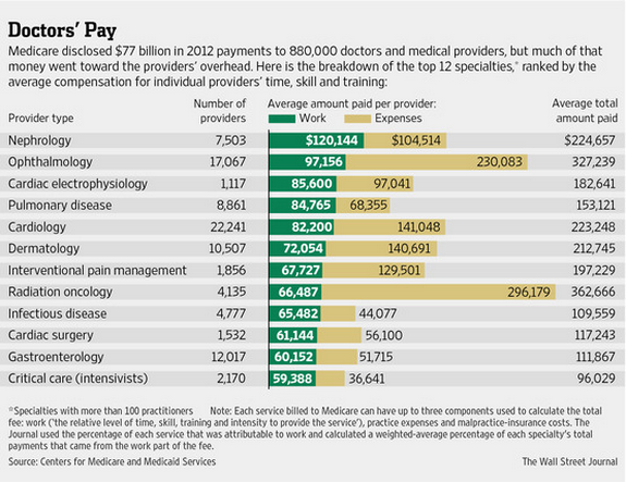
Among the trove of charts, we chose this one, from The Wall Street Journal, for conveying a great deal of nuance in a reasonably simple, straightforward graphic. It not only makes the point that Medicare reimbursements are gross, not net, income, but that specialties differ considerably on overhead costs. Oncologists, for example, use expensive chemotherapy drugs, while many ophthalmologists administer pricey drugs such as Lucentis (for macular degeneration) in their offices.
Overall, according to The Washington Post’s analysis, 43% of the roughly $64 billion paid by Medicare to doctors in 2012 went to office overhead, while 13% went to drugs and other costs and 3% paid for malpractice insurance. That still left 41%, or $26.2 billion, as compensation for the doctors.
