
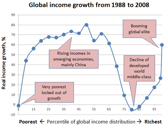
Sometimes a graphic inspires us not by its creative animations or mesmerizing interactive elements, but by how much it can explain with how little. That’s why we like this chart from Branko Milanovic, lead economist at the World Bank’s research department (as annotated by James Plunkett, policy director at U.K. think tank Resolution Foundation). Milanovic likes to call it, “How the world changed between the fall of the Berlin wall and the fall of Wall Street.”
The vertical axis measures real income growth (measured in constant dollars on a purchasing power parity basis) between 1988 and 2008. The horizontal axis shows not time but income levels, from lowest to highest. For example, the second dot on the chart marks the 10th percentile of income, meaning people who outearned just 10% of the world’s population; that group saw its real income rise more than 40% over that 20-year period.
The top 1% clearly did well during the period under study, but Milanovic notes that the biggest gains occurred further down the income ladder. “It is there…that we find some 200 million Chinese, 90 million Indians, and about 30 million people each from Indonesia, Brazil and Egypt,” he writes. “These two groups — the global top 1% and the middle classes of the emerging market economies — are indeed the main winners of globalization.”
[i]
[g]
