
In the years following the Great Recession, the share of Americans who live in middle-income households held steady at 51% in 2013, the same share as in 2010, according to a new Pew Research Center analysis.
While the muddled recovery has yet to bolster the middle, this flat trend might actually be good news because, for now, it stems a decades-long slide. Back in 1970, 61% of adults lived in middle-income households.
But who, exactly, is middle income? First, we should note that middle income is not necessarily the same thing as middle class. There are many different ways to measure America’s “middle,” including by people’s education, occupation, wealth, social values or some combination of the above. There is no universal definition.
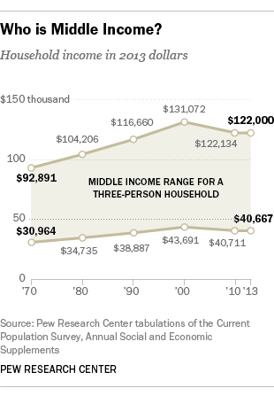
Our analysis is based on household income data from the U.S. Census Bureau. First, we adjust incomes for family size. Incomes of households of below-average size are scaled up (because their dollars go farther), and incomes of households of above-average size are scaled down (because their dollars do not go as far). This process ultimately adjusts household incomes to reflect the standard of living of a three-person household.
Finally, we compute the median of the size-adjusted household incomes. Middle-income households, by our definition, earn as much as twice the median income or as little as two-thirds the median. This results in a range of $40,667 to $122,000 for a middle-income American household of three in 2013.
Now, let’s take a look at our major findings on the trends for America’s lower-, middle- and upper-income households.
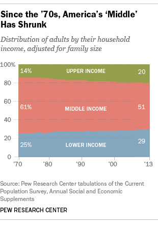
The share of adults who live in middle-income households has eroded over time, from 61% in 1970 to 51% in 2013. Although the share is unchanged in recent years – it was the same in 2010 – the erosion over the last four decades has been sure and steady, through economic ups and downs. If past trends continue to hold, there is little reason to believe the recovery from the Great Recession will eventually lead to a rebound in the share of adults in middle-income households.
The shrinking in the middle of the income distribution is not all bad news, however. Yes, the share of adults living in lower-income households has increased, up from 25% in 1970 to 29% in 2013. But more adults now live in upper-income households, up from 14% in 1970 to 20% in 2013.
The narrowing in the middle happened for all major racial and ethnic groups. From 1990 to 2013, the share of adult whites and Asians living in middle-income households decreased the most, from 58% to 53% and from 56% to 50%, respectively. The decline was less pronounced among Hispanics (from 48% to 47%) and blacks (47% to 45%).
Nonetheless, sharp differences persist across racial and ethnic groups in the distribution of adults by income tiers. In 2013, 44% each of Hispanic and black adults were lower income, compared with 23% of whites and 24% of Asians.
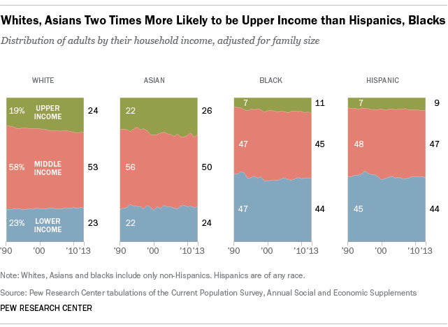
At the top, about one-in-four whites and Asian adults are upper income, compared with only about one-in-ten Hispanics and blacks. There is no meaningful change in these gaps in the past two decades. (Consistent data on racial and ethnic categories are only available for 1987 onward.)
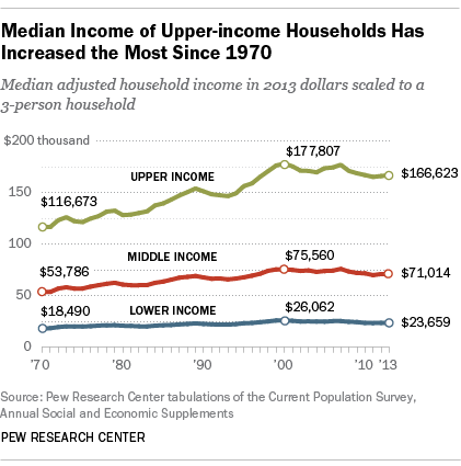
Incomes of all households are higher today than they were in 1970. Upper-income households saw the most growth, as their median income increased 43% from 1970 to 2013. Middle-income households gained 32% over the same period, and the median income of lower-income households increased 28%. (All incomes are adjusted for household size.)
However, the overall gains mask a lengthy period – a lost decade, and then some – of losses from 2000 to 2013. During this time, the median incomes of lower-, middle- and upper-income households have fallen by 9%, 6% and 6%, respectively. Currently, the incomes of these households are comparable to what they were in 1997.
Upper-income households command a higher share of the U.S. aggregate household income than ever before. That is because the median income of upper-income households has risen the most, and also because a greater share of adults now lives in upper-income households.
In 2013, upper-income households accounted for 47% of aggregate household income, more than double the share of adults (20%) living in those households. Middle-income households accounted for 44% of aggregate household income, less than the share of adults (51%) living in those households.
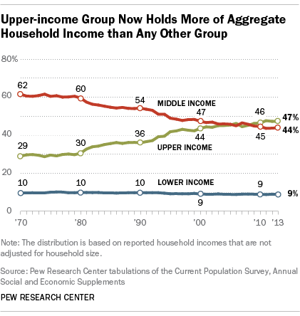
Today’s distribution of aggregate income stands in stark contrast to what it looked like four decades ago. In 1970, middle-income households accounted for 62% of aggregate income, similar to the share of the adult population (61%) in those households. Upper-income households held a 29% share in the aggregate income of U.S. households in 1970, and 14% of the adult population lived in those households.
These data points are further confirmation of the nation’s growing economic inequality. A previous analysis by the Pew Research Center using a different data source determined that only upper-income families have experienced significant gains in wealth since the early 1990s. Researchers who focus on consumption have also found evidence of rising inequality, albeit not necessarily to the same degree as the increase in income disparities. Americans are seeing it too. In a January 2014 Pew Research Center survey, 65% of adults said the gap between the rich and everyone else had increased in the past 10 years.

