
The heart of our work at the Pew Research Center is data. And data visualizations that tell clear stories about our research — whether it be about American politics or our changing demographics — are just as important as the words we write in a report. So, what makes a successful data visual? We think it should present information clearly and concisely, engage the reader and allow them to explore that information (Hat-tip to Alberto Cairo’s Functional Art; we’re also big fans of Dona Wong’s Wall Street Journal Guide to Information Graphics).
This year, the design staff looked back through our 2014 archive, and these graphics stood out as almost universal favorites. These visualizations presented a particular challenge and, for each of them, we talk about the approach we took in presenting the data.
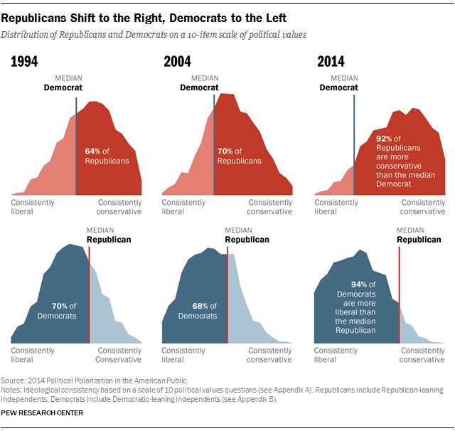
For the powerful findings from our political polarization report, we knew that we’d need an equally powerful graphic presentation. In this case, we used a smoothed histogram — a graph that plots the frequency of variables within a range of data — to display the change in ideological consistency. The resulting “moving mountains,” as we called them (see an animated version here), are both visually unique and present clear visualizations of the growing political divide in the U.S. over the past two decades. This chart is especially interesting because it quantifies a steady increase in the percentage of Democrats whose ideological preferences fall to the left of the median Republican, and a nearly equal and opposite shift for Republicans.
The histogram has a reputation as one of the wonkier chart types; indeed, they are rarely seen outside of scientific and academic contexts. As visualization geeks, we were pleased to see them reach a wider audience.
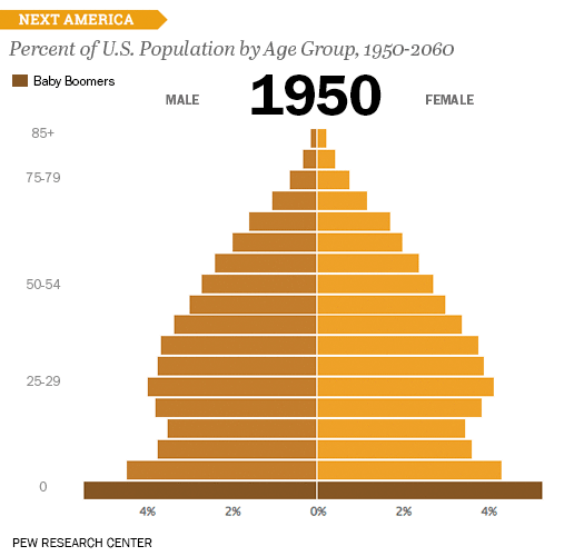
The U.S. age pyramid from The Next America makes great use of animation to illustrate how age demographics are shifting over time. Line charts also are a good option for showing change over time in a single view, but with this many variables, there would be too many lines to follow. The bar chart allows us to show many age ranges at once, and the animation shows how the changing lengths of the bars alter the shape of the population over time. The two shades of orange help readers differentiate between the data for men and women, but still allow the opposing bars to read as a whole. Baby boomers, identified with darker shading, are easy to pick out as they rise through the timeframes. The interactive version of this graphic invites readers to find themselves in it by viewing data for years of particular interest to them and checking how their age cohort relates to the other generations.
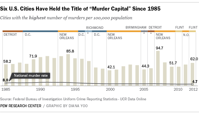
This chart, in a post written after a wave of killings in Chicago on July 4, contains quite a bit of data. But it organizes the information in a way that allows the parts to be easily processed. We wanted to be able to show change over time, but we couldn’t present the discrete data points on a continuous line because they represent data from different cities in each year.
So, we started with a column chart. To allow readers to visually trace the peaks and valleys of the bars, we left them all one color. Then, we added colored bars along the top and dotted lines to group the bars so readers could quickly see the ‘streaks’ of years where the bars represent the murder rate in each city. The colors more quickly identify the cities as they are repeated. For example, you don’t need to count the bars to be able to tell that the color orange appears the most, and from that, you can identify New Orleans as the city that has appeared most often at the top of the murder rate list.
Finally, we provided the national murder rate as a continuous line to provide additional context, so readers wouldn’t have to guess whether 58.2 is a little higher than the national average, or significantly higher. We designed this graphic to be easy to read at a glance, but the additional layers of information allow readers to explore it further.
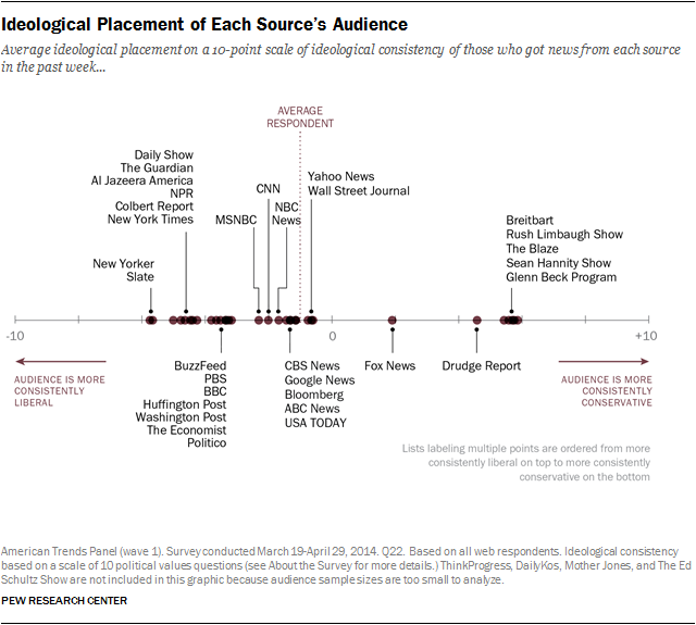
There are about 90 words in this graphic illustrating a report on political polarization and media habits, and that doesn’t include the subtitles and footnotes. That is a lot, and when a designer has a lot of text that can’t be left out, a data table is sometimes the only way to organize the information in a compact space. But we wanted to avoid doing a table that just listed the media platforms one after another. This graphic succeeds as an alternative to a table in a carefully labeled distribution plot.
Tables are a good choice when the intent is for the reader to quickly look up a particular value and to make one or two comparisons between entries. But with these data, a dot plot works better than a table. Unlike a table, a dot or distribution plot allows readers to see the entire media landscape at a glance, and see each outlet, by name, within that context. For example, displayed in a data table, the Wall Street Journal, Fox News and the Drudge Report would appear as a list, evenly spaced. But this graphic shows that the ideological distance between those three audiences accounts for about half of the entire ideological range. Elsewhere on the line, clusters of closely spaced dots tell readers which media outlets have ideologically compatible audiences, such as Rush Limbaugh and Sean Hannity, or the Colbert Report and the Daily Show. Careful labeling helps reinforce these meaningful spatial distinctions: The labels for media outlets with ideologically similar audiences are simply presented in short columns of text above and below each cluster, instead of incrementally spaced from left to right. Doing so would intrude on the graphic’s meaningful white space, and probably require an overwhelming number of pointer lines.
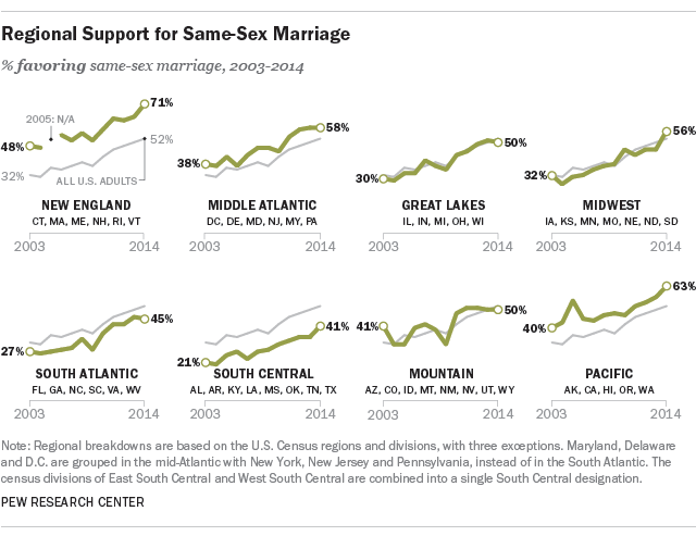
A successful data visualization conveys meaning in a clear and compelling way, sometimes in just seconds. We think that the best do so using as little ink (or as few pixels) as possible. Small-multiples, which allow for easy comparison among data points, are a wonderful format for achieving this.
In the above graphic that accompanied a post on regional differences in views of same-sex marriage, we first tried a map-based approach. When dealing with geographic data, it can be tempting to use a map. But too often, we see this can result in maps that make the data harder to follow, maps that fail to account for population density, and even maps that have no function at all. In this case, while each state’s position on same-sex marriage is at the core of the data, the geographic position is secondary, so we focused not on the map, but on how the support changed over time. The addition of the grey “all U.S. adults” line shows how each region’s views compare with the U.S. overall.
