
After many years of historically low inflation, consumer prices in the United States continued their steep ascent last month. The consumer price index, the most widely followed inflation gauge, increased 7.0% from December 2020 to December 2021 – its highest rate in nearly 40 years.
The CPI – or, to give it its full name, the Consumer Price Index for All Urban Consumers (CPI-U) – isn’t the government’s only measure of inflation. For that matter, it isn’t even the only version of the CPI. Pew Research Center analyses typically use the CPI’s Retroactive Series, especially when adjusting prices or dollar values over several years or decades, because that series adjusts the CPI for previous years to reflect current methodology. There’s also the chained CPI, which is meant to reflect how consumers alter their buying patterns in response to changes in relative prices – for example, buying more chicken when beef becomes more expensive. The chained CPI often (but not always) comes in a bit below the “regular” CPI-U: It rose 6.9% between December 2020 and December 2021.
But the CPI-U is the most widely cited inflation metric, so it’s worth popping the hood and looking inside to see how it works.
Although the overall national inflation rate gets the most attention, the monthly inflation report from the Bureau of Labor Statistics (BLS) contains a wealth of other data on consumer prices. Users can find price trends on everything from soup to tires to men’s shirts and sweaters – and for dozens of regions and metropolitan areas.
For this analysis, Pew Research Center focused on the detailed expenditure tables in the inflation report covering December 2021. We dug down through the broader categories and subcategories to the most specific items for which BLS reported “relative importance” – essentially, the percentage of the CPI accounted for by that expenditure – and/or an inflation rate. Some items had their own inflation rate but no reported relative importance value; those items were included when we looked at which items had increased the most in price, but not in the weighting analysis.
Not every expenditure that goes into the CPI is broken out separately. The CPI also includes “unsampled items” – typically, products and services that are in the scope of the index but aren’t practical for the agency to sample and price. For example, if a handful of people in the Consumer Expenditure Survey reported buying private jets, BLS won’t create a separate “private jets” category, since it wouldn’t be feasible to sample such a small number and that category’s relative importance to the overall index would be tiny. Instead, BLS would add private jets to “unsampled new and used motor vehicles,” whose prices are assumed to move at the same rate as the larger category of which it’s a part.
The Bureau of Labor Statistics (BLS), which is responsible for the CPI, starts by collecting price data for hundreds of discrete goods and services – the so-called “market basket” – from around 8,000 housing units and 23,000 retailers, service providers and online outlets in 75 urban areas around the country. Data on rents is gathered from some 50,000 landlords and tenants. The items sampled, and their weights in the overall index, are determined by the Consumer Expenditure Survey, which is carried out for BLS by the Census Bureau.
The BLS reports index weights for dozens of categories, subcategories and specific items in the CPI’s basket of goods and services. The biggest category by far is shelter, which accounts for nearly a third of the index. The single weightiest item, at about 22.3%, is “owner’s equivalent rent of primary residence” – essentially how much homeowners would have to pay if they were renting their homes. (The idea is to separate out shelter, the service provided by a house, from whatever value the house might have as an investment.)
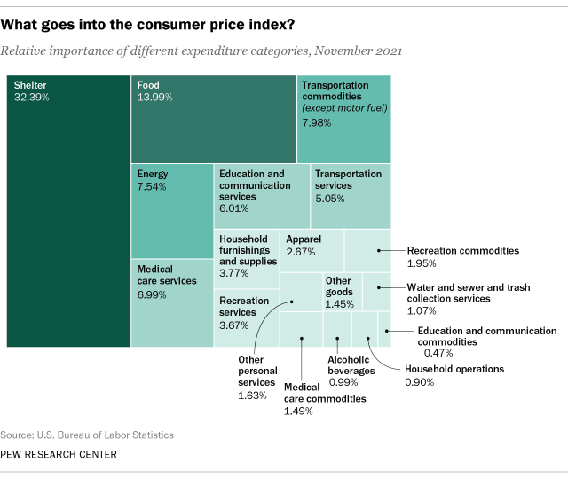
While shelter costs carry the most weight in the CPI, they’ve not risen nearly as much as the index as a whole. In December, owner’s equivalent rent was up 3.8% compared with December 2020, and regular rent of primary residence was just 3.3% higher. The one big exception among shelter costs was lodging away from home, a category that mostly tracks hotel and motel room rates, where prices were 27.6% higher than a year earlier. However, that subcategory accounts for less than 1% (0.849%, to be precise) of the CPI.
The next-biggest category, food, accounts for just under 14% of the index. Groceries, or “food at home,” makes up a bit more than half of that category. Grocery prices were 6.5% higher than a year ago, which will come as no surprise to anyone who’s been to a supermarket lately. Meats, especially beef and pork, led the way, with prices for beef roasts and steaks more than 20% higher than a year ago, bacon up 18.6% and chicken parts up 11.5%. (On the other hand, prices for hot dogs and cheese both are down 0.6%.)
Eating out has gotten more expensive too. Prices for full-service meals and snacks consumed away from home were up 6.6% from December 2020, and limited-service meals and snacks were up 8%. School breakfasts and lunches were down by nearly two-thirds, perhaps because the U.S. Department of Agriculture has authorized free meals for all children in public schools this academic year.
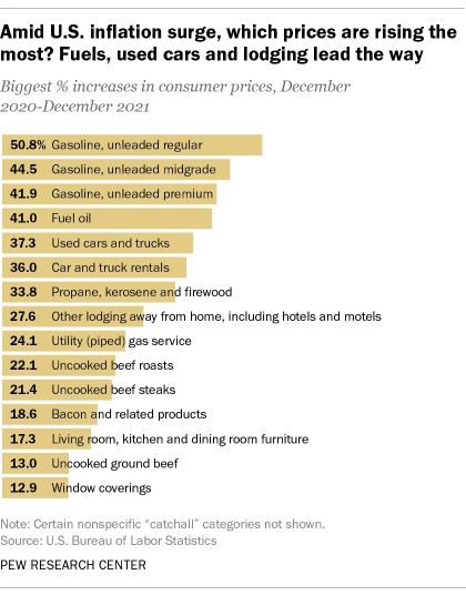
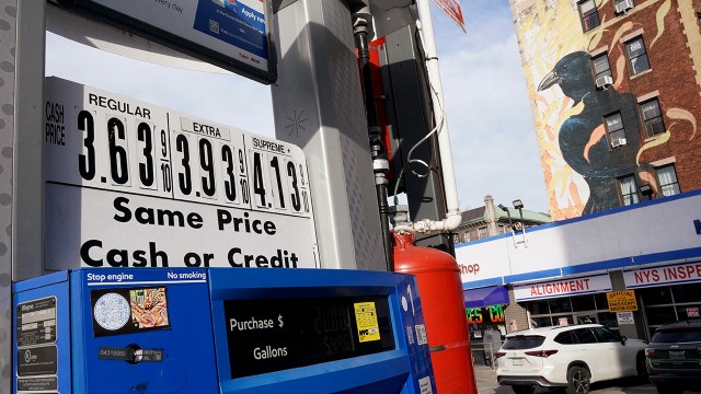
Besides at the supermarket, consumers also feel the effects of inflation acutely at the fuel pump. Gasoline accounts for just 4% of the overall CPI, but prices for it have risen more than any other good or service in the CPI basket over the past year. Regular unleaded gasoline, for instance, is up 50.8% since December 2020. It should be noted that gas prices fell sharply in 2020, as demand plunged because much of the U.S. economy was shut down. As the economy reopened and demand came back, so did gas prices, though they’ve since risen 20% or more above pre-pandemic levels.
Energy goods and services, a category of which gasoline is a major component, accounts for roughly 7.5% of the overall CPI. Prices for fuels used for home heating and cooking also are sharply higher than a year ago: Fuel oil is up 41%, propane, kerosene and firewood are up 33.8%, and piped natural gas is up 24.1%.
Aside from motor fuels, the vehicles that burn them also loom relatively large in the CPI. New vehicles account for nearly 3.9% of the index; prices for new cars rose 12% from December 2020 to December 2021, and new trucks prices almost as much (11.6%). But the real movement was for used vehicles: Prices for used cars and trucks, which make up about 3.4% of the index, have soared 37.3% over the past 12 months. Why? The pandemic has disrupted and depressed production of new vehicles, while low interest rates have increased demand for cars and trucks. Buyers who couldn’t find the new vehicles they wanted have moved over to the used lot, increasing demand at the same time as the flow of pre-owned cars and trucks dwindled.
