
The Changing Geography of
COVID-19 in the U.S.
In the spring, when the toll from COVID-19 passed the grim milestone of 100,000 American deaths, its geographic reach had been largely concentrated. Most deaths had occurred in a small number of metropolitan areas around the U.S., especially the New York City area.
Today, with the death toll from COVID-19 approaching 300,000, and the number of deaths occurring each day matching or exceeding the peaks seen in the spring, the pandemic has become truly national in scope. In the nearly nine months since the coronavirus outbreak was declared a national emergency, almost every part of the country has been directly affected by the loss of life resulting from the virus.
A new Pew Research Center analysis of official reports of COVID-19 deaths across the nation’s 435 congressional districts plus the District of Columbia, based on mortality data collected by the Johns Hopkins University Center for Systems Science and Engineering, shows how the geography of the coronavirus has changed as the coronavirus spread across the country.
Pew Research Center conducted this analysis to understand how the geography of the coronavirus outbreak has changed over its course. For this analysis, we relied on official reports of deaths attributed to the novel coronavirus.
This analysis required congressional-district-level estimates of the number of deaths attributed to COVID-19. To generate these estimates, researchers used the available county-level figures (collected and reported by the Center for Systems Science and Engineering at John Hopkins University). However, many counties are divided across two or more congressional districts. In cases where a county is divided across multiple congressional districts, the deaths in that county were proportionally assigned to the congressional districts the county falls into based on the share of its population that falls into each district (using the Geocorr tool from the Missouri Census Data Center).
We focus on deaths at the congressional district level for several reasons. First, the political relevance of congressional districts provides insight into the political dynamics of the pandemic. Second, congressional districts are of roughly equal size clarifying the actual impact to people rather than landmass that gets obscured in some county-level maps.
The estimates provided in this report are subject to several sources of error. In addition to the mismatch between county geography and congressional districts, there may be significant differences between the true number of deaths due to COVID-19 and the official reported counts of those deaths. There may also be variation across the states in the quality and types of data reported. For example, most states report deaths based on the residency of the deceased person rather than the location they died; JHU collects data from many different local health agencies, and this likely leads to some additional measurement error.
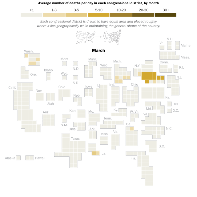
In the early months of the pandemic, cases and deaths were heavily concentrated in the metropolitan areas of New York, New Orleans, Boston and Detroit, with other major cities and surrounding areas also experiencing higher death rates than less densely populated parts of the country. Overall, urban areas were initially hit much harder than suburban and rural areas, and more racially and ethnically diverse areas were hit harder than less racially and ethnic diverse areas.
Both of these characteristics are strongly associated with the partisan and ideological lean of an area, and so the congressional districts experiencing the brunt of cases and deaths in those early months were far more likely to be represented by Democrats than by Republicans. But as the virus has afflicted more and more communities across the United States over time, reaching into more rural and exurban areas, that has shifted. In recent months – since deaths from COVID-19 began surging again in the fall – the average death toll in Republican districts is higher than in Democratic districts.
A timeline of the shifting geography of the pandemic
Coronavirus deaths by congressional district

Source: Pew Research Center analysis of COVID-19 Data Repository from the Johns Hopkins University Center for Systems Science and Engineering as of Dec 3, 2020. See methodology for details.
“The Changing Geography of COVID-19 in the U.S.”
PEW RESEARCH CENTER
In March and April, during the first spike in deaths, the heaviest cost of the pandemic was borne by just a few places. During this period, several congressional districts in New York City and the surrounding areas were averaging more than 50 new deaths every day, and on some days more than 150 people in these districts lost their lives to the pandemic.
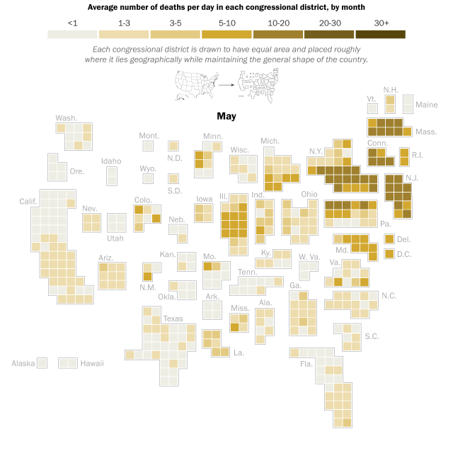
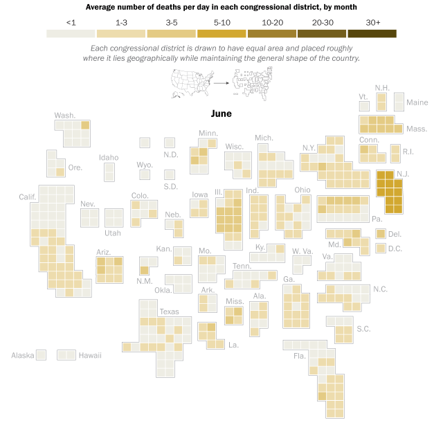
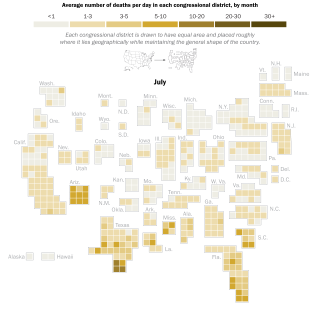
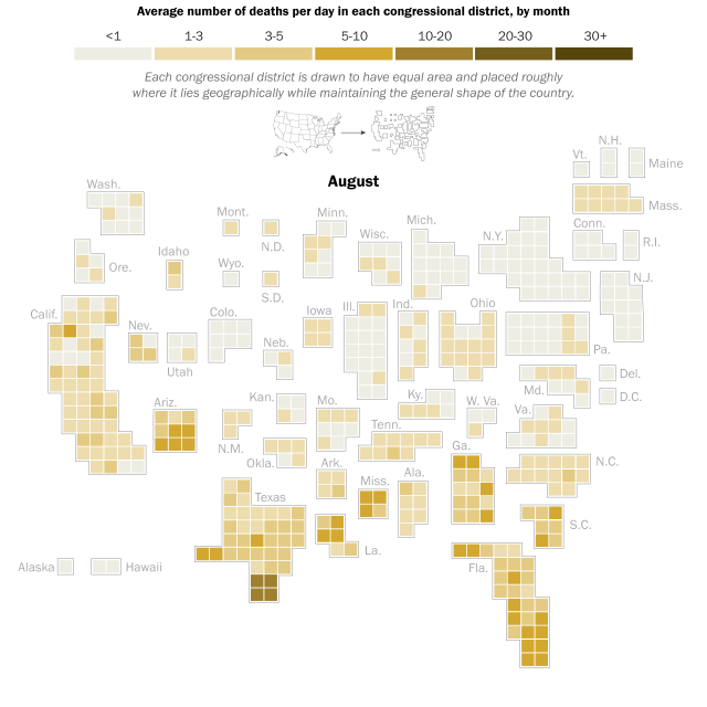
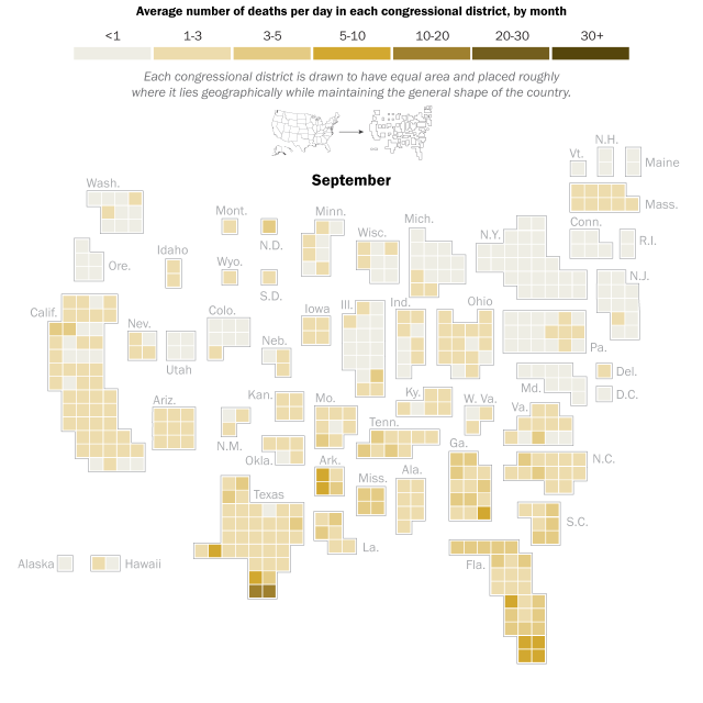
Nationally, new deaths fell substantially in May and June before rising again beginning in July. By this point, new deaths in the Northeastern districts that had been hit hardest in the prior months had fallen dramatically, while deaths were rising in the South and Southwest: Texas, Florida and Arizona registered record numbers of new deaths during the summer months.
While U.S. deaths in this period did not rise as high as the peaks during April and May, the geographic reach spread substantially during this phase. Where before the most substantial toll in lives lost was concentrated in a few heavily urbanized places, the summer months saw new deaths increase in suburban and rural areas.
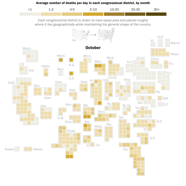
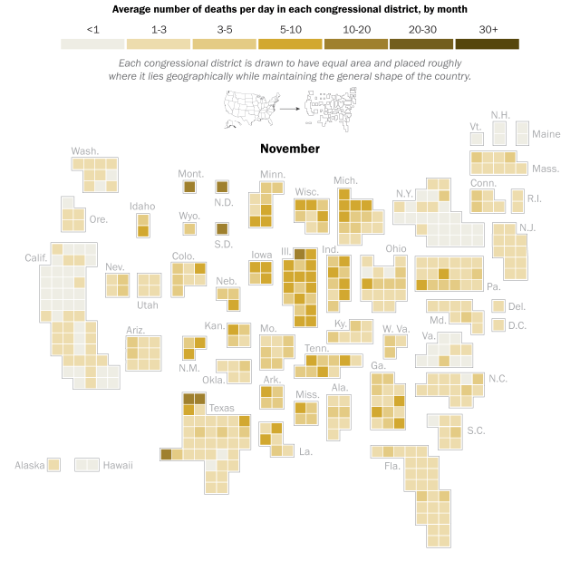
New deaths fell somewhat again at the close of the summer, but once again rose nationwide in October. Again, this marked a geographic shift in the places suffering the largest numbers of new deaths. In recent weeks, the regions seeing the largest numbers of new deaths have been more likely to be in the Midwest and Mountain states. Montana, for example, averaged less than one death per day prior to October (179 total deaths in the first seven months of the pandemic), but 501 Montanans died of COVID-19 in October and November – a nearly tenfold increase in the average daily death rate.
Less densely populated areas are now hardest hit
As the geography of new deaths has shifted over the course of the pandemic, the types of communities affected have also changed substantially.
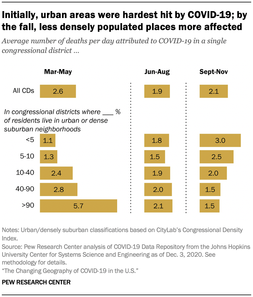
Early in the course of the pandemic, the health impacts were felt most severely in dense urban centers. From March to May, congressional districts in the most urbanized parts of the country were experiencing about five times as many deaths on average compared with those in the least dense parts of the country, and in some places this disparity was much larger.
However, by the summertime the urban-rural split had largely disappeared, and over the last several months, those districts with small shares of residents in densely populated places have been experiencing twice as many deaths as those in the parts of the country where all or nearly all residents live in urban neighborhoods.
The urban and dense suburban areas that experienced higher death rates in the early days of the pandemic also had larger shares of non-White residents than areas that were less hard hit in the spring: The most racially and ethnically diverse congressional districts (those with fewer than 40% White residents) had about 3.5 times as many deaths on average as the districts that are less racially and ethnically diverse (those with more than 80% White residents) between March and May.
But in recent months, paralleling the rising death rates in more exurban and rural areas, the loss of life to COVID-19 has been roughly the same in less racially and ethnically diverse districts as it has in more racially and ethnically diverse districts. (Note: While comprehensive nationwide data on the racial and ethnic backgrounds of those who have died from COVID-19 is not available, available data has found that in the U.S., Black people, Hispanic people and Native Americans have died at higher rates than White people.)

Since the beginning of the pandemic, Democratic areas have experienced more COVID-19 deaths; in recent months, GOP areas have been hit harder
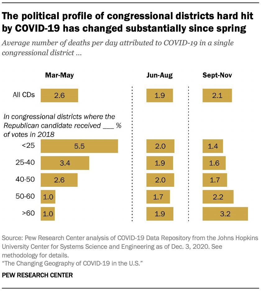
A similar pattern to those seen with the urban-rural and racial composition of each district emerges in the relationship between the partisan leanings of a district and deaths attributable to the coronavirus. In the early stages of the pandemic, the hardest hit districts were overwhelmingly “blue” parts of the country. COVID-19 deaths in the March through May period were more than four times as high in strongly Democratic districts (where Republican congressional candidates received less than 25% of the vote in the 2018 midterm elections) as in districts where Republican candidates won more than 60% of the 2018 vote.
But from September through November, the death rate has been roughly twice as high in Republican strongholds than in places where the GOP lost the 2018 vote by wide margins. (Note: 2018 vote share is used for this analysis, since district-level data is not yet complete for the 2020 election.)
Democrats and Republicans in Congress represent dramatically different constituencies, and these differences track with the changing impact of the coronavirus outbreak over the past nine months. Democrats are far more likely than Republicans to represent urban and diverse constituencies – the places hardest hit early in the pandemic.
Republicans are more likely than Democrats to represent rural areas and districts with higher shares of White residents – the same places that have seen cases and deaths grow in the past three months.
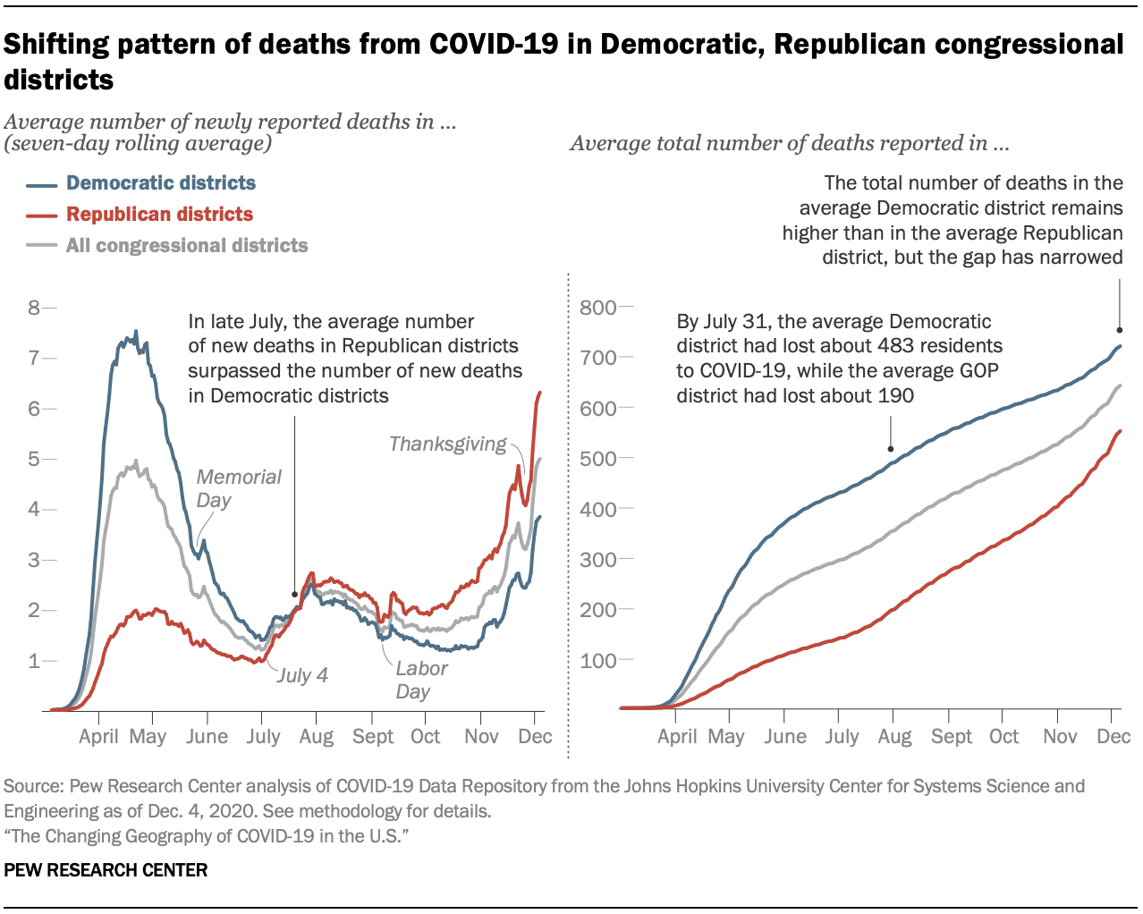
While the total number of COVID-19 deaths in Democratic districts remains higher overall, new deaths have been higher on average in Republican-controlled districts since the end of July. New deaths in Republican controlled districts began increasing in mid-October while they were still falling somewhat overall in Democratically controlled districts. However, since November, deaths have been rising in both Republican and Democratic districts.
Public concerns about the coronavirus have long been divided along partisan lines. Democrats are more likely than Republicans to view the coronavirus outbreak as a major threat to the nation’s public health, and Democrats express greater concern than do Republicans about contracting a serious case of COVID-19. However, large majorities in both parties – 91% of Democrats and 81% of Republicans – report that they wore a mask or face covering always or most of the time when visiting stores and businesses over the past month. (For more, see “Intent to Get a COVID-19 Vaccine Rises to 60% as Confidence in Research and Development Process Increases.”)
This analysis relies on official reports of deaths attributed to the novel coronavirus in the United States, collected and reported by the Center for Systems Science and Engineering (CSSE) at John Hopkins University.
To estimate the number of deaths attributed to COVID-19 in each congressional district, researchers used the county-level figures CSSE makes available. In many cases, counties fall into more than one congressional district. In these cases, the deaths in that county were proportionally assigned to the congressional districts it falls into based on the share of the county’s population that falls into each district (using the Geocorr tool from the Missouri Census Data Center).
Some small-population counties in Massachusetts and Utah have been aggregated into larger reporting units. In these cases, the aggregate unit was mapped onto congressional districts and deaths were allocated in the same manner detailed above (e.g., Box Elder, Cache and Rich counties in Utah are reported as a single unit; for the purposes of mapping onto congressional districts, these three counties were treated as a single “county”).
COVID-19 deaths that are not assigned a specific geographic location are not included in this analysis. This includes (as of Nov. 30, 2020): 442 deaths classified as “out of state,” five deaths recorded in “Federal Correctional Institutions,” 89 deaths recorded in the Michigan Department of Corrections and 1,628 deaths that were recorded by states but not assigned to a specific county.
Data was pulled from the GitHub repository maintained by the CSSE on Dec. 4 and reflects reported coronavirus deaths through Dec. 3.
Racial and ethnic composition for congressional districts was drawn from the 2014-2018 American Community Survey estimates published by the Census Bureau (accessed through the tidycensus package in R on Dec. 1, 2020). The estimates of urban and dense suburban population by congressional district come from CityLab’s estimates (accessed on May 21). The 2018 vote share for each congressional district was collected from the Federal Election Commission report (accessed on Dec. 3).
Graphics by Alissa Scheller and Bradley Jones.
All photos Getty Images.