In recent years, Pew Research Center has been thinking more intentionally about our website’s accessibility and how we can improve it. A key component of this effort involves pushing our writers and researchers to think about alt text for the many charts we publish – and to do so from the very beginning of the editorial process.
Alt text, or alternative text, is the descriptive text that is packaged with online images to help people with visual impairments. Alt text is generally read aloud by screen readers, presented visually in certain browsers and used by search engines.
In this post, I’ll discuss the Center’s (still-evolving) approach to improving our website’s accessibility using alt text for charts.
How we approached alt text in the past
Until recently, many of our publications didn’t use alt text – even though most of our graphics are static images that many screen readers can’t process. And when we began to implement alt text, we didn’t always do so in a consistent way.
Initially, our alt text simply referred to the type of chart we were showing, along with the chart’s headline. This allowed us to convey the main finding of each chart without taking too much time to draft alt text amid the many other tasks involved in producing a publication.
Here’s an example of the general format we settled on for alt text, using a line chart from a 2021 blog post about Americans’ views of labor unions:
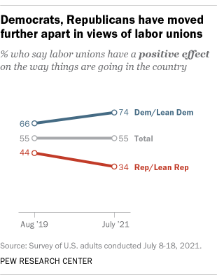
ALT TEXT: A line chart showing that Democrats, Republicans have moved further apart in views of labor unions
As we added alt text in this format to our charts, our digital producers sometimes added more clarifying words or phrases.
But as we began to use alt text more consistently, we found that using the chart headline format did not always lead to thorough and helpful alt text. In fact, some of our chart headlines are so broad that simply repeating them in the alt text may tell a reader very little about the charts themselves. And when the alt text doesn’t mention other components of the chart – such as subheads, labels and notes – it can result in a loss of important context and information.
How we approach alt text today
These days, we try to think “alt text first” in our editorial process. Here are some of the things we’re asking our writers and researchers to keep in mind as we increasingly prioritize website accessibility:
- When writing a chart title, consider if it would make sense as alt text. Are there important details being left out of the title?
- Does the title of the chart make sense as a full sentence or when read aloud?
- When writing alt text, try to be specific with findings and wording rather than using broad strokes.
- How would you describe the chart to someone over the phone? With detailed charts or tables, it’s difficult to include everything in alt text. When this occurs, think about the most relevant information you’d want a reader to know about that image.
- Sometimes, getting started on alt text is intimidating. A good place to begin is to look at the chart’s components, like subheads and labels, as well as the data being shown, such as significant data points or trends.
We’re still working on ensuring that all of our publications reflect these considerations. But as we continue integrating alt text into our editorial processes, we can refine and improve our methods even more.
Different charts present different challenges with alt text
If you’ve followed our work, you know that Pew Research Center produces a large variety of charts. These range from simple bar charts to in-depth graphical breakdowns of data. In this section, I’ll walk through a few examples of common chart types and show how they present different challenges in terms of alt text.
Please note that the following section describes charts in detail but may leave out information about certain chart components. We’ve tried to ensure the alt text for these charts is comprehensive.
Chart #1
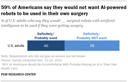
This is a bar chart taken from our February 2023 survey about artificial intelligence in health care. In this case, the chart is a relatively simple one with a clear headline, meaning that our past approach to alt text would be OK:
ALT TEXT: A bar chart showing that 59% of Americans say they would not want AI-powered robots to be used in their own surgery
Still, there is room for improvement. For example, we could include more detail drawn from the chart components by adding nuances found in the question wording, as well as the share of Americans who express the opposite opinion of the one emphasized in the chart title:
ALT TEXT: A stacked bar chart showing that 59% of Americans say they definitely or probably would not want AI-powered robots to be used in their own surgery, while 40% say they definitely or probably would want them to be used.
Chart #2
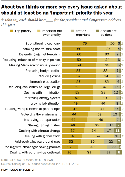
This is a more detailed chart from a survey about Americans’ political priorities. In this instance, our past approach to alt text would not work very well since the headline of the chart is so broad:
ALT TEXT: A bar chart showing that about two-thirds or more say every issue asked about should at least be an “important” priority this year
This particular chart includes 21 different priorities that Americans were asked about, from strengthening the economy to dealing with the coronavirus outbreak. Furthermore, it includes four degrees of potential importance that Americans could ascribe to each issue. This broad range of information certainly presents a challenge for alt text.
So how could we do this a little better? There may not be a perfect answer, but we could highlight some of the more interesting findings from the chart in the alt text:
ALT TEXT: A stacked bar chart showing that strengthening the economy tops Americans’ agenda for the president and Congress in 2023. 75% of Americans say strengthening the economy should be a top priority; no other single policy area stands out as a top priority. The public gives the lowest priority to dealing with the challenges facing parents (27%) and dealing with the coronavirus outbreak (26%).
Chart #3
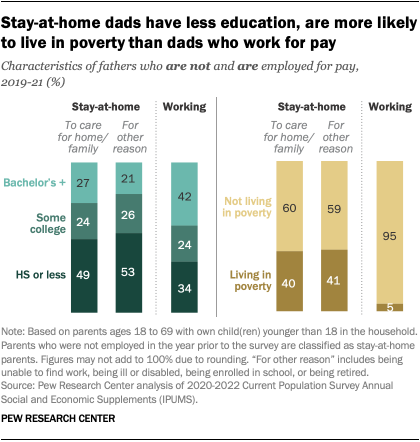
This chart comes from a blog post about stay-at-home dads in the United States. In this case, researchers suggested alt text well ahead of production, with our new internal guidelines in mind:
ALT TEXT: A pair of bar charts depicting the education level and share in poverty of stay-at-home dads and dads working for pay. Working dads are about twice as likely as stay-at-home dads to have completed at least a bachelor’s degree. About 5% of working dads live in poverty, compared with 40% of stay-at-home dads.
The alt text pulls out the most important findings from a straightforward headline and expands on them using key figures. You’ll notice, when compared with our earlier format, there is more detail and information in this alt text, more consistency with naming the chart type and a better sense of the chart’s content.
However, there are still aspects of this chart left out. Listing every feature of a detailed chart can be hard to follow; part of what we’re figuring out now is a balance between information and information overload.
Chart #4
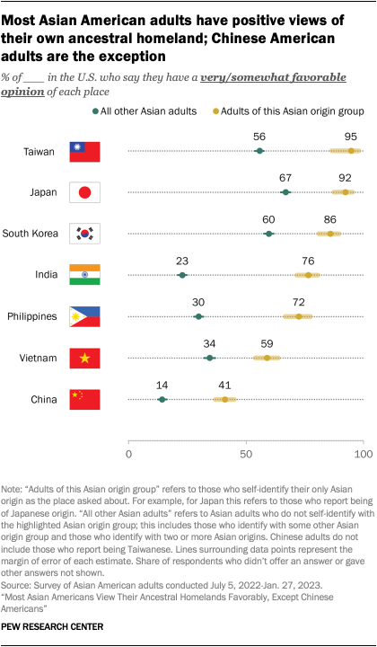
This last chart comes from a report on Asian Americans’ views of their ancestral homelands. Here, too, researchers suggested alt text early in the process and with our new guidelines in mind:
ALT TEXT: A dot plot showing that most Asian American adults have positive views of the homelands of their ancestors. Taiwanese, Japanese, Korean, Indian, Filipino and Vietnamese adults in the U.S. have majority favorable views of their ancestral homelands. Only 41% of Chinese American adults have a favorable view of China.
The alt text here pulls largely from chart labels that name the countries we asked about, though it also expands on the chart title. Yet there are still other data points and information in the note that are challenging to include in the alt text. Once again, the issue of information versus information overload arises.
The Center also publishes tables as images, particularly in methodology sections, which can be incredibly difficult to capture in alt text. This is an area we’re still figuring out in terms of accessibility, but we do recognize that what we’re using now is often unhelpful to those who use alt text on our site.
In addition to alt text, we’ve worked on a few other ways to improve accessibility on our site, including a focus on hyperlink text, color in charts and readability. Our interactive charts and scrolling features can be read by most screen readers, though it’s an area we can explore further and optimize. Some accessibility improvements occur as we update our site, and others we’ll continue to work on.