Academic survey researchers tend to differ from polling organizations in the way they treat sampling error in graphics and other data visualizations. Academic researchers frequently show the standard error alongside each of their survey estimates, including for subgroups. Polling organizations, by contrast, often present survey estimates by themselves and only mention the survey’s overall margin of sampling error, often at the bottom of charts or press releases. Both professions have good reasons for their approaches, especially since their audiences differ greatly.
Pew Research Center, a polling organization, recently decided to adopt a more academic approach by displaying margins of error within some of its survey graphics. In this post, we’ll explain the reasons behind this change and how it will work moving forward.
Reasons for our new approach
Many reporters and other polling consumers want to go beyond the overall results of a survey and see the results for various demographic, religious or political subgroups within the country. For example, a recent Center survey found that 44% of U.S. adults approve of the way Joe Biden is handling his job as president. But what was Biden’s approval rate among Hispanic adults? Conservatives? Black adults?
We can often release the results for subgroups like these without reservation because our surveys include hundreds or even thousands of interviews with members of such groups. But other times, subgroup sample sizes may consist of only 100 or so interviews, and the margin of sampling error may be 10 percentage points or more. In these cases, there is a tension between wanting to publish data for a particular subgroup and pollsters’ obligation to avoid suggesting that estimates are more precise or definitive than they really are.
One way to resolve this tension is to display margins of sampling error in charts.
The margin of sampling error can be described as the “penalty” in precision for not talking to everyone in a given population. It describes the range that an answer likely falls between if the survey had reached everyone in a population, instead of just a sample of that population. (More precise definitions are available, but they can get rather technical and philosophical.) For our purposes, showing the margins of sampling error in graphics is useful because it allows us to report results for important subgroups and give readers a visual cue when subgroup estimates have especially low precision.
How it works
Pew Research Center has, on rare occasion, displayed error bars to present findings or explain concepts. But this marks our first foray into using error bars with regularity. Chances are we will make some tweaks to our approach as we learn what works well and what doesn’t.
For now, we plan to display error bars only in certain situations. Specifically, we will show the margins of sampling error when the effective sample size — a statistical term that refers to the number of interviews adjusted for the loss in precision associated with weighting — is less than 100 people for one or more of the chart’s subgroups. If a subgroup has fewer than 100 raw interviews or an effective sample size of less than 50, we will not publish the estimates at all, not even with error bars.
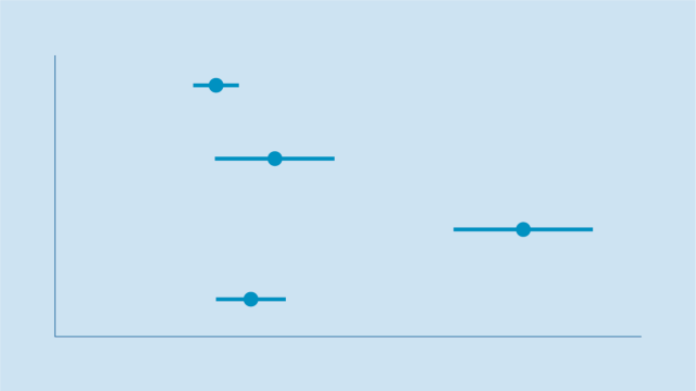
To understand how our new approach will work in practice, consider the two hypothetical charts below. The chart on the left includes 95% confidence interval bars as a way of showing readers that survey estimates for some subgroups aren’t as precise as they may initially seem — and that the true value likely falls somewhere within the highlighted range. The chart on the right, by contrast, omits the error bars and may lead readers to believe that the subgroup estimates are more precise than they actually are:

A natural question is why polling organizations like Pew Research Center don’t just show margins of sampling error in all graphics. To be sure, social science is trending in that direction, and one day we might report data that way. For now, though, most charts will not display margins of sampling error in the interest of readability and accessibility. We want average people, not just researchers, to be able to understand our survey reports. The more information we include in charts, the harder it can be for readers to decipher the key takeaways. As a result, we will be displaying margins of sampling error only when they are so large that we feel readers should be aware of them when considering the results.