
The Changing Political Geography of COVID-19 Over the Last Two Years
Over the past two years, the official count of coronavirus deaths in the United States has risen and is now approaching 1 million lives. Large majorities of Americans say they personally know someone who has been hospitalized or died of the coronavirus, and it has impacted – in varying degrees – nearly every aspect of life.
A new Pew Research Center analysis of official reports of COVID-19-related deaths across the country, based on mortality data collected by The New York Times, shows how the dynamics of the pandemic have shifted over the past two years.
A timeline of the shifting geography of the pandemic
Pew Research Center conducted this analysis to understand how the geography of the coronavirus outbreak has changed over its course. For this analysis, we relied on official reports of deaths attributed to the novel coronavirus collected and maintained by The New York Times.
The estimates provided in this report are subject to several sources of error. There may be significant differences between the true number of deaths due to COVID-19 and the official reported counts of those deaths. There may also be variation across the states in the quality and types of data reported. For example, most states report deaths based on the residency of the deceased person rather than the location where they died. The New York Times collects data from many different local health agencies, and this likely leads to some additional measurement error.
This analysis relies on county-level data. Counties in the United States vary widely in their population sizes, so in many places in the essay, we divide counties into approximately equal-sized groups (in terms of their population) for comparability or report on population adjusted death rates rather than total counts of deaths.
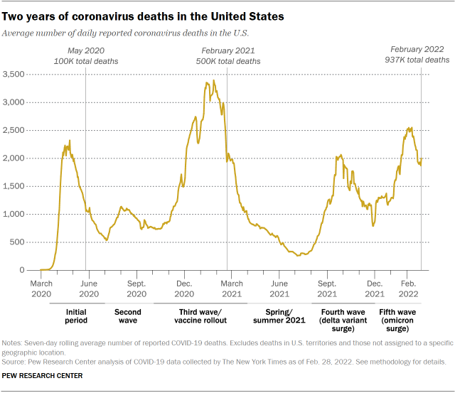
The pandemic has rolled across the U.S. unevenly and in waves. Today, the death toll of the pandemic looks very different from how it looked in the early part of 2020. The first wave (roughly the first 125,000 deaths from March 2020 through June 2020) was largely geographically concentrated in the Northeast and in particular the New York City region. During the summer of 2020, the largest share of the roughly 80,000 deaths that occurred during the pandemic’s second wave were in the southern parts of the country.
The fall and winter months of 2020 and early 2021 were the deadliest of the pandemic to date. More than 370,000 Americans died of COVID-19 between October 2020 and April 2021; the geographic distinctions that characterized the earlier waves became much less pronounced.
By the spring and summer of 2021, the nationwide death rate had slowed significantly, and vaccines were widely available to all adults who wanted them. But starting at the end of the summer, the fourth and fifth waves (marked by new variants of the virus, delta and then omicron) came in quick succession and claimed more than 300,000 lives.
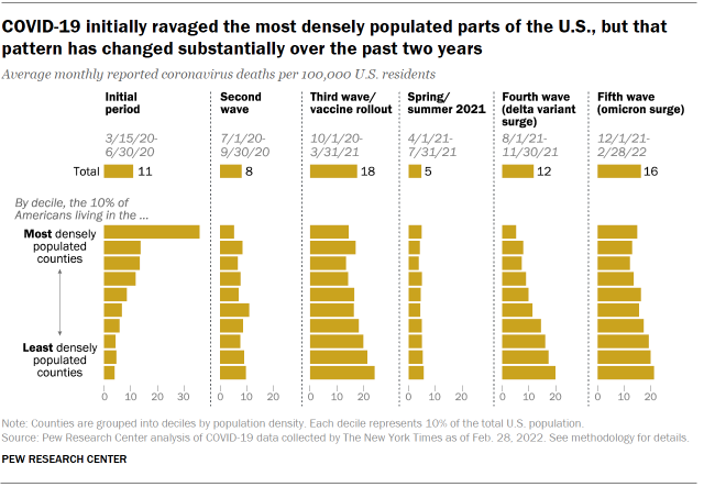
In many cases, the characteristics of communities that were associated with higher death rates at the beginning of the pandemic are now associated with lower death rates (and vice versa). Early in the pandemic, urban areas were disproportionately impacted. During the first wave, the coronavirus death rate in the 10% of the country that lives in the most densely populated counties was more than nine times that of the death rate among the 10% of the population living in the least densely populated counties. In each subsequent wave, however, the nation’s least dense counties have registered higher death rates than the most densely populated places.
Despite the staggering death toll in densely populated urban areas during the first months of the pandemic (an average 36 monthly deaths per 100,000 residents), the overall death rate over the course of the pandemic is slightly higher in the least populated parts of the country (an average monthly 15 deaths per 100,000 among the 10% living in the least densely populated counties vs. 13 per 100,000 among the 10% in the most densely populated counties).
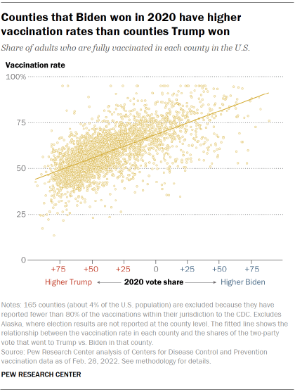
As the relationship between population density and coronavirus death rates has changed over the course of the pandemic, so too has the relationship between counties’ voting patterns and their death rates from COVID-19.
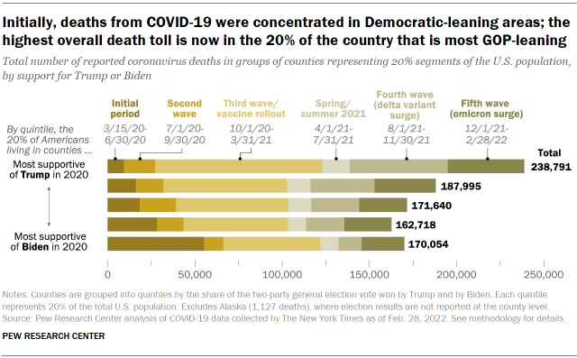
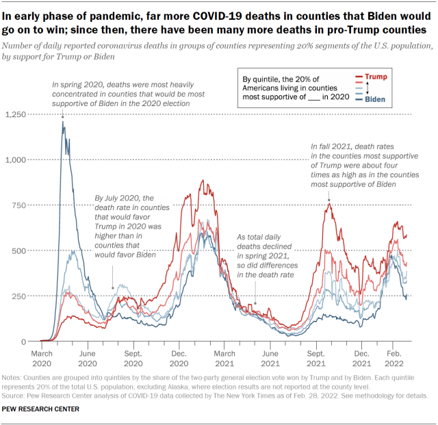
In the spring of 2020, the areas recording the greatest numbers of deaths were much more likely to vote Democratic than Republican. But by the third wave of the pandemic, which began in fall 2020, the pattern had reversed: Counties that voted for Donald Trump over Joe Biden were suffering substantially more deaths from the coronavirus pandemic than those that voted for Biden over Trump. This reversal is likely a result of several factors including differences in mitigation efforts and vaccine uptake, demographic differences, and other differences that are correlated with partisanship at the county level.
During this third wave – which continued into early 2021 – the coronavirus death rate among the 20% of Americans living in counties that supported Trump by the highest margins in 2020 was about 170% of the death rate among the one-in-five Americans living in counties that supported Biden by the largest margins.
As vaccines became more widely available, this discrepancy between “blue” and “red” counties became even larger as the virulent delta strain of the pandemic spread across the country during the summer and fall of 2021, even as the total number of deaths fell somewhat from its third wave peak.

During the fourth wave of the pandemic, death rates in the most pro-Trump counties were about four times what they were in the most pro-Biden counties. When the highly transmissible omicron variant began to spread in the U.S. in late 2021, these differences narrowed substantially. However, death rates in the most pro-Trump counties were still about 180% of what they were in the most pro-Biden counties throughout late 2021 and early 2022.
The cumulative impact of these divergent death rates is a wide difference in total deaths from COVID-19 between the most pro-Trump and most pro-Biden parts of the country. Since the pandemic began, counties representing the 20% of the population where Trump ran up his highest margins in 2020 have experienced nearly 70,000 more deaths from COVID-19 than have the counties representing the 20% of population where Biden performed best. Overall, the COVID-19 death rate in all counties Trump won in 2020 is substantially higher than it is in counties Biden won (as of the end of February 2022, 326 per 100,000 in Trump counties and 258 per 100,000 in Biden counties).
Partisan divide in COVID-19 deaths widened as more vaccines became available
Partisan differences in COVID-19 death rates expanded dramatically after the availability of vaccines increased. Unvaccinated people are at far higher risk of death and hospitalization from COVID-19, according to the Centers for Disease Control and Prevention, and vaccination decisions are strongly associated with partisanship. Among the large majority of counties for which reliable vaccination data exists, counties that supported Trump at higher margins have substantially lower vaccination rates than those that supported Biden at higher margins.
Counties with lower rates of vaccination registered substantially greater death rates during each wave in which vaccines were widely available.
During the fall of 2021 (roughly corresponding to the delta wave), about 10% of Americans lived in counties with adult vaccination rates lower than 40% as of July 2021. Death rates in these low-vaccination counties were about six times as high as death rates in counties where 70% or more of the adult population was vaccinated.
More Americans were vaccinated heading into the winter of 2021 and 2022 (roughly corresponding to the omicron wave), but nearly 10% of the country lived in areas where less than half of the adult population was vaccinated as of November 2021. Death rates in these low-vaccination counties were roughly twice what they were in counties that had 80% or more of their population vaccinated. (Note: The statistics here reflect the death rates in the county as a whole, not rates for vaccinated and unvaccinated individuals, though individual-level data finds that death rates among unvaccinated people are far higher than among vaccinated people.)
This analysis relies on official reports of deaths attributed to COVID-19 in the United States collected and reported by The New York Times.
COVID-19 deaths in Puerto Rico and other U.S. territories are not included in this analysis. Additionally, deaths without a specific geographic location have been excluded.
Data was pulled from the GitHub repository maintained by The New York Times on March 1, 2022, and reflects reported coronavirus deaths through Feb. 28.
There are several anomalies in the deaths data. Many locales drop off their reporting on the weekends and holidays. In addition to the rhythm of the reporting cycle, there are many instances where a locality will revise the count of its deaths downward (usually only by a small amount) or release a large batch of previously unreported deaths on a single day. The downward revisions were identified and retroactively applied to earlier days.
Large batches of cases were identified by finding days that increased by more than 10 deaths and were 10 standard deviations above the norm for a county within a 30-day window. Deaths reported in these anomalous batches were then evenly distributed across the days leading up to when they were released.
Population data for U.S. counties comes from the 2015-2019 American Community Survey estimates published by the Census Bureau (accessed through the tidycensus package in R on Feb. 21). The 2020 vote share for each county was purchased from Dave Leip’s Election Atlas (downloaded on Nov. 21, 2021).
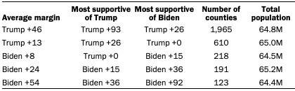
The analysis looks at deaths among counties based on their 2020 vote. Counties were grouped into five groups with approximately equal population. For analyses that include 2020 vote, Alaskan counties are excluded because Alaska does not report its election results at the county level. The table below provides more details.
This essay benefited greatly from thoughtful comments and consultation with many individuals around Pew Research Center. Jocelyn Kiley, Carroll Doherty and Jeb Bell provided invaluable editorial guidance. Peter Bell and Alissa Scheller contributed their expertise in visualization, Ben Wormald built the map animation, and Reem Nadeem did the digital production. Andrew Daniller provided careful attention to the quality check process, and David Kent’s watchful copy editing eye brought clarity to some difficult concepts.
Lead photo: Kent Nishimura/Los Angeles Times via Getty Images
