As anyone who’s looked for a job lately knows, there’s no single U.S. labor market but rather a collection of local ones. Occupations that are in high demand in, say, Denver might be oversupplied in Birmingham, or vice versa — and they almost certainly won’t pay the same. But while this might make sense intuitively, it’s hard to visualize just how different one place’s job market is from another.
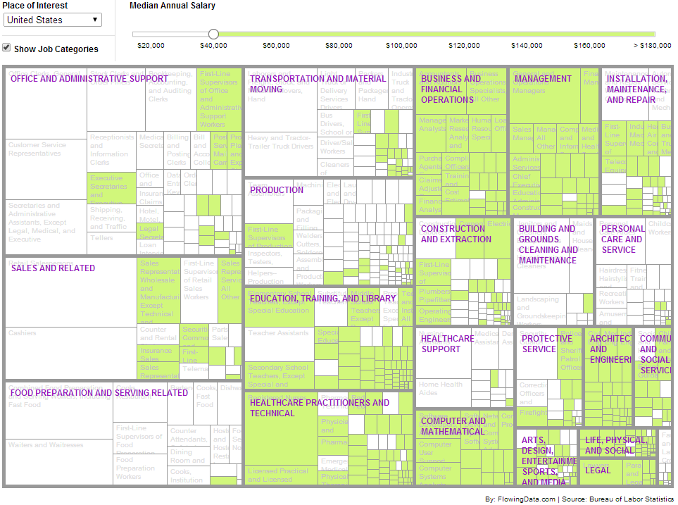
Which is what makes this chart, from the folks at FlowingData, so impressive — it not only elegantly presents several dimensions of data but easily enables state-by-state comparisons. It shows hundreds of different occupations, organized into 22 major sectors, drawn from the Bureau of Labor Statistics. On the interactive version, hovering over any square tells you the estimated employment and median annual salary for that occupation; adjust the slider on top and the chart shows which occupations have median salaries above that level.
That’s plenty cool on its own, but switch states via the drop-down box and the boxes grow and shrink proportionally to each occupation’s share of the state’s overall employment base. You can see instantly how important the transportation and production sectors are in Indiana, or how few computer and mathematical jobs there are in Mississippi. You can also see how dominant such high-paying sectors as business, management and legal are in D.C., while Floridians largely work in lower-paying office/administrative jobs or in sales, food service or building-maintenance jobs.
This sort of thing could occupy a curious person for hours. Which state has a relatively bigger farming/fishing/forestry sector — California or Iowa? The answer might surprise you.