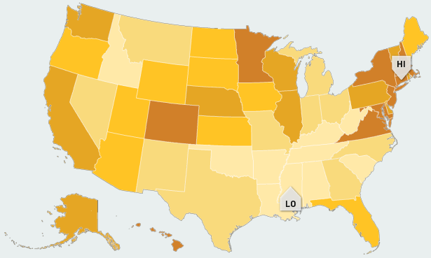
From “best places to live/retire/do business” lists to arguments over who has the worst weather, Americans love to compare themselves with each other. This map, part of an interactive series developed by Measure of America (a project of the Social Science Research Council) aims to summarize people’s well-being with a single indicator: the American Human Development Index. The darker a state is colored on the map, the higher its score.
Adapted from the United Nations Development Program‘s Human Development Index, the American HDI uses four indicators to summarize three overarching goals: leading a long and healthy life (measured by life expectancy at birth), having access to knowledge (measured by school enrollment and adults’ educational attainment) and having a decent material standard of living (measured by median wage and salary earnings).
Connecticut has the highest overall HDI in the U.S.: It ranks third on the health and education indices and fourth on the income index. Mississippi has the lowest composite HDI score: It ranked at the bottom of the health index and 48th on the education and income indices.
Along with the HDI components, the interactive version of the map on Measure of America’s site also lets you see at a glance how the states rank on dozens of other indicators, from population over age 65 to carbon dioxide emissions. You can also sort by gender, race and ethnicity, download the underlying datasets, hover over each state with your cursor to see each state’s data, and look at previous years’ data, to see who’s improved and who hasn’t.