Pew Research Center has been documenting shifts in U.S. public opinion during the COVID-19 outbreak using our American Trends Panel, a randomly selected group of adults who take our surveys online. But a number of important questions can’t be answered by survey data alone. For instance: How is someone’s proximity to COVID-19 cases or deaths related to their perceptions of the crisis and the government’s response? Answering this question requires external data about the progression of the outbreak in survey respondents’ area at the time they took a particular survey.
A number of entities have been providing timely, well-organized data on the state of the coronavirus outbreak. But that raised a different question: How could we decide which source to use, especially since all use slightly different methods and report different types of data?
This post will walk through some of the differences in the data available from three widely used sources of information related to the geographic progression of the coronavirus outbreak:
- The Johns Hopkins Center for Systems Science and Engineering (JHU) tracks confirmed COVID-19 cases, deaths and recoveries on a daily basis at the county level in the United States, and at the province level in select countries globally.
- The New York Times (NYT) provides data on deaths and confirmed cases on a daily basis at the U.S. county level.
- The COVID Tracking Project provides data on tests, hospitalizations, deaths, recoveries and confirmed cases collected daily at the U.S. state level. It also offers data on intensive care unit admissions and ventilator usage.
Note that each of these sources is constantly evolving. The descriptions above are accurate as of the time of this analysis but may change in the future. Also note that we’ll be using the R statistical software program to walk through our analysis of the three sources in greater detail.
Analysis
To work with these datasets, we first had to download them from their respective online repositories and conduct some basic data processing to get the data in a consistent and usable condition. Here’s some example code we used with the Johns Hopkins data:
# Example of reading data from JHU’s case tracker
## Load the necessary package
library(tidyverse)
library(lubridate)

## Read U.S. case data directly from GitHub into a data frame
jhu_url <- "https://raw.githubusercontent.com/CSSEGISandData/COVID-19/master/csse_covid_19_data/csse_covid_19_time_series/time_series_covid19_confirmed_US.csv"
raw_data <- read_csv(jhu_url)

## An example of cleaning for just US data using dplyr
clean_data <- raw_data %>%

  ## Convert all column names to lowercase
  rename_all(tolower)  %>%

  ## Choose relevant columns/variables
  ### Note: JHU case count variables are organized based on dates, ends_with("/20") captures
  ### all dates columns with the ‘m/dd/20’ format
  select(county=admin2, state_name=province_state, country_abb=iso2, ends_with("/20")) %>%

  ## Transform case count data frame from wide to long, by dates
  gather(date, jhu_cases, ends_with("/20")) %>%

  ## Useful data reformats for easier interaction with other datasets:

  ## Add state abbreviation column using a lookup table
  ### Note: state.abb and state.name are part of the state dataset, a build-in R dataset—similar
  ### to iris and mtcars—containing basic information related the 50 U.S. states
  ### Note2: match() looks for and returns the index position of matching state names, the index is then used
  ### to locate the adjacent state abbreviation related to the state names
  mutate(state = state.abb[match(state_name, state.name)],

         ## DC is not part of the 50 states, it has to be manually added
         state = ifelse(state_name=="District of Columbia", "DC", state),

         ## Standardize date type/format to datetime object
         date=parse_date_time(date, orders = "%m/%d/%y",  truncated = 1))
After performing a similar process for the other two data sources, we compared the results to see how well all three agreed with each other. Ideally, each of these sources would paint a similar picture — especially at the state or county level, since we wanted to see how local conditions might affect public opinion. But when we dug into the underlying numbers, we got a glimpse of some of the challenges of working with multiple sources of independently collected real-time data.
Using the Johns Hopkins dataset as our example, here’s the code we used to calculate cumulative nationwide COVID-19 case counts on a daily basis:
# An example on how to calculate daily country level JHU cases
## Country level data includes cases from U.S. territories and cruise ships
country_data <- clean_data %>%

  ## Group by date (group by daily topline/country level data)
  group_by(date)  %>%

  ## Calculate cumulative sum of cases at the national level
  summarise(jhu_cases = sum(jhu_cases))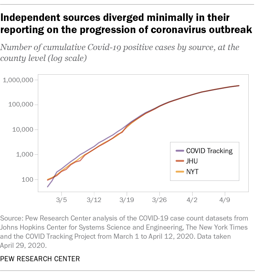
At the national level, all three sources told a similar story about the progression of the outbreak. The chart below shows total national-level reported case counts (displayed using a log scale) from each source, collected roughly in real time. As the outbreak progressed, the reported case count figures from each source began to diverge by as much as several thousand cases on any given day. But in the context of a pandemic with more than a half-million reported cases nationwide by early April, these differences were minimal as a share of overall cases:
Of course, national-level data isn’t especially useful if we’re trying to see how public opinion varies based on local conditions. So let’s see how these three sources compare when evaluating data at the state level instead. (Since only two of our three sources reported data at the county level, we decided to compare their state-level estimates.)
For the Johns Hopkins data, here’s how we aggregated the case counts from the county level up to the state level:
# An example on how to calculate daily state level cases
state_data <- clean_data %>%

  ## Filter out U.S. territories
  filter(country_abb=="US",

         ## Filter out cruise ships
         !(state_name %in% c("Diamond Princess", "Grand Princess)")
         ) %>%

  ## Group by state and date to get daily state level data
  group_by(state, date)  %>%

  # Calculate cumulative sum of daily cases at the state level
  summarise(jhu_cases = sum(jhu_cases))


## Subset state data to only include states that we want to analyze,
## which are California, New York, and Louisiana
state_data.subset <- state_data %>%
	filter(state %in% c("CA", "NY", "LA"))
The charts below show the absolute difference in reported case counts in three states hit especially hard by the coronavirus: New York, California and Louisiana.
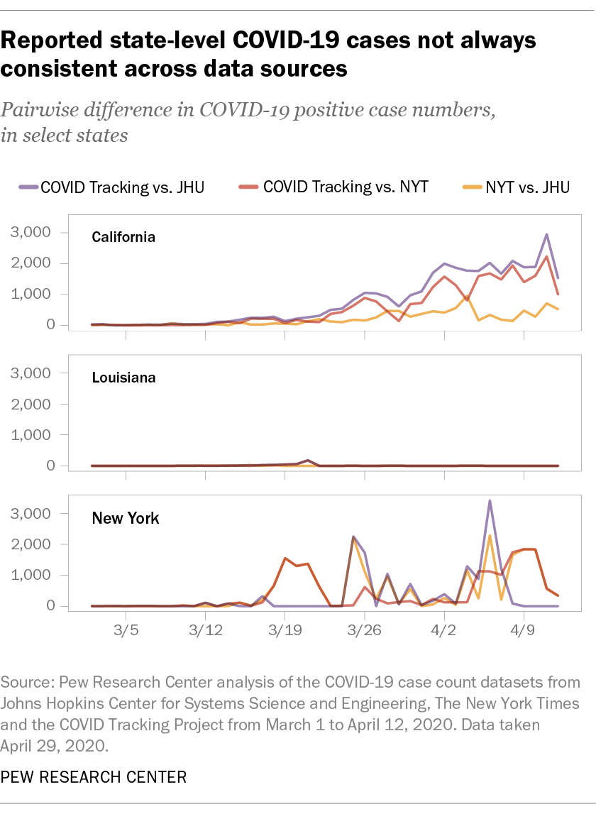
Several trends are apparent from these charts. First, our three sources consistently provided different numbers of case counts in California and New York, but apart from one brief blip, they showed virtually no divergence in Louisiana. Second, the sources that matched each other most closely were not always consistent across states. The Johns Hopkins and New York Times datasets matched each other relatively closely in California but diverged quite a bit in New York.
The chart below offers a more systematic view of this trend. It shows the proportional difference in daily reported case counts from the New York Times and COVID Tracking datasets at the state level relative to the Johns Hopkins dataset, starting in the first full week after all states had reported positive cases:
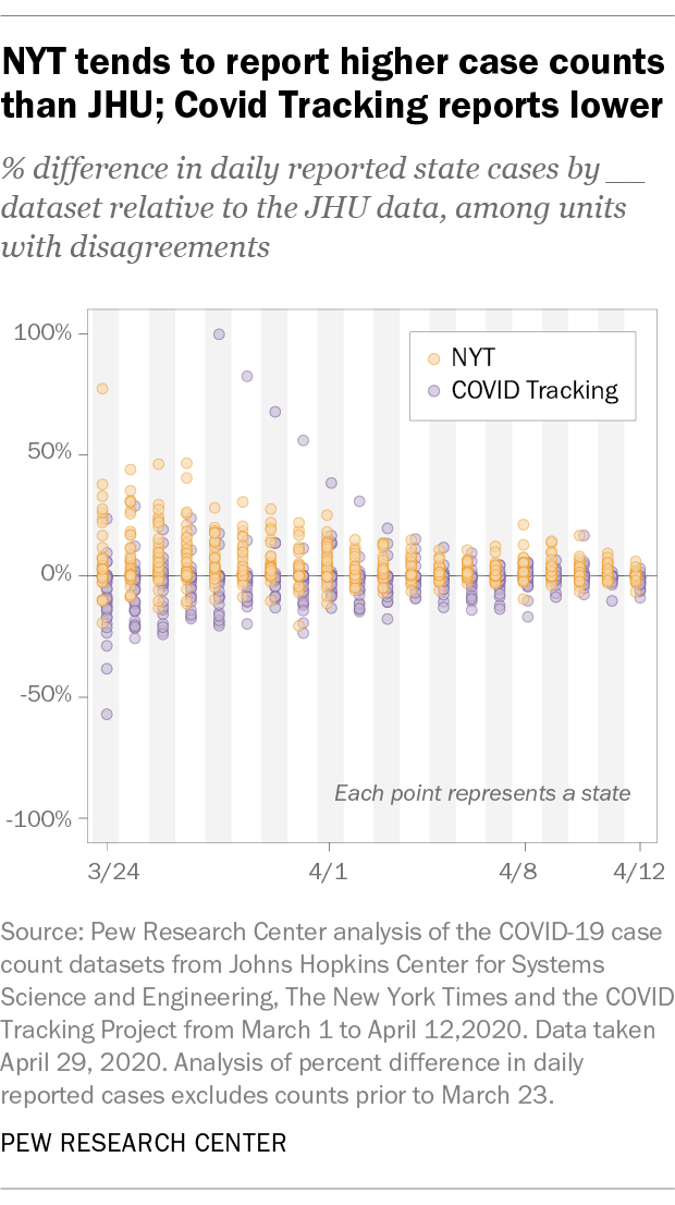
Two takeaways are clear from this analysis. First, when differences in case counts are observed, the New York Times dataset tends to report estimates for cases and deaths that are higher than those from the other two sources. The COVID Tracking dataset, on the other hand, tends to report numbers that are lower than the other two. Second, these datasets began to converge in the first two weeks of April, even if they still differed in their totals by several thousand cases. In the earlier weeks of the outbreak, these sources consistently differed around 20% to 40%. By April, these differences narrowed to 10% to 20%.
It wasn’t always easy to understand why we might be seeing these differences, but a few possibilities seemed likely after investigating the data and the different sources and methods being used:
- Differences in counting methodology. These sources may define a COVID-19 cases differently. For instance, the JHU dataset counts presumptive cases as positive, while the COVID Tracking project focuses on counting positive cases as a subset of reported tests. At least partially as a result of these decisions, some datasets seem to consistently over- or undercount relative to others.
- Idiosyncratic sources of infection. Particularly in the early stages of the outbreak, cruise ships were a prominent source of COVID-19 infections. Some datasets (such as the JHU data) treat cases on cruise ships as their own entry not assigned to a particular state. Others, including The New York Times, assign those cases to the counties where the cruise ships first docked.
- Tracking delays and real-time errors. Our analysis indicated that case count differences often increased during the early part of the week and then declined through the weekend, before repeating the same cycle the following week. This might point toward recalibration efforts by the different sources over the course of the week.
- Changes in reporting structure. These sources are continuously adjusting their reporting structure to reflect the rapid developments on the ground. For instance, the JHU dataset alternated between reporting state-level and county-level data for a period of time before settling on its current level of granularity at the county level.
- Retroactive fixes. Some of these data sources — most prominently the COVID Tracking collection — regularly recalibrate their historical data to match with official reports. One notable feature of some of this data collection effort is that changes are documented. As a result, researchers relying on real-time data and researchers working on retroactive data might get different results in a particular area on a particular day.
Conclusion
So which source did we wind up using in our own reporting? Our first analysis was based on a survey conducted March 10 to 16, relatively early in the outbreak. At that point, all three data sources reported comparable numbers of cases, and case counts nationwide were relatively low. For that study, we used state-level data from the COVID Tracking Project and grouped states into three broad “bins,” based on the number of reported cases.
Our second analysis was based on a survey conducted April 7 to 12. At that point, overall cases were much more prevalent. In order to capture respondents living in hard-hit areas, we decided to use death counts from the virus at the county level using the JHU dataset, and to again “bin” these counties into three broad groupings.
As we continue to track the geographic spread of the outbreak and its impact on public opinion, our choice of external data source will depend on the exact research question we’re striving to answer, as well as the level of geographic specificity needed to analyze our results. The wealth of near-real-time data on the outbreak has certainly been a boon to researchers, but figuring out the right tool for the task at hand is often not a simple one.