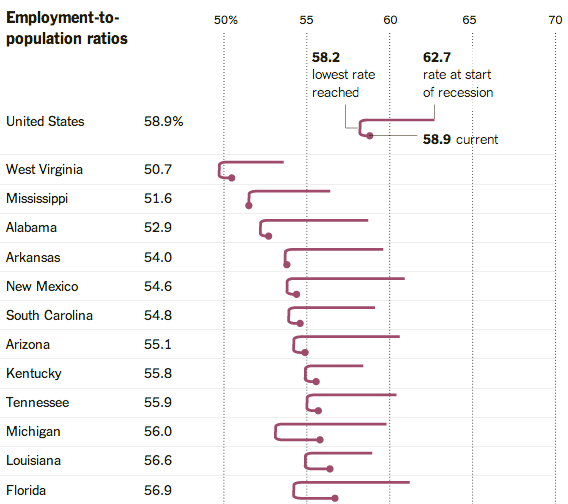
While unemployment continues to fall throughout the United States, and the economy has recovered all the jobs lost in the Great Recession, almost no one would argue that the U.S. jobs situation is where it should be. One big reason: The share of adults who actually have jobs (58.9%) is still well below its pre-recession level (62.7%).
While that’s overall trend is true in every state, there’s considerable variation in both how much employment ratios fell during the recession and how much they’ve since rebounded, as this nifty chart from The New York Times’ “The Upshot” blog shows. We liked the way it helps people readily visualize an abstract, and not overly familiar, concept over time, without using the standard trend line.
The full version orders the states from lowest employment ratio (West Virginia, 50.7%) to highest (North Dakota, 69.3%). You can also easily see which states stand out for having made the most progress in rebuilding employment (such as Utah and Maine) or where employment ratios remain near their bottoms (such as Mississippi and New Jersey).
Why, unlike in previous recoveries, has the employment ratio been stuck so long? Economists and other analysts offer a variety of answers, from more formerly employed people giving up on looking for work to a surge in Baby Boomer retirements. But as a Wells Fargo report (referenced by Vox) notes, other advanced economies are facing similar (though less dramatic) declines in employment.
